<?xml version="1.0" encoding="utf-8"?>
<feed xmlns="http://www.w3.org/2005/Atom" xmlns:media="http://search.yahoo.com/mrss/" xml:lang="en-US">
  <title>BigBinary Blog: ReactJS</title>
  <subtitle>Deep technical writing on Ruby on Rails, performance, scaling, monitoring and engineering.</subtitle>
  <link rel="self" type="application/atom+xml" href="https://www.bigbinary.com/blog/categories/reactjs/feed.xml"/>
  <link rel="alternate" type="text/html" href="https://www.bigbinary.com/blog/categories/reactjs"/>
  <id>https://www.bigbinary.com/blog/categories/reactjs</id>
  <updated>2026-06-10T00:00:00.000Z</updated>
  <author>
    <name>BigBinary</name>
    <uri>https://www.bigbinary.com/</uri>
  </author>
  <icon>https://www.bigbinary.com/favicon.ico</icon>
  <logo>https://www.bigbinary.com/images/bigbinary_square_big_logo.png</logo>
  <rights>Copyright 2026 Big Binary LLC</rights>
  <generator uri="https://nextjs.org">Next.js</generator>
  <entry>
      <title type="text"><![CDATA[Debugging frontend crash and handling circular dependency]]></title>
      <link rel="alternate" type="text/html" href="https://www.bigbinary.com/blog/debugging-frontend-crash-and-handling-circular-dependency"/>
      <link rel="enclosure" type="image/jpeg" href="https://www.bigbinary.com/blog/images/social_preview_images/debugging_frontend_crash_and_circular_dependency.jpg"/>
      <id>https://www.bigbinary.com/blog/debugging-frontend-crash-and-handling-circular-dependency</id>
      <published>2026-06-10T00:00:00.000Z</published>
      <updated>2026-06-10T00:00:00.000Z</updated>
      <author>
        <name>Joseph Mathew</name>
        <uri>https://www.bigbinary.com/blog/authors/josephmathew900</uri>
      </author>
      <category term="JavaScript"/>
      <category term="ReactJS"/>
      <media:thumbnail url="https://www.bigbinary.com/blog/images/social_preview_images/debugging_frontend_crash_and_circular_dependency.jpg" width="1200" height="627"/>
      <summary type="text"><![CDATA[Recently, we had a crash in our NeetoCRM application. As we can see in the screenshot, it looks like the error happened in neeto-widget-replay.js file. At Neeto we have built an internal tool called...]]></summary>
      <content type="html" xml:base="https://www.bigbinary.com/blog/debugging-frontend-crash-and-handling-circular-dependency"><![CDATA[<p>Recently, we had a crash in our <a href="https://www.neeto.com/neetocrm">NeetoCRM</a>
application.</p>
<p><img src="https://www.bigbinary.com/blog/images/images_used_in_blog/2026/investigating-frontend-crash/crash-screenshot.png" alt="crash screenshot"></p>
<p>As we can see in the screenshot, it looks like the error happened in
<code>neeto-widget-replay.js</code> file.</p>
<p>At <a href="https://neeto.com">Neeto</a> we have built an internal tool called NeetoReplay
which captures users' activities in the browser. This helps us in debugging when
users contact us for support or in investigating bugs. This is built on top of
<a href="https://github.com/rrweb-io/rrweb">rrweb</a>. <em>Just want to add that admins of the
workspace can completely opt out of NeetoReplay.</em></p>
<p>We had not changed anything in NeetoReplay for a while, so the error happening
in NeetoReplay was perplexing. Upon investigation, I found that the console
indeed pointed to the <code>neeto-widget-replay.js</code> file. But I also knew that the
filename only tells us which function called <code>console.error</code>, not where the
error originated.</p>
<p>The replay widget wraps <code>console.log</code>, <code>console.warn</code>, and <code>console.error</code> so it
can capture console output for session replay. Once the page loads, every
console message passes through the widget's wrapper, causing DevTools to
associate those messages with the widget file. As a result, when the NeetoCRM
app throws an error during startup, the console makes it look like the error
came from the replay widget even though the actual exception was thrown inside
the NeetoCRM bundle.</p>
<p>The way rrweb's console plugin works, it replaces <code>console.log</code>, <code>console.warn</code>,
and <code>console.error</code> so console output can be captured for session replay. I
checked whether rrweb provides a way to preserve the original caller
information, but it doesn't. Removing the wrapper would also mean losing console
capture from replays.</p>
<p>This isn't specific to rrweb either. Honeybadger, Sentry, PostHog, and React
DevTools use similar wrapping and have the same behavior. React DevTools has an
identical issue documented in
<a href="https://github.com/facebook/react/issues/22257">facebook/react#22257</a>.</p>
<p>The only known mitigation is Chrome's <code>x_google_ignoreList</code> source map feature,
which allows DevTools to hide library frames and show the host application frame
instead. However, it only works when source maps are available. Since we don't
ship source maps with the production minified bundle, this isn't available in
production. As a result, the console attribution is an unavoidable side effect
of session replay tooling, but the actual error information remains intact.</p>
<p>The video mentioned below is the one I created for the internal Neeto folks. The
video is being published <strong>as-is</strong> without any modifications.</p>
<p><a href="https://www.youtube.com/watch?v=cBZvoN5HQKo"><img src="https://img.youtube.com/vi/cBZvoN5HQKo/hqdefault.jpg" alt="Watch on YouTube" width="480" height="360"></a><br><a href="https://www.youtube.com/watch?v=cBZvoN5HQKo">Watch on YouTube</a></p>
<h2>Back to the error</h2>
<p>The real error is:</p>
<pre><code>TypeError: I is not a function at chunk-CL4SWXVJ.digested.js
</code></pre>
<p><code>I</code> is the minified name for <code>createColumn</code>, a helper defined in
<code>commons/utils.jsx</code>.</p>
<p>The failure occurs because code in <code>commons/constants.js</code> calls
<code>createColumn(...)</code> before the function has been initialized. At runtime,
<code>createColumn</code> is still <code>undefined</code>, causing the call to fail and preventing the
React application from starting. The subsequent <code>Failed to load component App</code>
message is simply the mount code reporting that application initialization
failed.</p>
<p>Tracing this back further shows that <code>commons/constants.js</code> and
<code>commons/utils.jsx</code> have a circular dependency. <code>constants.js</code> imports
<code>createColumn</code> from <code>utils.jsx</code> while <code>utils.jsx</code> imports values from
<code>constants.js</code>.</p>
<p>In development, Vite serves modules as native ES modules and the browser
evaluates them depth-first. When <code>constants.js</code> imports <code>createColumn</code> from
<code>utils.jsx</code>, the browser evaluates <code>utils.jsx</code> first, which initializes
<code>createColumn</code> before control returns to <code>constants.js</code>. By the time
<code>constants.js</code> calls <code>createColumn</code>, the function is already defined.</p>
<p>In production, builds are generated using esbuild, which bundles everything into
a single file and has to choose a linear execution order. This can introduce
subtle differences in behavior, particularly around module evaluation order and
circular dependencies. In the generated bundle, code from <code>constants.js</code> ends up
running before <code>createColumn</code> is initialized, which causes the crash.</p>
<p>The reason this surfaced now is that a recent change introduced the following
import in the Deals, Leads, and Contacts <code>Show/index.jsx</code> files:</p>
<pre><code>import { buildHeaderMoreMenu } from &quot;components/commons/utils&quot;;
</code></pre>
<p>Those files did not previously import from <code>commons/utils</code>. The circular
dependency already existed, but this additional import changed esbuild's
bundling order and exposed the issue. The change did not introduce the circular
dependency itself; it only made the existing problem surface in production.</p>
<h2>The fix</h2>
<p>The fix is to break the circular dependency by moving <code>createColumn</code> into a
small standalone module that has no dependency on <code>commons/constants.js</code>. Once
the circular import is removed, esbuild can no longer generate an execution
order where <code>createColumn</code> is referenced before initialization.</p>
<h2>How to replicate this behavior in the development environment</h2>
<p>To help catch these issues earlier, we provide an esbuild-based development
server that mirrors production bundling behavior while still supporting
automatic rebuilds during development.</p>
<p>Start the Rails server with the <code>ESBUILD_DEVSERVER</code> flag enabled.</p>
<pre><code>ESBUILD_DEVSERVER=true bundle exec rails server
</code></pre>
<p>In a separate terminal, start esbuild in watch mode.</p>
<pre><code>yarn build --watch
</code></pre>
<p>With <code>ESBUILD_DEVSERVER=true</code>, Rails serves the assets generated by esbuild
instead of the assets served by Vite. Running <code>yarn build --watch</code> ensures the
bundles are rebuilt automatically whenever files change, allowing you to test
the application using the same bundling behavior as production.</p>
<h2>Why Honeybadger didn't catch this error</h2>
<p>If JavaScript execution fails before the React tree mounts, Honeybadger never
receives the error. This includes chunk load failures, syntax errors in the
entry chunk, runtime errors during module evaluation, and bundling issues caused
by incorrect module ordering.</p>
<p>The error was thrown while evaluating the <code>App</code> chunk and was visible in the
browser console for every affected user. However, no Honeybadger issue was
created.</p>
<p>The initialization flow looked like this:</p>
<pre><code>application.js
└─ mount({ App: () =&gt; import(&quot;src/App&quot;) })
     └─ dynamic import(&quot;src/App&quot;)
          └─ &lt;App&gt;
               └─ &lt;AppContainer&gt;
                    └─ &lt;HoneybadgerErrorBoundary&gt;
</code></pre>
<p><code>Honeybadger.configure()</code> is called inside <code>HoneybadgerErrorBoundary</code>. Since
that component is rendered as a descendant of <code>&lt;App&gt;</code>, Honeybadger is
initialized only after the <code>App</code> chunk has been successfully loaded and
rendered.</p>
<p>When a startup failure occurs, <code>import(&quot;src/App&quot;)</code> rejects, <code>mount.js</code> catches
the error and logs it using <code>console.error(...)</code>, and the execution stops before
<code>&lt;App&gt;</code> is mounted. Because the error has already been handled, <code>window.onerror</code>
is never triggered. Since <code>&lt;HoneybadgerErrorBoundary&gt;</code> never renders,
<code>Honeybadger.configure()</code> is never called, which means no API key is configured,
no global handlers are registered, and no error is reported.</p>
<p>As a result, startup failures that completely prevent the application from
loading are invisible to Honeybadger.</p>
<p>Honeybadger should be initialized before loading the <code>App</code> chunk so that
failures during application bootstrap, chunk loading, and module evaluation are
captured and reported.</p>
<h2>The Honeybadger fix</h2>
<p>Honeybadger is now configured in <code>application.js</code>, before <code>mount()</code> runs:</p>
<pre><code>application.js
├─ Honeybadger.configure({ enableUncaught: true, ... })   // configured before mount
└─ mount({ App: () =&gt; import(&quot;src/App&quot;) })
     ├─ dynamic import(&quot;src/App&quot;) succeeds
     │    └─ &lt;App&gt;
     │         └─ &lt;AppContainer&gt;
     │              └─ &lt;HoneybadgerErrorBoundary&gt;   // uses pre-configured client
     │
     └─ dynamic import(&quot;src/App&quot;) fails
          └─ Honeybadger.notify(error, { name: &quot;AppMountError&quot; })
</code></pre>
<p>With <code>enableUncaught: true</code>, <code>window.onerror</code> is armed before any dynamic import
runs, so failures during module evaluation are captured. And if the <code>App</code> chunk
itself fails to load, <code>mount()</code> reports it explicitly via
<code>Honeybadger.notify(...)</code> instead of only logging to the console.</p>
]]></content>
    </entry>
  <entry>
      <title type="text"><![CDATA[Remotely EV code-signing a Windows app with ssl.com]]></title>
      <link rel="alternate" type="text/html" href="https://www.bigbinary.com/blog/ev-code-sign-windows-application-ssl-com"/>
      <link rel="enclosure" type="image/jpeg" href="https://www.bigbinary.com/blog/images/social_preview_images/ev_code_sign_a_windows_application.jpg"/>
      <id>https://www.bigbinary.com/blog/ev-code-sign-windows-application-ssl-com</id>
      <published>2024-12-17T00:00:00.000Z</published>
      <updated>2024-12-17T00:00:00.000Z</updated>
      <author>
        <name>Farhan CK</name>
        <uri>https://www.bigbinary.com/blog/authors/farhanlatheef</uri>
      </author>
      <category term="JavaScript"/>
      <category term="ReactJS"/>
      <category term="Electron"/>
      <media:thumbnail url="https://www.bigbinary.com/blog/images/social_preview_images/ev_code_sign_a_windows_application.jpg" width="1200" height="627"/>
      <summary type="text"><![CDATA[EV code-sign a Windows application using ssl.com]]></summary>
      <content type="html" xml:base="https://www.bigbinary.com/blog/ev-code-sign-windows-application-ssl-com"><![CDATA[<p><em>Recently, we built <a href="https://neetorecord.com/neetorecord/">NeetoRecord</a>, a loom
alternative. The desktop application was built using Electron. In a series of
blogs, we capture how we built the desktop application and the challenges we ran
into. This blog is part 9 of the blog series. You can also read about
<a href="https://www.bigbinary.com/blog/sync-store-main-renderer-electron">part 1</a>,
<a href="https://www.bigbinary.com/blog/publish-electron-application">part 2</a>,
<a href="https://www.bigbinary.com/blog/video-background-removal">part 3</a>,
<a href="https://www.bigbinary.com/blog/electron-multiple-browser-windows">part 4</a>,
<a href="https://www.bigbinary.com/blog/code-sign-notorize-mac-desktop-app">part 5</a>,
<a href="https://www.bigbinary.com/blog/deep-link-electron-app">part 6</a>,
<a href="https://www.bigbinary.com/blog/request-camera-micophone-permission-electron">part 7</a>
and <a href="https://www.bigbinary.com/blog/native-modules-electron">part 8</a>.</em></p>
<p>Code-signing allows Windows to verify the identity of an application's
publisher, making it authentic and trustworthy. Additionally, code-signing helps
applications comply with Windows security policies, avoiding warnings and
installation blocks, ultimately building user confidence and providing a
smoother, safer experience.</p>
<h3>What is code-signing?</h3>
<p>At its core, code-signing involves using a cryptographic hash function to create
a unique digital fingerprint of the code. This fingerprint and a certificate
from a trusted Certificate Authority (CA) form the digital signature. When users
download and run the software, their operating system or browser checks the
digital signature to verify its authenticity.</p>
<p>There are two types of certificates we can use to sign a Windows application:</p>
<ul>
<li>Code-signing Certificate</li>
<li>EV Code-signing Certificate</li>
</ul>
<p>A <strong>Standard Code-signing Certificate</strong> provides our application a baseline
level of security and trust. While it verifies the software publisher's identity
and ensures that the code has not been tampered with since it was signed, the
validation process is less rigorous than EV certificates. It shows a warning
during installation that goes away once enough users have installed our
application and we've built up trust.</p>
<p><strong>Extended Validation (EV) Code-signing Certificates</strong>, on the other hand, offer
the highest level of security and trust. These certificates require a more
rigorous vetting process by the Certificate Authority (CA) before they are
issued, ensuring that the entity requesting the certificate is thoroughly
verified. This process involves verifying the legal, physical, and operational
existence of the entity, as well as confirming the identity of the individual
requesting the certificate.</p>
<p>Unlike Apple, Microsoft allows developers to purchase these certificates on the
open market. They are typically sold by the same companies that offer HTTPS
certificates. Prices can vary, so it's worth shopping around. Some popular
resellers include:</p>
<ul>
<li><a href="https://www.digicert.com/signing/code-signing-certificates">DigiCert code-signing certificate</a></li>
<li><a href="https://shop.certum.eu/data-security/code-signing-certificates/certum-ev-code-sigining.html">Certum EV code-signing certificate</a></li>
<li><a href="https://www.entrust.com/products/digital-signing/code-signing-certificates">Entrust code-signing certificate</a></li>
<li><a href="https://www.ssl.com/certificates/ev-code-signing/">SSL.com EV code-signing certificate</a></li>
</ul>
<h3>Why choose EV code-signing?</h3>
<p>Even though EV code-signing certificates are comparatively pricier than standard
code-signing certificates and have a rigorous vetting process. It is important
to note that, effective June 2023, the
<a href="https://cabforum.org/wp-content/uploads/Baseline-Requirements-for-the-Issuance-and-Management-of-Code-Signing.v3.2.pdf">new CA/Browser Forum code-signing requirements</a>
is in effect. As a result, publicly trusted Certificate Authorities (CA) will
require that certificate requestors use an appropriately certified (FIPS 140-2
level 2 or Common Criteria EAL 4+) hardware security module (HSM) to protect
their code-signing private keys. This requirement applies to the issuance of
both extended validation (EV) certificates and non-EV certificates.</p>
<p>In simple words, what this means is that standard code-signing certificates no
longer provides benefits they provided in the past. Windows will treat our
application as completely unsigned and display the equivalent warning dialogs.
Another thing to note here is that since certificates are required to be stored
on an HSM, the certificate cannot be simply downloaded onto a CI infrastructure.</p>
<h3>Cloud-based EV code-signing</h3>
<p>In the past, EV code-signing could only be performed using a physical USB
dongle. Upon purchasing an EV certificate, the provider would send a physical
USB device containing the certificate. This method required code-signing to be
executed from a local machine, which posed flexibility challenges, especially
for team environments. Additionally, physical USB dongles are prone to loss or
damage.</p>
<p>As a solution to this, many certificate providers now offer &quot;cloud-based EV
signing,&quot; where the signing hardware is housed in their data centers, allowing
us to remotely sign code.</p>
<p>In this blog, we will look into how we can remotely EV code-sign a Windows
application built using Electron, using SSL.com's
<a href="https://www.ssl.com/guide/esigner-codesigntool-command-guide/">eSigner CodeSignTool</a></p>
<h3>Purchase and validate EV certificate from SSL.com</h3>
<p>For the NeetoRecord desktop application, we used EV certificate from ssl.com and
hence we will use ssl.com as an example in this blog.</p>
<p>Once we sign into <a href="http://ssl.com/">SSL.com</a> and purchase the
<a href="https://www.ssl.com/certificates/ev-code-signing/buy/">EV code-signing certificate</a>,
We need to validate the certificate. For this, we need to fill out the <strong>EV
subscriber agreement</strong> and <strong>EV authorization form</strong>. Both of them can be
downloaded from
<a href="https://www.ssl.com/faqs/what-are-the-requirements-for-ssl-com-ev-certificates/">here</a>.
Also, make sure we have <a href="http://www.dnb.com/get-a-duns-number.html">D-U-N-S</a>
number or equivalent ready before starting the validation process. To know about
all the requirements in detail, follow
<a href="https://www.ssl.com/faqs/what-are-the-requirements-for-ssl-com-ev-certificates/">this article</a>
or watch this <a href="https://www.youtube.com/watch?v=y9rhsL7jZnc">Youtube video</a>.</p>
<h3>eSigner and CodeSignTool</h3>
<p><a href="https://www.ssl.com/esigner/">eSigner</a> is SSL.com's cloud signing service that
allows remote access to its HSM hardware from anywhere. We can use our SSL.com
signing credentials to access it.</p>
<p><a href="https://www.ssl.com/guide/esigner-codesigntool-command-guide/">CodeSignTool</a> is
a command-line tool for remotely signing various types of scripts like MSI
installers, Microsoft Authenticode etc., with eSigner EV code-signing
certificates. Hashes of the files are sent to SSL.com for signing so that the
code itself is not sent. This is ideal where sensitive files need to be signed
but should not be sent over the wire for signing. CodeSignTool is also ideal for
automated batch processes for high-volume signings or integration into existing
CI/CD pipeline workflows.</p>
<h3>Enroll in eSigner</h3>
<p>To be able to code-sign the application using eSigner, we need to first enroll
in eSigner. To do so,</p>
<ul>
<li>Navigate to an issued Code-signing order in our SSL.com account. Note that the
order is labeled eSigner Ready.
<img src="https://www.bigbinary.com/blog/images/images_used_in_blog/2024/ev-code-sign-windows-application-ssl-com/esigner-code-signing-01.png" alt="esigner ready"></li>
<li>Click one of the download links.
<img src="https://www.bigbinary.com/blog/images/images_used_in_blog/2024/ev-code-sign-windows-application-ssl-com/esigner-code-signing-02.png" alt="download link"></li>
<li>Create and confirm a 4-digit PIN and click the create PIN button.
<img src="https://www.bigbinary.com/blog/images/images_used_in_blog/2024/ev-code-sign-windows-application-ssl-com/esigner-code-signing-03.png" alt="set pin"></li>
<li>Our certificate will be generated, and after a few moments, a QR code will
appear above the certificate downloads table.
<img src="https://www.bigbinary.com/blog/images/images_used_in_blog/2024/ev-code-sign-windows-application-ssl-com/esigner-totp-secret.png" alt="QR code"></li>
</ul>
<p>When the eSigner QR code is displayed for our certificate, copy and save the
secret code value shown in a safe location. This is the TOTP (time-based
one-time password) secret associated with our eSigner certificate. Just as 2FA
authentication software like Authy can scan this value from the QR code to
generate valid OTPs for code-signing, CodeSignTool can also use it to generate
OTPs are automatically generated during the signing process. In the next
section, we will use this secret code as <code>totp_secret</code> while integrating with
CodeSignTool.</p>
<p>For more information, check out these articles:
<a href="https://www.ssl.com/guide/remote-ev-code-signing-with-esigner/">How to Enroll in eSigner</a>
and
<a href="https://www.ssl.com/how-to/automate-esigner-ev-code-signing/">Automate eSigner EV Code-signing</a>.</p>
<h3>Obtain Required Credentials</h3>
<p>We need to provide the following credentials to the CodeSignTool for it to
successfully connect with eSigner and code-sign the application.</p>
<p>If we haven't purchased a certificate yet and want to try out how it works,
SSL.com offers
<a href="https://www.ssl.com/guide/esigner-demo-credentials-and-certificates/">eSigner Demo Credentials and Certificates</a>.</p>
<ul>
<li>username</li>
<li>password</li>
<li>totp_secret</li>
<li>credential_id</li>
</ul>
<p>For <code>username</code> and <code>password</code>, use the same credentials we used to sign in to
SSL.com. If needed, we can also add additional users to the same account. For
the <code>totp_secret</code>, use the secret code we saved during the eSigner enrollment
process.</p>
<p><img src="https://www.bigbinary.com/blog/images/images_used_in_blog/2024/ev-code-sign-windows-application-ssl-com/esigner-totp-secret.png" alt="QR code"></p>
<p>To obtain the <code>credential_id</code>, navigate to the certificate details section on
the SSL.com dashboard. The <code>credential_id</code> will be listed under
<code>SIGNING CREDENTIALS</code>.</p>
<p><img src="https://www.bigbinary.com/blog/images/images_used_in_blog/2024/ev-code-sign-windows-application-ssl-com/ssl-com-credential-id.png" alt="credential id"></p>
<p>After acquiring all the credentials, add them to GitHub Secrets with the
following names:</p>
<ul>
<li><code>username</code> -&gt; <code>WINDOWS_SIGN_USER_NAME</code></li>
<li><code>password</code> -&gt; <code>WINDOWS_SIGN_USER_PASSWORD</code></li>
<li><code>totp_secret</code> -&gt; <code>WINDOWS_SIGN_USER_TOTP</code></li>
<li><code>credential_id</code> -&gt; <code>WINDOWS_SIGN_CREDENTIAL_ID</code></li>
</ul>
<p>Load up these secrets as environment variables in our Github Action workflow.</p>
<pre><code class="language-yml">- name: Publish releases
    env:
      AWS_ACCESS_KEY_ID: ${{secrets.AWS_ACCESS_KEY}}
      AWS_SECRET_ACCESS_KEY: ${{secrets.AWS_SECRET}}
      WINDOWS_SIGN_USER_NAME: ${{ secrets.WINDOWS_SIGN_USER_NAME }}
      WINDOWS_SIGN_USER_PASSWORD: ${{ secrets.WINDOWS_SIGN_USER_PASSWORD }}
      WINDOWS_SIGN_USER_TOTP: ${{ secrets.WINDOWS_SIGN_USER_TOTP }}
      WINDOWS_SIGN_CREDENTIAL_ID: ${{ secrets.WINDOWS_SIGN_CREDENTIAL_ID }}
    run: npm exec electron-builder -- --publish always -mwl
</code></pre>
<h3>Integrate CodeSignTool</h3>
<p>The Windows version of CodeSignTool is provided as a batch file
(<code>CodeSignTool.bat</code>), while the Linux/macOS version is available as a shell
script (<code>CodeSignTool.sh</code>). We can find the download links and more details
about CodeSignTool in
<a href="https://www.ssl.com/guide/esigner-codesigntool-command-guide/">this article</a></p>
<p>For our purposes, we'll be using the shell script. Download the Linux/macOS
version, unzip it, and place it in the root directory of our Electron project.</p>
<p>To integrate the <code>CodeSignTool</code> into the Electron build process, create a script
(<code>./scripts/windows-sign.mjs</code>) that runs the <code>CodeSignTool</code> shell script.</p>
<pre><code class="language-js">import path from &quot;path&quot;;
import fs from &quot;fs&quot;;
import childProcess from &quot;child_process&quot;;

const TEMP_DIR = path.join(__dirname, &quot;../release&quot;, &quot;temp&quot;);

if (!fs.existsSync(TEMP_DIR)) {
  fs.mkdirSync(TEMP_DIR);
}

const sign = file =&gt; {
  const USER_NAME = process.env.WINDOWS_SIGN_USER_NAME;
  const USER_PASSWORD = process.env.WINDOWS_SIGN_USER_PASSWORD;
  const CREDENTIAL_ID = process.env.WINDOWS_SIGN_CREDENTIAL_ID;
  const USER_TOTP = process.env.WINDOWS_SIGN_USER_TOTP;

  if (USER_NAME &amp;&amp; USER_PASSWORD &amp;&amp; USER_TOTP &amp;&amp; CREDENTIAL_ID) {
    console.log(`Windows code-signing ${file.path}`);
    const { name, dir } = path.parse(file.path);
    const tempFile = path.join(TEMP_DIR, name);

    const setDir = `cd ./CodeSignTool-v1.3.0`;
    const signFile = `./CodeSignTool.sh sign -input_file_path=&quot;${file.path}&quot; -output_dir_path=&quot;${TEMP_DIR}&quot; -credential_id=${CREDENTIAL_ID}   -username=&quot;${USER_NAME}&quot; -password=&quot;${USER_PASSWORD}&quot; -totp_secret=&quot;${USER_TOTP}&quot;`;
    const moveFile = `mv &quot;${tempFile}.exe&quot; &quot;${dir}&quot;`;
    childProcess.execSync(`${setDir} &amp;&amp; ${signFile} &amp;&amp; ${moveFile}`, {
      stdio: &quot;inherit&quot;,
    });
  } else {
    console.warn(`windows-sign.js - Can't sign file, credentials are missing`);
    process.exit(1);
  }
};

export default sign;
</code></pre>
<p>The script exports a <code>sign</code> function that accepts an object containing the path
to the file that needs to be signed. It reads all the necessary credentials from
environment variables and then passes these credentials along with the file
path.</p>
<p>To finish up, pass this script to the <code>electron-builder</code> configuration.</p>
<pre><code class="language-json">
 &quot;build&quot;: {
    &quot;productName&quot;: &quot;MyProduct&quot;,
     &quot;win&quot;: {
      &quot;target&quot;: {
        &quot;target&quot;: &quot;nsis&quot;,
        &quot;arch&quot;: [
          &quot;x64&quot;
        ]
      },
      &quot;signingHashAlgorithms&quot;: [
        &quot;sha256&quot;
      ],
      &quot;sign&quot;: &quot;./scripts/windows-sign.mjs&quot;,
      &quot;publisherName&quot;: &quot;Neeto LLC&quot;,
      &quot;artifactName&quot;: &quot;${productName}-Setup-${version}.${ext}&quot;
    },
 }

</code></pre>
<p>Here, we pass the script path to the <code>win.sign</code> field in the <code>electron-builder</code>
configuration. Once added, <code>electron-builder</code> will call this script for each
file that needs to be signed.</p>
<p>Great! With this, we've completed the EV code-signing process for our Windows
application. Now, when we run the GitHub Action workflow, it will successfully
code-sign our Windows application.</p>
<h3>SSL.com pricing</h3>
<p>As mentioned earlier, EV code signing certificates are expensive. SSL.com
charges $349 per year for an EV code signing certificate, with discounts
available for multi-year purchases. For more information, visit:
https://www.ssl.com/certificates/ev-code-signing/buy/.</p>
<p>In addition to the certificate cost, we must also subscribe to the eSigner cloud
signing service, which is a subscription-based service. The Tier 1 plan costs
$100 per month and allows a maximum of 10 files to be signed, equating to a
minimum of $10 per signing. An Electron application requires four files to be
signed per build. This means we can only build an Electron application twice per
month under the Tier 1 plan.</p>
<p>If we need to build the application more than twice per month, we recommend
upgrading to Tier 2. This plan costs $300 per month and allows up to 100 file
signings, reducing the cost to $3 per signing. For more information, visit:
https://www.ssl.com/guide/esigner-pricing-for-code-signing/</p>
<p><img src="https://www.bigbinary.com/blog/images/images_used_in_blog/2024/ev-code-sign-windows-application-ssl-com/esigner_pricing.png" alt="esigner pricing"></p>
]]></content>
    </entry>
  <entry>
      <title type="text"><![CDATA[Requesting camera and microphone access in Electron]]></title>
      <link rel="alternate" type="text/html" href="https://www.bigbinary.com/blog/request-camera-micophone-permission-electron"/>
      <link rel="enclosure" type="image/jpeg" href="https://www.bigbinary.com/blog/images/social_preview_images/requesting_camera_and_microphone_permission_in_electron.jpg"/>
      <id>https://www.bigbinary.com/blog/request-camera-micophone-permission-electron</id>
      <published>2024-12-03T00:00:00.000Z</published>
      <updated>2024-12-03T00:00:00.000Z</updated>
      <author>
        <name>Farhan CK</name>
        <uri>https://www.bigbinary.com/blog/authors/farhanlatheef</uri>
      </author>
      <category term="JavaScript"/>
      <category term="ReactJS"/>
      <media:thumbnail url="https://www.bigbinary.com/blog/images/social_preview_images/requesting_camera_and_microphone_permission_in_electron.jpg" width="1200" height="627"/>
      <summary type="text"><![CDATA[Requesting camera and microphone permission in an Electron app]]></summary>
      <content type="html" xml:base="https://www.bigbinary.com/blog/request-camera-micophone-permission-electron"><![CDATA[<p><em>Recently, we built <a href="https://neetorecord.com/neetorecord/">NeetoRecord</a>, a loom
alternative. The desktop application was built using Electron. In a series of
blogs, we capture how we built the desktop application and the challenges we ran
into. This blog is part 7 of the blog series. You can also read about
<a href="https://www.bigbinary.com/blog/sync-store-main-renderer-electron">part 1</a>,
<a href="https://www.bigbinary.com/blog/publish-electron-application">part 2</a>,
<a href="https://www.bigbinary.com/blog/video-background-removal">part 3</a>,
<a href="https://www.bigbinary.com/blog/electron-multiple-browser-windows">part 4</a>,
<a href="https://www.bigbinary.com/blog/code-sign-notorize-mac-desktop-app">part 5</a>,
<a href="https://www.bigbinary.com/blog/deep-link-electron-app">part 6</a>
<a href="https://www.bigbinary.com/blog/native-modules-electron">part 8</a> and
<a href="https://www.bigbinary.com/blog/ev-code-sign-windows-application-ssl-com">part 9</a>
.</em></p>
<p>When developing an Electron app, handling permissions for the camera and
microphone varies from platform to platform. On macOS, apps are denied access to
the camera and microphone by default. To gain access, we must explicitly request
these permissions from the user. On the other hand, Windows tends to grant these
permissions to apps by default, although users can manually revoke them through
the system settings.</p>
<h3>Updating entitlement file for Mac</h3>
<p>In macOS, applications are run with a limited set of permissions to limit
potential damage from malicious code. Depending on which Electron APIs our app
uses, we may need to add additional entitlements to our app's entitlements file.</p>
<p>In macOS applications, entitlements or permissions are specified using a file
with a format like property list (<code>.plist</code>) or XML.</p>
<pre><code class="language-xml">&lt;?xml version=&quot;1.0&quot; encoding=&quot;UTF-8&quot;?&gt;
&lt;!DOCTYPE plist PUBLIC &quot;-//Apple//DTD PLIST 1.0//EN&quot; &quot;http://www.apple.com/DTDs/PropertyList-1.0.dtd&quot;&gt;
&lt;plist version=&quot;1.0&quot;&gt;
  &lt;dict&gt;
    &lt;key&gt;com.apple.security.cs.allow-unsigned-executable-memory&lt;/key&gt;
    &lt;true/&gt;
    &lt;key&gt;com.apple.security.cs.allow-jit&lt;/key&gt;
    &lt;true/&gt;
    &lt;key&gt;com.apple.security.device.camera&lt;/key&gt;
    &lt;true/&gt;
    &lt;key&gt;com.apple.security.device.microphone&lt;/key&gt;
    &lt;true/&gt;
    &lt;key&gt;com.apple.security.device.audio-input&lt;/key&gt;
    &lt;true/&gt;
    &lt;key&gt;com.apple.security.cs.allow-dyld-environment-variables&lt;/key&gt;
    &lt;true/&gt;
  &lt;/dict&gt;
&lt;/plist&gt;
</code></pre>
<p>For our purpose, we need <code>com.apple.security.device.camera</code> for the camera and
<code>com.apple.security.device.microphone</code> and
<code>com.apple.security.device.audio-input</code> entitlements for the microphone.</p>
<h3>Configuring in electron-builder</h3>
<p><a href="https://www.electron.build/">electron-builder</a> is a popular alternative package
for building, packaging and distributing Electron applications.</p>
<p>We need to ensure that the path to <code>entitlements.plist</code> is correctly set in the
<code>electron-builder</code> configuration.</p>
<pre><code class="language-json"> &quot;build&quot;: {
    &quot;productName&quot;: &quot;AppName&quot;,
    &quot;appId&quot;: &quot;com.neeto.AppName&quot;,
     &quot;mac&quot;: {
      &quot;target&quot;: {
        &quot;target&quot;: &quot;default&quot;,
        &quot;arch&quot;: [
          &quot;arm64&quot;,
          &quot;x64&quot;
        ]
      },
      &quot;type&quot;: &quot;distribution&quot;,
      &quot;entitlements&quot;: &quot;assets/entitlements.mac.plist&quot;,
    },
 }
</code></pre>
<p>We also need to provide a description of the camera and microphone's usage in
the <code>Info.plist</code>. We don't have to create an <code>Info.plist</code> when using
<code>electron-builder</code>; it will create and handle it internally, and any additional
info can be passed using the <code>extendInfo</code> key.</p>
<pre><code class="language-json"> &quot;build&quot;: {
    &quot;productName&quot;: &quot;AppName&quot;,
    &quot;appId&quot;: &quot;com.neeto.AppName&quot;,
     &quot;mac&quot;: {
      &quot;target&quot;: {
        &quot;target&quot;: &quot;default&quot;,
        &quot;arch&quot;: [
          &quot;arm64&quot;,
          &quot;x64&quot;
        ]
      },
      &quot;type&quot;: &quot;distribution&quot;,
      &quot;entitlements&quot;: &quot;assets/entitlements.mac.plist&quot;,
      &quot;entitlementsInherit&quot;: &quot;assets/entitlements.mac.plist&quot;,
      &quot;extendInfo&quot;: {
        &quot;NSMicrophoneUsageDescription&quot;: &quot;Please give us access to your microphone&quot;,
        &quot;NSCameraUsageDescription&quot;: &quot;Please give us access to your camera&quot;,
      },
    },
 }
</code></pre>
<p>The above code will add <code>NSMicrophoneUsageDescription</code> and
<code>NSCameraUsageDescription</code> to the <code>Info.plist</code>.</p>
<h3>Requesting permission</h3>
<p>Electron's
<a href="https://www.electronjs.org/docs/latest/api/system-preferences">systemPreferences</a>
module exposes events and methods to access and alter system preferences.</p>
<p>Before requesting permission, we can use the
<code>systemPreferences.getMediaAccessStatus</code> method to check if we already have the
access.</p>
<pre><code class="language-js">import { systemPreferences } from &quot;electron&quot;;

const hasMicrophonePermission =
  systemPreferences.getMediaAccessStatus(&quot;microphone&quot;) === &quot;granted&quot;;
const hasCameraPermission =
  systemPreferences.getMediaAccessStatus(&quot;camera&quot;) === &quot;granted&quot;;
</code></pre>
<p>For the camera and microphone, if permission is granted, it will return
<code>granted</code>; otherwise, depending on the platform and permission settings, it will
return <code>not-determined</code>, <code>denied</code>, <code>restricted</code> or <code>unknown</code>.</p>
<p><strong>For Mac</strong>, we can use the <code>systemPreferences.askForMediaAccess</code> method to
request permission. This method will return a promise that resolves with <code>true</code>
if consent was granted and <code>false</code> if it was denied.</p>
<pre><code class="language-js">const cameraGranted = await systemPreferences.askForMediaAccess(&quot;camera&quot;);
const microPhoneGranted = await systemPreferences.askForMediaAccess(
  &quot;microphone&quot;
);
</code></pre>
<p>When we call this method, it will open a system alert asking the user to grant
permission.</p>
<p><img src="https://www.bigbinary.com/blog/images/images_used_in_blog/2024/request-camera-micophone-permission-electron/camera-permission-alert.png" alt="camera permission"></p>
<p>If the user denies the permission the very first time, this method call will not
open the system alert again. Now, we have to open the system preference pane and
ask the user to enable it from there.</p>
<pre><code class="language-js">import { shell } from &quot;electron&quot;;

const cameraGranted = await systemPreferences.askForMediaAccess(&quot;camera&quot;);
if (!cameraGranted) {
  shell.openExternal(
    &quot;x-apple.systempreferences:com.apple.preference.security?Privacy_Camera&quot;
  );
}

const microPhoneGranted = await systemPreferences.askForMediaAccess(
  &quot;microphone&quot;
);
if (!microPhoneGranted) {
  shell.openExternal(
    &quot;x-apple.systempreferences:com.apple.preference.security?Privacy_Microphone&quot;
  );
}
</code></pre>
<p>To open the preference pane, we can use the
<a href="https://www.electronjs.org/docs/latest/api/shell">shell</a> module.
<code>shell.openExternal</code> can be used to call any external protocol URL.</p>
<p>Here we are opening <code>System preference(x-apple.systempreferences)</code> -&gt;
<code>Privacy &amp; Security(com.apple.preference.security)</code> -&gt; <code>Camera(Privacy_Camera)</code>
or <code>Microphone(Privacy_Microphone)</code>.</p>
<p><img src="https://www.bigbinary.com/blog/images/images_used_in_blog/2024/request-camera-micophone-permission-electron/camera-settings-mac.png" alt="camera permission"></p>
<p>Since we asked the user to open the preference pane because the user initially
denied permission if they chose to enable it this time, we should ask them to
relaunch the application. Only then will the updated permission settings take
effect.</p>
<p><strong>Windows</strong> has global settings for controlling the camera and microphone. The
good thing is that it is enabled by default. But in case the user explicitly
disables it, one thing we can do is open the privacy settings page of the camera
and microphone and ask the user to re-enable it.</p>
<pre><code class="language-js">const hasMicrophonePermission =
  systemPreferences.getMediaAccessStatus(&quot;microphone&quot;) === &quot;granted&quot;;
if (!hasMicrophonePermission) {
  shell.openExternal(&quot;ms-settings:privacy-microphone&quot;);
}

const hasCameraPermission =
  systemPreferences.getMediaAccessStatus(&quot;camera&quot;) === &quot;granted&quot;;
if (!hasCameraPermission) {
  shell.openExternal(&quot;ms-settings:privacy-webcam&quot;);
}
</code></pre>
<p><img src="https://www.bigbinary.com/blog/images/images_used_in_blog/2024/request-camera-micophone-permission-electron/windows-camera.png" alt="windows camera permission"></p>
<p>Just like we did for Mac, we use the <code>shell.openExternal</code> method to open the
<code>Setting(ms-settings)</code> -&gt; <code>Privacy</code> -&gt; <code>Camera(privacy-webcam)</code> or
<code>Microphone(privacy-microphone)</code>.</p>
<p>And we are done! Here is everything put together.</p>
<pre><code class="language-js">const checkMicrophonePermission = async () =&gt; {
  const hasMicrophonePermission =
    systemPreferences.getMediaAccessStatus(&quot;microphone&quot;) === &quot;granted&quot;;
  if (hasMicrophonePermission) return;
  if (process.platform === &quot;darwin&quot;) {
    const microPhoneGranted = await systemPreferences.askForMediaAccess(
      &quot;microphone&quot;
    );
    if (!microPhoneGranted) {
      shell.openExternal(
        &quot;x-apple.systempreferences:com.apple.preference.security?Privacy_Microphone&quot;
      );
    }
  } else if (process.platform === &quot;win32&quot;) {
    shell.openExternal(&quot;ms-settings:privacy-microphone&quot;);
  }
};

const checkCameraPermission = async () =&gt; {
  const hasCameraPermission =
    systemPreferences.getMediaAccessStatus(&quot;camera&quot;) === &quot;granted&quot;;
  if (hasCameraPermission) return;
  if (process.platform === &quot;darwin&quot;) {
    const cameraGranted = await systemPreferences.askForMediaAccess(&quot;camera&quot;);
    if (!cameraGranted) {
      shell.openExternal(
        &quot;x-apple.systempreferences:com.apple.preference.security?Privacy_Camera&quot;
      );
    }
  } else if (process.platform === &quot;win32&quot;) {
    shell.openExternal(&quot;ms-settings:privacy-webcam&quot;);
  }
};
</code></pre>
]]></content>
    </entry>
  <entry>
      <title type="text"><![CDATA[Code-signing and notarizing an Electron app for macOS]]></title>
      <link rel="alternate" type="text/html" href="https://www.bigbinary.com/blog/code-sign-notorize-mac-desktop-app"/>
      <link rel="enclosure" type="image/jpeg" href="https://www.bigbinary.com/blog/images/social_preview_images/code_sign_and_notarize_electron_app_for_macOS.jpg"/>
      <id>https://www.bigbinary.com/blog/code-sign-notorize-mac-desktop-app</id>
      <published>2024-11-19T00:00:00.000Z</published>
      <updated>2024-11-19T00:00:00.000Z</updated>
      <author>
        <name>Farhan CK</name>
        <uri>https://www.bigbinary.com/blog/authors/farhanlatheef</uri>
      </author>
      <category term="JavaScript"/>
      <category term="ReactJS"/>
      <category term="Electron"/>
      <media:thumbnail url="https://www.bigbinary.com/blog/images/social_preview_images/code_sign_and_notarize_electron_app_for_macOS.jpg" width="1200" height="627"/>
      <summary type="text"><![CDATA[Code-sign and notarize an Electron application for macOS]]></summary>
      <content type="html" xml:base="https://www.bigbinary.com/blog/code-sign-notorize-mac-desktop-app"><![CDATA[<p><em>Recently, we built <a href="https://neetorecord.com/neetorecord/">NeetoRecord</a>, a loom
alternative. The desktop application was built using Electron. In a series of
blogs, we capture how we built the desktop application and the challenges we ran
into. This blog is part 5 of the blog series. You can also read about
<a href="https://www.bigbinary.com/blog/sync-store-main-renderer-electron">part 1</a>,
<a href="https://www.bigbinary.com/blog/publish-electron-application">part 2</a>,
<a href="https://www.bigbinary.com/blog/video-background-removal">part 3</a>,
<a href="https://www.bigbinary.com/blog/electron-multiple-browser-windows">part 4</a>,
<a href="https://www.bigbinary.com/blog/deep-link-electron-app">part 6</a>,
<a href="https://www.bigbinary.com/blog/request-camera-micophone-permission-electron">part 7</a>
<a href="https://www.bigbinary.com/blog/native-modules-electron">part 8</a> and
<a href="https://www.bigbinary.com/blog/ev-code-sign-windows-application-ssl-com">part 9</a>
.</em></p>
<p>macOS identifies applications that are not code-signed and notarized as being
from unknown publishers and blocks their installation. Code-signing allows macOS
to recognize the application's creator. Notarization, an additional step,
provides extra credibility and security, ensuring a safer experience for users.</p>
<h3>What is code-signing?</h3>
<p>Code-signing is the process of generating a unique digital fingerprint of the
code using a cryptographic hash function. This fingerprint is combined with a
certificate from a trusted Certificate Authority (CA) to create the digital
signature. When users download or execute the software, the operating system
verifies this signature to confirm its authenticity.</p>
<p>Apple prefers developers to use certificates issued through the Apple Developer
Program to sign macOS applications. This is because macOS verifies signatures
against Apple's own Certificate Authority. If a third-party certificate is used,
macOS might not recognize it as trusted, leading to warnings or blocking the
application from running due to
<a href="https://support.apple.com/en-in/guide/security/sec5599b66df/web">Gatekeeper</a>,
Apple's security feature.</p>
<h3>Enroll in the Apple developer program</h3>
<p>We should enroll in the Apple developer program (which costs $99 per year) to
create a certificate that we can use to code-sign our application. We can follow
<a href="https://developer.apple.com/programs/enroll/">this link</a> to know what we need
to enroll in the Apple developer program.</p>
<h3>Apple certificates</h3>
<p>Apple provides two main types of code-signing certificates:</p>
<ul>
<li><strong>Developer ID Certificate:</strong> Used to sign apps distributed outside the Mac
App Store. Apps signed with this can be gatekeeper-approved.</li>
<li><strong>Mac App Distribution Certificate:</strong> Required for submitting apps to the Mac
App Store. Apple will re-sign the application after review and approval for
distribution on the Mac App Store.</li>
</ul>
<p>In this blog, we will look into how to code-sign an
<a href="https://electronjs.org/">Electron</a> application using <strong>Developer ID
Certificate</strong>.</p>
<h3>Create a Developer ID certificate</h3>
<p>To create a Developer ID certificate, we can follow Apple's detailed guide on
<a href="https://developer.apple.com/help/account/create-certificates/create-developer-id-certificates/">how to create a Developer ID certificate</a>.</p>
<p>Once we've successfully created the certificate and downloaded the <code>.cer</code> file,
the next step is to convert this file into a <code>.p12</code> format.</p>
<p>First, we'll need to convert the <code>.cer</code> file into a <code>.pem</code> format. We can do
this using <code>openssl</code>.</p>
<pre><code class="language-bash">openssl x509 -in certificate.cer -inform DER -out certificate.pem -outform PEM
</code></pre>
<p>Then, use the <code>.pem</code> file and our private <code>.key</code> to generate the <code>.p12</code> file.</p>
<pre><code class="language-bash">openssl pkcs12 -export -out certificate.p12 -inkey certificate-private.key -in certificate.pem
</code></pre>
<p>When generating the <code>.p12</code> file, we'll be prompted to set a password. Save this
password in a secure location, as we'll need it later when code-signing the
application.</p>
<p>To use this certificate with our existing GitHub Action workflow to automate the
deployment process, we need to convert this <code>.p12</code> file into a base64 string.
This is necessary because GitHub doesn't allow uploading files as secrets, but
we can store the base64 string instead.</p>
<pre><code class="language-bash">openssl base64 -in certificate.p12 -out certificate.txt
</code></pre>
<p>The command will output the base64 version of the <code>.p12</code> file into a
<code>certificate.txt</code> file. We can then add the text contents of this file as a
secret in GitHub. Save the base64 string in GitHub secrets with the name
<code>CSC_CONTENT</code> and password as <code>CSC_KEY_PASSWORD</code></p>
<h3>Update Electron build process</h3>
<p>To code-sign a macOS app, we just need to pass the certificate and password to
the <a href="https://www.electron.build/">electron-builder</a> <code>publish</code> command. However,
since we saved our certificate as a base64 string, we need to convert it back to
a <code>.p12</code> file before publishing.</p>
<pre><code class="language-yml"> - name: Publish releases
    env:
      GH_TOKEN: ${{ secrets.GITHUB_TOKEN }}
      AWS_ACCESS_KEY_ID: ${{secrets.AWS_ACCESS_KEY}}
      AWS_SECRET_ACCESS_KEY: ${{secrets.AWS_SECRET}}
      CSC_CONTENT: ${{ secrets.CSC_CONTENT }}
      CSC_KEY_PASSWORD: ${{ secrets.CSC_KEY_PASSWORD }}
    run: |
      echo &quot;$CSC_CONTENT&quot; | base64 --decode &gt; certificate.p12
      export CSC_LINK=&quot;./certificate.p12&quot;
      npm exec electron-builder -- --publish always -mwl

</code></pre>
<p>As mentioned above, we first decoded the base64 string back to a
<code>certificate.p12</code> file. We then set the path to this file as <code>CSC_LINK,</code> which
<code>electron-builder</code> expects.</p>
<p>Great! With everything in place, running this workflow should successfully
code-sign our application.</p>
<h2>Notarize</h2>
<p>Code-signing allows macOS to recognize the application's creator, but this alone
is insufficient. Users will still see a warning stating, <strong>&quot;macOS cannot verify
if the app is free from malware.&quot;</strong></p>
<p>To eliminate this warning, we need to notarize our application.
<a href="https://developer.apple.com/documentation/security/notarizing-macos-software-before-distribution">Notarization</a>
is a security feature introduced by Apple to ensure that macOS applications are
safe and free of malicious content. It's an additional layer of security that
builds on code-signing. The notarization process involves submitting our app to
Apple for automated security checks. Once notarized, macOS will recognize the
app as trustworthy, ensuring smooth installation and execution on users'
systems, even when downloaded from outside the Mac App Store.</p>
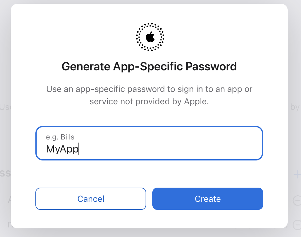
<p>To notarize, we need to create an &quot;App-specific password&quot;. To create an
App-specific password:</p>
<ul>
<li>Sign in to <a href="https://appleid.apple.com/account/home">appleid.apple.com</a></li>
<li>In the Sign-In and Security section, select App-Specific Passwords.</li>
<li>Select Generate an app-specific password or select the Add button(+).
<img src="https://www.bigbinary.com/blog/images/images_used_in_blog/2024/code-sign-notorize-mac-desktop-app/app-specific-1.png" alt="app specific password 1"></li>
<li>Then give a name for the password and click <code>Create</code>.
<img src="https://www.bigbinary.com/blog/images/images_used_in_blog/2024/code-sign-notorize-mac-desktop-app/app-specific-2.png" alt="app specific password 2"></li>
</ul>
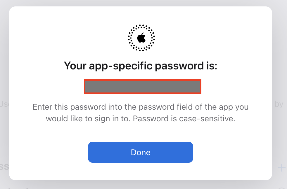
<p>A new App-Specific Password will be generated. Save it in a safe place. We will
use this password to notarize our macOS application.</p>
<h3>Update Electron build process</h3>
<p>Add <code>APPLE_APP_SPECIFIC_PASSWORD</code>, <code>TEAM_ID</code>, and <code>APPLE_ID</code> to GitHub secrets.
Then load up these secrets as environment variables along with others in our
Github Action workflow.</p>
<pre><code class="language-yml"> - name: Publish releases
    env:
      GH_TOKEN: ${{ secrets.GITHUB_TOKEN }}
      AWS_ACCESS_KEY_ID: ${{secrets.AWS_ACCESS_KEY}}
      AWS_SECRET_ACCESS_KEY: ${{secrets.AWS_SECRET}}
      CSC_CONTENT: ${{ secrets.CSC_CONTENT }}
      CSC_KEY_PASSWORD: ${{ secrets.CSC_KEY_PASSWORD }}
      TEAM_ID: ${{ secrets.TEAM_ID }}
      APPLE_ID: ${{ secrets.APPLE_ID }}
      APPLE_APP_SPECIFIC_PASSWORD: ${{ secrets.APPLE_APP_SPECIFIC_PASSWORD }}
    run: |
      echo &quot;$CSC_CONTENT&quot; | base64 --decode &gt; certificate.p12
      export CSC_LINK=&quot;./certificate.p12&quot;
      npm exec electron-builder -- --publish always -mwl

</code></pre>
<p>At the time of writing this, we encountered issues with the built-in notarize
feature of <code>electron-builder</code>, so we created a custom script to handle the
notarization process.</p>
<pre><code class="language-js">const { notarize } = require(&quot;@electron/notarize&quot;);
const { build } = require(&quot;../package.json&quot;);

const notarizeMacos = async context =&gt; {
  const { electronPlatformName, appOutDir } = context;
  if (electronPlatformName !== &quot;darwin&quot;) return;
  if (process.env.CI !== &quot;true&quot;) {
    console.warn(&quot;Skipping notarizing step. Packaging is not running in CI&quot;);
    return;
  }

  const appName = context.packager.appInfo.productFilename;
  await notarize({
    tool: &quot;notarytool&quot;,
    appBundleId: build.appId,
    appPath: `${appOutDir}/${appName}.app`,
    teamId: process.env.TEAM_ID,
    appleId: process.env.APPLE_ID,
    appleIdPassword: process.env.APPLE_APP_SPECIFIC_PASSWORD,
    verbose: true,
  });
  console.log(&quot;--- notarization completed ---&quot;);
};

exports.default = notarizeMacos;
</code></pre>
<p>The script uses the <code>notarize</code> function from the <code>@electron/notarize</code> package.
It passes the path to the generated <code>.app</code> file during the build process, along
with the required <code>TEAM_ID</code>, <code>APPLE_ID</code>, and <code>APPLE_APP_SPECIFIC_PASSWORD</code>,
which were obtained earlier.</p>
<p>To run the custom notarization script, disable the built-in notarization feature
in the <code>electron-builder</code> configuration. Then, call this script from the
<code>afterSign</code> callback to ensure it runs after the signing process is complete.</p>
<pre><code class="language-json">&quot;build&quot;: {
    &quot;mac&quot;: {
      &quot;notarize&quot;: false,
      &quot;target&quot;: {
        &quot;target&quot;: &quot;default&quot;,
        &quot;arch&quot;: [
          &quot;arm64&quot;,
          &quot;x64&quot;
        ]
      },
    },
    &quot;afterSign&quot;: &quot;./scripts/notarize.js&quot;,
}
</code></pre>
<p>Great! We have successfully code-signed and notarized our macOS application.
Now, macOS will trust our application, and an added benefit of this process is
that it allows us to auto-update our application seamlessly, ensuring that users
always have the latest version.</p>
]]></content>
    </entry>
  <entry>
      <title type="text"><![CDATA[Configuring webpack for multiple Electron windows]]></title>
      <link rel="alternate" type="text/html" href="https://www.bigbinary.com/blog/electron-multiple-browser-windows"/>
      <link rel="enclosure" type="image/jpeg" href="https://www.bigbinary.com/blog/images/social_preview_images/configuring_webpack_handle_multiple_browser.jpg"/>
      <id>https://www.bigbinary.com/blog/electron-multiple-browser-windows</id>
      <published>2024-11-12T00:00:00.000Z</published>
      <updated>2024-11-12T00:00:00.000Z</updated>
      <author>
        <name>Farhan CK</name>
        <uri>https://www.bigbinary.com/blog/authors/farhanlatheef</uri>
      </author>
      <category term="JavaScript"/>
      <category term="ReactJS"/>
      <category term="Electron"/>
      <media:thumbnail url="https://www.bigbinary.com/blog/images/social_preview_images/configuring_webpack_handle_multiple_browser.jpg" width="1200" height="627"/>
      <summary type="text"><![CDATA[How to configure webpack to handle multiple browser windows in Electron]]></summary>
      <content type="html" xml:base="https://www.bigbinary.com/blog/electron-multiple-browser-windows"><![CDATA[<p><em>Recently, we built <a href="https://neetorecord.com/neetorecord/">NeetoRecord</a>, a loom
alternative. The desktop application was built using Electron. In a series of
blogs, we capture how we built the desktop application and the challenges we ran
into. This blog is part 4 of the blog series. You can also read about
<a href="https://www.bigbinary.com/blog/sync-store-main-renderer-electron">part 1</a>,
<a href="https://www.bigbinary.com/blog/publish-electron-application">part 2</a>,
<a href="https://www.bigbinary.com/blog/video-background-removal">part 3</a>,
<a href="https://www.bigbinary.com/blog/code-sign-notorize-mac-desktop-app">part 5</a>,
<a href="https://www.bigbinary.com/blog/deep-link-electron-app">part 6</a>,
<a href="https://www.bigbinary.com/blog/request-camera-micophone-permission-electron">part 7</a>
<a href="https://www.bigbinary.com/blog/native-modules-electron">part 8</a> and
<a href="https://www.bigbinary.com/blog/ev-code-sign-windows-application-ssl-com">part 9</a>
.</em></p>
<p>When developing desktop applications with Electron, managing multiple browser
windows within a single app is often necessary. Whether we need to display
different types of content or create a more complex user interface, handling
multiple windows efficiently can be challenging.</p>
<p>In this blog, we'll explore how to configure Webpack to manage multiple browser
windows in our Electron application, ensuring that each window operates smoothly
in our project.</p>
<h3>Configuring Webpack for a Single Browser Window</h3>
<p>Before diving into the setup for multiple windows, let's first review how to
configure Webpack for a single browser window. This example focuses on the
renderer process, which is responsible for rendering the UI and handling
interactions. If interested in learning how to configure Webpack for the entire
Electron app, including the main process, check out
<a href="https://www.bigbinary.com/blog/publish-electron-application">this blog</a>.</p>
<p>Consider the following typical folder structure for an Electron project:</p>
<pre><code class="language-js">electron-app
├── assets
├── app
├── src
│   └── main
│     └── main.js
│   └── renderer
│     └── App.jsx
│     └── index.ejs
├── node_modules
├── package.json
</code></pre>
<p>This structure separates the code for the <code>main</code> and <code>renderer</code> processes, which
is a standard practice in Electron projects.</p>
<p>Here's how we can configure Webpack for a single browser window:</p>
<pre><code class="language-js">// ./config/webpack/renderer.mjs

import webpack from &quot;webpack&quot;;
import HtmlWebpackPlugin from &quot;html-webpack-plugin&quot;;

const configuration = {
  target: [&quot;web&quot;, &quot;electron-renderer&quot;],
  entry: &quot;src/renderer/App.jsx&quot;,
  output: {
    path: &quot;app/dist/renderer&quot;,
    publicPath: &quot;./&quot;,
    filename: &quot;renderer.js&quot;,
    library: {
      type: &quot;umd&quot;,
    },
  },
  module: {...},  // Module configuration (loaders, etc.)
  optimization: {...},  // Optimization settings (minification, etc.)
  plugins: [
    // Other plugins...
    new HtmlWebpackPlugin({
      filename: &quot;app.html&quot;,
      template: &quot;src/renderer/index.ejs&quot;,
    }),
  ],
};

export default configuration;
</code></pre>
<p>In this configuration:</p>
<ul>
<li>The <code>target</code> is set to <code>[&quot;web&quot;, &quot;electron-renderer&quot;]</code>, enabling both standard
web and Electron renderer environments.</li>
<li>The <code>entry</code> specifies the entry point for the renderer process, which is
<code>src/renderer/App.jsx</code>.</li>
<li>The output is bundled into a single file named <code>renderer.js</code>, which is stored
in the <code>app/dist/renderer</code> directory. In an Electron app, it's often
preferable to bundle everything into a single file since the files are loaded
locally.</li>
<li>The <code>HtmlWebpackPlugin</code> generates an <code>app.html</code> file from a template
(<code>index.ejs</code>), embedding the necessary script to load <code>renderer.js</code>.</li>
</ul>
<p>We can compile and bundle our frontend code using the following command:</p>
<pre><code class="language-bash">webpack --config ./config/webpack/renderer.mjs
</code></pre>
<p>This will produce an <code>app.html</code> file in the <code>app/dist/renderer</code> directory, along
with <code>renderer.js</code>.</p>
<pre><code class="language-html">&lt;!DOCTYPE html&gt;
&lt;html&gt;
   &lt;head&gt;
      &lt;meta charset=utf-8&gt;
      &lt;meta http-equiv=Content-Security-Policy content=&quot;script-src 'self' 'unsafe-inline'&quot;&gt;
      &lt;title&gt;MyApp&lt;/title&gt;
      &lt;script defer=defer src=./renderer.js&gt;&lt;/script&gt;
   &lt;/head&gt;
   &lt;body&gt;
      &lt;div id=root&gt;&lt;/div&gt;
   &lt;/body&gt;
&lt;/html&gt;
</code></pre>
<p>The <code>HtmlWebpackPlugin</code> correctly injects the <code>&lt;script/&gt;</code> tag to load
<code>renderer.js</code>. This <code>app.html</code> can now be loaded into a browser window from the
<code>main</code> process.</p>
<pre><code class="language-js">const appWindow = new BrowserWindow({
  show: false,
  width: 1408,
  height: 896,
});
appWindow.loadURL(&quot;app/dist/renderer/app.html&quot;);
appWindow.on(&quot;ready-to-show&quot;, () =&gt; {
  appWindow.show();
});
</code></pre>
<h3>Configuring Webpack for Multiple Browser Windows</h3>
<p>With the single window setup complete, let's add another browser window to the
app. For example, let's say we want to create a <code>Settings.jsx</code> component within
the renderer folder:</p>
<pre><code class="language-js">electron-app
├── assets
├── app
├── src
│   └── main
│     └── main.js
│   └── renderer
│     └── App.jsx
│     └── Settings.jsx
│     └── index.ejs
├── node_modules
├── package.json
</code></pre>
<p>Previously, we bundled all JavaScript code into a single <code>renderer.js</code> file.
However, since we're now working with multiple windows, it makes sense to create
separate bundles for each window—one for the <code>App</code> window and another for the
<code>Settings</code> window. To achieve this, we can specify multiple entry points in
Webpack:</p>
<pre><code class="language-js">// ./config/webpack/renderer.mjs

import webpack from &quot;webpack&quot;;
import HtmlWebpackPlugin from &quot;html-webpack-plugin&quot;;

const configuration = {
  target: [&quot;web&quot;, &quot;electron-renderer&quot;],
  entry: {
    app: &quot;src/renderer/App.jsx&quot;,
    settings: &quot;src/renderer/Settings.jsx&quot;,
  },
  output: {
    path: &quot;app/dist/renderer&quot;,
    publicPath: &quot;./&quot;,
    filename: &quot;[name].js&quot;, // Use placeholders to generate separate bundles
    library: {
      type: &quot;umd&quot;,
    },
  },
  // Other configuration options...
};

export default configuration;
</code></pre>
<p>In this configuration:</p>
<ul>
<li>The <code>entry</code> property now contains two entry points: <code>app</code> and <code>settings</code>.
Webpack will generate separate bundles for each, named <code>app.js</code> and
<code>settings.js</code> respectively.</li>
<li>The <code>filename</code> in the <code>output</code> section uses the <code>[name]</code> placeholder to
dynamically generate filenames based on the entry point names.</li>
</ul>
<p>Next, we need to generate two HTML files—one for each window. We can achieve
this by adding another instance of <code>HtmlWebpackPlugin</code> to the <code>plugins</code> array:</p>
<pre><code class="language-js">// ./config/webpack/renderer.mjs

import webpack from &quot;webpack&quot;;
import HtmlWebpackPlugin from &quot;html-webpack-plugin&quot;;

const configuration = {
  target: [&quot;web&quot;, &quot;electron-renderer&quot;],
  entry: {
    app: &quot;src/renderer/App.jsx&quot;,
    settings:&quot;src/renderer/Settings.jsx&quot;
  },
  output: {
    path: &quot;app/dist/renderer&quot;,
    publicPath: &quot;./&quot;,
    filename: '[name].js',
    library: {
      type: &quot;umd&quot;,
    },
  },
  module: {...},
  optimization: {...},
  plugins: [
    // Other plugins...
    new HtmlWebpackPlugin({
      filename: &quot;app.html&quot;,
      template: &quot;src/renderer/index.ejs&quot;,
      chunks: ['app'],  // Load only the 'app' bundle
    }),
    new HtmlWebpackPlugin({
      filename: &quot;settings.html&quot;,
      template: &quot;src/renderer/index.ejs&quot;,
      chunks: ['settings'],  // Load only the 'settings' bundle
    }),
  ],
};

export default configuration;
</code></pre>
<p>By specifying the <code>chunks</code> property for each <code>HtmlWebpackPlugin</code> instance, we
ensure that each HTML file only includes the appropriate JavaScript bundle. The
final output will include two HTML files:</p>
<pre><code class="language-html">&lt;!-- app.html --&gt;
&lt;!DOCTYPE html&gt;
&lt;html&gt;
   &lt;head&gt;
      &lt;meta charset=utf-8&gt;
      &lt;meta http-equiv=Content-Security-Policy content=&quot;script-src 'self' 'unsafe-inline'&quot;&gt;
      &lt;title&gt;MyApp&lt;/title&gt;
      &lt;script defer=defer src=./app.js&gt;&lt;/script&gt;
   &lt;/head&gt;
   &lt;body&gt;
      &lt;div id=root&gt;&lt;/div&gt;
   &lt;/body&gt;
&lt;/html&gt;

&lt;!-- settings.html --&gt;
&lt;!DOCTYPE html&gt;
&lt;html&gt;
   &lt;head&gt;
      &lt;meta charset=utf-8&gt;
      &lt;meta http-equiv=Content-Security-Policy content=&quot;script-src 'self' 'unsafe-inline'&quot;&gt;
      &lt;title&gt;MyApp&lt;/title&gt;
      &lt;script defer=defer src=./settings.js&gt;&lt;/script&gt;
   &lt;/head&gt;
   &lt;body&gt;
      &lt;div id=root&gt;&lt;/div&gt;
   &lt;/body&gt;
&lt;/html&gt;
</code></pre>
<p>Finally, from the <code>main</code> process, we can easily create two browser windows, each
with its own renderer code:</p>
<pre><code class="language-js">const appWindow = new BrowserWindow({
  show: false,
  width: 1408,
  height: 896,
});
appWindow.loadURL(&quot;app/dist/renderer/app.html&quot;);
appWindow.on(&quot;ready-to-show&quot;, () =&gt; {
  appWindow.show();
});

const settingsWindow = new BrowserWindow({
  show: false,
  width: 1408,
  height: 896,
});
settingsWindow.loadURL(&quot;app/dist/renderer/settings.html&quot;);
settingsWindow.on(&quot;ready-to-show&quot;, () =&gt; {
  settingsWindow.show();
});
</code></pre>
<p>With this setup, each browser window will load its own dedicated JavaScript
bundle, ensuring that our Electron application is both efficient and modular.
This approach not only makes our code easier to manage but also enhances the
performance of our application by reducing unnecessary code loading.</p>
]]></content>
    </entry>
  <entry>
      <title type="text"><![CDATA[Blurred and virtual video backgrounds in React apps]]></title>
      <link rel="alternate" type="text/html" href="https://www.bigbinary.com/blog/video-background-removal"/>
      <link rel="enclosure" type="image/jpeg" href="https://www.bigbinary.com/blog/images/social_preview_images/creating_virtual_background_in_video_in_react_apps.jpg"/>
      <id>https://www.bigbinary.com/blog/video-background-removal</id>
      <published>2024-11-05T00:00:00.000Z</published>
      <updated>2024-11-05T00:00:00.000Z</updated>
      <author>
        <name>Farhan CK</name>
        <uri>https://www.bigbinary.com/blog/authors/farhanlatheef</uri>
      </author>
      <category term="ReactJS"/>
      <media:thumbnail url="https://www.bigbinary.com/blog/images/social_preview_images/creating_virtual_background_in_video_in_react_apps.jpg" width="1200" height="627"/>
      <summary type="text"><![CDATA[Creating blurred or virtual backgrounds in real-time video in React apps]]></summary>
      <content type="html" xml:base="https://www.bigbinary.com/blog/video-background-removal"><![CDATA[<p><em>Recently, we built <a href="https://neetorecord.com/neetorecord/">NeetoRecord</a>, a loom
alternative. The desktop application was built using Electron. In a series of
blogs, we capture how we built the desktop application and the challenges we ran
into. This blog is part 3 of the blog series. You can also read about
<a href="https://www.bigbinary.com/blog/sync-store-main-renderer-electron">part 1</a>,
<a href="https://www.bigbinary.com/blog/publish-electron-application">part 2</a>,
<a href="https://www.bigbinary.com/blog/electron-multiple-browser-windows">part 4</a>,
<a href="https://www.bigbinary.com/blog/code-sign-notorize-mac-desktop-app">part 5</a>,
<a href="https://www.bigbinary.com/blog/deep-link-electron-app">part 6</a>,
<a href="https://www.bigbinary.com/blog/request-camera-micophone-permission-electron">part 7</a>
<a href="https://www.bigbinary.com/blog/native-modules-electron">part 8</a> and
<a href="https://www.bigbinary.com/blog/ev-code-sign-windows-application-ssl-com">part 9</a>.</em></p>
<p>Modern tools like Zoom and Google Meet allow us to blur or completely replace
our background in real-time video, creating a polished and distraction-free
environment regardless of where we are.</p>
<p>This is possible because of advancements in machine learning. In this blog,
we'll explore how to achieve real-time background blurring and replacement using
TensorFlow's body segmentation capabilities.</p>
<h3>Tensorflow body segmentation</h3>
<p>TensorFlow body segmentation is a computer vision technique that involves
dividing an image into distinct regions corresponding to different parts of a
human body. It typically employs deep learning models, such as convolutional
neural networks (CNNs), to analyze an image and predict pixel-level labels.
These labels indicate whether each pixel belongs to a specific body part, like
the head, torso, arms, or legs.</p>
<p>The segmentation process often starts with a pre-trained model, which has been
trained on large datasets. The model processes the input image through multiple
layers of convolutions and pooling, gradually refining the segmentation map. The
final output is a precise mask that outlines each body part, allowing for
applications in areas like augmented reality, fitness tracking, and virtual
try-ons.</p>
<p>To learn more about Tensorflow and body segmentation, check out the below
resources.</p>
<ul>
<li><a href="https://www.tensorflow.org/lite/examples/segmentation/overview">TensorFlow segmentation</a></li>
<li><a href="https://blog.tensorflow.org/2022/01/body-segmentation.html">Body Segmentation with MediaPipe and TensorFlow.js</a></li>
</ul>
<h3>Setting up React app</h3>
<p>We'll create a simple React app that streams video from the webcam.</p>
<pre><code class="language-js">import React, { useRef, useEffect } from &quot;react&quot;;

const App = () =&gt; {
  const videoRef = useRef(null);

  useEffect(() =&gt; {
    const getVideo = async () =&gt; {
      try {
        const stream = await navigator.mediaDevices.getUserMedia({
          video: true,
        });
        if (videoRef.current) {
          videoRef.current.srcObject = stream;
        }
      } catch (err) {
        console.error(&quot;Error accessing webcam: &quot;, err);
      }
    }

    getVideo();

    return () =&gt; {
      if (videoRef.current &amp;&amp; videoRef.current.srcObject) {
        videoRef.current.srcObject.getTracks().forEach(track =&gt; track.stop());
      }
    };
  }, []);

  return (
    &lt;div&gt;
      &lt;video ref={videoRef} autoPlay width=&quot;640&quot; height=&quot;480&quot; style={transform: 'scaleX(-1)'}/&gt;
    &lt;/div&gt;
  );
}

export default App;
</code></pre>
<p>In the code above, we render a <code>&lt;video&gt;</code> element, and once the app is mounted,
we obtain the video stream from the user's webcam using
<code>navigator.mediaDevices.getUserMedia</code>. This call will prompt the user to grant
permission to access their camera. Once the user grants permission, the video
stream is captured and rendered in the <code>&lt;video&gt;</code> element.</p>
<h3>Installing packages</h3>
<p>Next, let's add the necessary TensorFlow packages.</p>
<pre><code class="language-bash">yarn add @tensorflow/tfjs-core @tensorflow/tfjs-converter @tensorflow-models/body-segmentation @mediapipe/selfie_segmentation
</code></pre>
<p><code>@tensorflow/tfjs-core</code> is the core JavaScript package for TensorFlow,
<code>@tensorflow-models/body-segmentation</code> contains all the functions we need for
body segmentation, and <code>@mediapipe/selfie_segmentation</code> is our pre-trained
model.</p>
<h3>Creating body segmenter</h3>
<p>The TensorFlow body segmentation package provides a pre-trained
<code>MediaPipeSelfieSegmentation</code> model for segmenting the human body in images and
videos. This model is specifically designed for the upper body. If our
requirement involves the entire body, we may want to consider other models like
<a href="https://github.com/tensorflow/tfjs-models/tree/master/body-pix">BodyPix</a>.</p>
<p>We need to load this model to create a segmenter.</p>
<pre><code class="language-js">import * as bodySegmentation from &quot;@tensorflow-models/body-segmentation&quot;;

const createSegmenter = async () =&gt; {
  const model = bodySegmentation.SupportedModels.MediaPipeSelfieSegmentation;
  const segmenterConfig = {
    runtime: &quot;mediapipe&quot;,
    solutionPath: &quot;https://cdn.jsdelivr.net/npm/@mediapipe/selfie_segmentation&quot;,
    modelType: &quot;general&quot;,
  };
  return bodySegmentation.createSegmenter(model, segmenterConfig);
};
</code></pre>
<p>We load the model from a CDN, configure the runtime as <code>mediapipe</code>, and set the
modelType to <code>general</code>. Then, we create the <code>segmenter</code> using the
<code>bodySegmentation.createSegmenter</code> method.</p>
<pre><code class="language-js">// ./videoBackground.js
import * as bodySegmentation from &quot;@tensorflow-models/body-segmentation&quot;;

const createSegmenter = async () =&gt; {
  const model = bodySegmentation.SupportedModels.MediaPipeSelfieSegmentation;
  const segmenterConfig = {
    runtime: &quot;mediapipe&quot;,
    solutionPath: &quot;https://cdn.jsdelivr.net/npm/@mediapipe/selfie_segmentation&quot;,
    modelType: &quot;general&quot;,
  };
  return bodySegmentation.createSegmenter(model, segmenterConfig);
};

class VideoBackground {
  #segmenter;

  getSegmenter = async () =&gt; {
    if (!this.#segmenter) {
      this.#segmenter = await createSegmenter();
    }
    return this.#segmenter;
  };
}

const videoBackground = new VideoBackground();
export default videoBackground;
</code></pre>
<p>Here, we define a <code>VideoBackground</code> class and create an instance of it. Inside
the class, the <code>getSegmenter</code> function ensures that the <code>segmenter</code> is created
only once, so we don't have to recreate it each time.</p>
<h3>Blur the video background</h3>
<p>Before we continue further, let's update our demo app. Since we are going to
modify the video, we need a <code>&lt;canvas/&gt;</code> to display the modified video. Add that
to our demo app.</p>
<pre><code class="language-js">// rest of the code...
const App = () =&gt; {
  const canvasRef = useRef();
  // rest of the code...
  return (
    &lt;div&gt;
      &lt;video
        ref={videoRef}
        autoPlay
        width=&quot;640&quot;
        height=&quot;480&quot;
        style={{ display: &quot;none&quot; }}
      /&gt;
      &lt;canvas ref={canvasRef} width=&quot;640&quot; height=&quot;480&quot; style={transform: 'scaleX(-1)'}/&gt;
    &lt;/div&gt;
  );
}
</code></pre>
<p>Also, hide the <code>&lt;video&gt;</code> element by setting <code>display: &quot;none&quot;</code> since we don't
want to display the raw video.</p>
<p>Next, create a function within the <code>VideoBackground</code> class to blur the video.</p>
<pre><code class="language-js">// rest of the code...
class VideoBackground {
  // rest of the code...

  #animationId;
  stop = () =&gt; {
    cancelAnimationFrame(this.#animationId);
  };

  blur = async (canvas, video) =&gt; {
    const foregroundThreshold = 0.5;
    const edgeBlurAmount = 15;
    const flipHorizontal = false;
    const blurAmount = 5;
    const segmenter = await this.getSegmenter();

    const processFrame = async () =&gt; {
      const segmentation = await segmenter.segmentPeople(video);
      await bodySegmentation.drawBokehEffect(
        canvas,
        video,
        segmentation,
        foregroundThreshold,
        blurAmount,
        edgeBlurAmount,
        flipHorizontal
      );
      this.#animationId = requestAnimationFrame(processFrame);
    };
    this.#animationId = requestAnimationFrame(processFrame);
  };
}
</code></pre>
<p>The <code>blur</code> function takes <code>video</code> and <code>canvas</code> references. It uses
<code>requestAnimationFrame</code> to continuously draw the resulting image onto the
<code>canvas</code>. First, it creates a body segmentation using the
<code>segmenter.segmentPeople</code> function by passing the video reference. This allows
us to identify which pixels belong to the background and foreground.</p>
<p>To achieve the blurred effect, we use the <code>bodySegmentation.drawBokehEffect</code>
function, which applies a blur to the background pixels. This function accepts
additional configurations like <code>foregroundThreshold</code>, <code>blurAmount</code>, and
<code>edgeBlurAmount</code>, which we can adjust to customize the effect.</p>
<p>We've also added a <code>stop</code> function to halt video processing by canceling the
recursive <code>requestAnimationFrame</code> calls.</p>
<pre><code class="language-jsx">import React, { useRef, useEffect, useState } from &quot;react&quot;;

function App() {
  const [cameraReady, setCameraReady] = useState(false);
  // rest of the code...

  &lt;video
    // rest of the code...
    onLoadedMetadata={() =&gt; setCameraReady(true)}
  /&gt;;
  // rest of the code...
}
</code></pre>
<p>Before calling the <code>blur</code> function, ensure the video is loaded by waiting for
the <code>onLoadedMetadata</code> event to be triggered.</p>
<p>All set; let's blur the video background.</p>
<pre><code class="language-jsx">import React, { useRef, useEffect, useState } from &quot;react&quot;;

import videoBackground from &quot;./videoBackground&quot;;

function App() {
  const [cameraReady, setCameraReady] = useState(false);
  const videoRef = useRef(null);
  const canvasRef = useRef();

  useEffect(() =&gt; {
    async function getVideo() {
      try {
        const stream = await navigator.mediaDevices.getUserMedia({
          video: true,
        });
        if (videoRef.current) {
          videoRef.current.srcObject = stream;
        }
      } catch (err) {
        console.error(&quot;Error accessing webcam: &quot;, err);
      }
    }

    getVideo();

    return () =&gt; {
      if (videoRef.current &amp;&amp; videoRef.current.srcObject) {
        videoRef.current.srcObject.getTracks().forEach(track =&gt; track.stop());
      }
    };
  }, []);

  useEffect(() =&gt; {
    if (!cameraReady) return;
    videoBackground.blur(canvasRef.current, videoRef.current);
    return () =&gt; {
      videoBackground.stop();
    };
  }, [cameraReady]);

  return (
    &lt;div className=&quot;App&quot;&gt;
      &lt;video
        ref={videoRef}
        autoPlay
        width=&quot;640&quot;
        height=&quot;480&quot;
        style={{ display: &quot;none&quot; }}
        onLoadedMetadata={() =&gt; setCameraReady(true)}
      /&gt;
      &lt;canvas ref={canvasRef} width=&quot;640&quot; height=&quot;480&quot; /&gt;
    &lt;/div&gt;
  );
}

export default App;
</code></pre>
<p>Here, we added another <code>useEffect</code> that triggers when <code>cameraReady</code> is <code>true</code>.
Inside this <code>useEffect</code>, we call the <code>videoBackground.blur</code> function, passing
the <code>canvas</code> and <code>video</code> refs. When the component unmounts, we stop the video
processing by calling the <code>videoBackground.stop()</code> function.</p>
<h3>Replace with a virtual background</h3>
<p>If we feel that just blurring is not enough and want to completely replace the
background, we need to remove the background from the video and place an
<code>&lt;img/&gt;</code> behind the <code>&lt;canvas/&gt;</code>. To remove the background, we can utilize the
<code>bodySegmentation.toBinaryMask</code> function. This function will return an
<a href="https://developer.mozilla.org/en-US/docs/Web/API/ImageData">ImageData</a> with its
alpha channel being <code>255</code> for the background and <code>0</code> for the foreground. We can
use this info in the original data and set the background pixels' alpha to be
<code>transparent</code>.</p>
<pre><code class="language-js">// rest of the code...
class VideoBackground {
  // rest of the code...

  remove = async (canvas, video) =&gt; {
    const context = canvas.getContext(&quot;2d&quot;);
    const segmenter = await this.getSegmenter();
    const processFrame = async () =&gt; {
      context.drawImage(video, 0, 0);
      const segmentation = await segmenter.segmentPeople(video);
      const coloredPartImage = await bodySegmentation.toBinaryMask(
        segmentation
      );
      const imageData = context.getImageData(
        0,
        0,
        video.videoWidth,
        video.videoHeight
      );
      // imageData format; [R,G,B,A,R,G,B,A...]
      // below for loop iterate through alpha channel
      for (let i = 3; i &lt; imageData.data.length; i += 4) {
        // Background pixel's alpha will be 255.
        if (coloredPartImage.data[i] === 255) {
          imageData.data[i] = 0; // this is a background pixel's alpha. Make it fully transparent
        }
      }
      await bodySegmentation.drawMask(canvas, imageData);
      this.#animationId = requestAnimationFrame(processFrame);
    };
    this.#animationId = requestAnimationFrame(processFrame);
  };
}
</code></pre>
<p>Similar to the blurring process, inside <code>processFrame</code>, we first create the
segmentation using <code>segmenter.segmentPeople</code> and convert it to a binary mask
using <code>bodySegmentation.toBinaryMask</code>. We then obtain the original image data
with <code>context.getImageData</code>. Next, we loop through the image data to make the
background pixels transparent. Finally, we draw the result on the canvas using
<code>bodySegmentation.drawMask</code>.</p>
<p>Before calling this function, let's modify our demo app by adding an option to
switch between <code>none</code>, <code>blur</code>, and <code>image</code> effects, rather than removing the
blur function. Additionally, include a background image.</p>
<pre><code class="language-js">const BACKGROUND_OPTIONS = [&quot;none&quot;, &quot;blur&quot;, &quot;image&quot;];
function App() {
  const [backgroundType, setBackgroundType] = useState(BACKGROUND_OPTIONS[0]);
  // rest of the code...

  return (
    &lt;div&gt;
      // rest of the code...
      {backgroundType === &quot;image&quot; &amp;&amp; (
        &lt;img
          alt=&quot;&quot;
          style={{
            position: &quot;absolute&quot;,
            top: 0,
            bottom: 0,
            width: &quot;640px&quot;,
            height: &quot;480px&quot;,
          }}
          src=&quot;/bgImage.png&quot;
        /&gt;
      )}
      // rest of the code...
      &lt;div&gt;
        &lt;select
          value={backgroundType}
          onChange={e =&gt; setBackgroundType(e.target.value)}
        &gt;
          {BACKGROUND_OPTIONS.map(option =&gt; (
            &lt;option value={option} key={option}&gt;
              {option}
            &lt;/option&gt;
          ))}
        &lt;/select&gt;
      &lt;/div&gt;
    &lt;/div&gt;
  );
}
</code></pre>
<p>Here, we added a <code>&lt;select&gt;</code> element to choose between <code>none</code>, <code>blur</code>, and
<code>image</code>, and an <code>&lt;img&gt;</code> element to display the background image, which will
serve as our virtual background.</p>
<p>All set. Now, let's update the <code>useEffect</code>.</p>
<pre><code class="language-js">useEffect(() =&gt; {
  if (!cameraReady || backgroundType === &quot;none&quot;) return;

  const bgFn =
    backgroundType === &quot;blur&quot; ? videoBackground.blur : videoBackground.remove;

  bgFn(canvasRef.current, videoRef.current);

  return () =&gt; {
    videoBackground.stop();
  };
}, [cameraReady, backgroundType]);
</code></pre>
<p>Based on the selection, we will call either <code>videoBackground.blur</code> or
<code>videoBackground.remove</code>.</p>
<p>Full working example can be found in this
<a href="https://github.com/bigbinary/tensorflow-body-segmentation-example">Github repo</a>.</p>
]]></content>
    </entry>
  <entry>
      <title type="text"><![CDATA[Syncing state between Electron main and renderer]]></title>
      <link rel="alternate" type="text/html" href="https://www.bigbinary.com/blog/sync-store-main-renderer-electron"/>
      <link rel="enclosure" type="image/jpeg" href="https://www.bigbinary.com/blog/images/social_preview_images/creating_synchronized_store_between_main_and_renderer_process_in_electron.jpg"/>
      <id>https://www.bigbinary.com/blog/sync-store-main-renderer-electron</id>
      <published>2024-10-01T00:00:00.000Z</published>
      <updated>2024-10-01T00:00:00.000Z</updated>
      <author>
        <name>Farhan CK</name>
        <uri>https://www.bigbinary.com/blog/authors/farhanlatheef</uri>
      </author>
      <category term="JavaScript"/>
      <category term="ReactJS"/>
      <category term="Electron"/>
      <media:thumbnail url="https://www.bigbinary.com/blog/images/social_preview_images/creating_synchronized_store_between_main_and_renderer_process_in_electron.jpg" width="1200" height="627"/>
      <summary type="text"><![CDATA[Creating a synchronized store between main and renderer process in Electron]]></summary>
      <content type="html" xml:base="https://www.bigbinary.com/blog/sync-store-main-renderer-electron"><![CDATA[<p><em>Recently, we built <a href="https://neetorecord.com/neetorecord/">NeetoRecord</a>, a loom
alternative. The desktop application was built using Electron. In a series of
blogs, we capture how we built the desktop application and the challenges we ran
into. This blog is part 1 of the blog series. You can also read
<a href="https://www.bigbinary.com/blog/publish-electron-application">part 2</a>,
<a href="https://www.bigbinary.com/blog/video-background-removal">part 3</a>,
<a href="https://www.bigbinary.com/blog/electron-multiple-browser-windows">part 4</a>,
<a href="https://www.bigbinary.com/blog/code-sign-notorize-mac-desktop-app">part 5</a>,
<a href="https://www.bigbinary.com/blog/deep-link-electron-app">part 6</a>,
<a href="https://www.bigbinary.com/blog/request-camera-micophone-permission-electron">part 7</a>
<a href="https://www.bigbinary.com/blog/native-modules-electron">part 8</a> and
<a href="https://www.bigbinary.com/blog/ev-code-sign-windows-application-ssl-com">part 9</a>
.</em></p>
<p>When building desktop applications with <a href="https://electronjs.org/">Electron</a>, one
of the key challenges developers often face is managing the shared state between
the <code>main</code> process and multiple <code>renderer</code> processes. While the <code>main</code> process
handles the core application logic, <code>renderer</code> processes are responsible for the
user interface. However, they often need access to the same data, like user
preferences, application state, or session information.</p>
<p>Electron does not natively provide a way to persist data, let alone give a
synchronized state across these processes.</p>
<h3>electron-store to store data persistently</h3>
<p>Since Electron doesn't have a built-in way to persist data, We can use
<a href="https://github.com/sindresorhus/electron-store">electron-store</a>, an npm package
to store data persistently. <code>electron-store</code> stores the data in a JSON file
named <code>config.json</code> in <code>app.getPath('userData')</code>.</p>
<p>Even though we can configure <code>electron-store</code> to be made directly available in
the <code>renderer</code> process, it is recommended not to do so. The best way is to
expose it via
<a href="https://www.electronjs.org/docs/latest/tutorial/tutorial-preload">Electron's preload script</a>.</p>
<p>Let's look at how we can expose the <code>electron store</code> to the renderer via a
preload script.</p>
<pre><code class="language-js">// preload.js
import { contextBridge, ipcRenderer } from &quot;electron&quot;;

const electronHandler = {
  store: {
    get(key) {
      return ipcRenderer.sendSync(&quot;get-store&quot;, key);
    },
    set(property, val) {
      ipcRenderer.send(&quot;set-store&quot;, property, val);
    },
  },
  // ...others code
};
contextBridge.exposeInMainWorld(&quot;electron&quot;, electronHandler);
</code></pre>
<p>Here, we exposed a <code>set</code> function that calls the <code>ipcRenderer.send</code> method,
which just sends a message to the <code>main</code> process. The <code>get</code> function calls the
<code>ipcRenderer.sendSync</code> method, which will send a message to the <code>main</code> process
while expecting a return value.</p>
<p>Now, let's add <code>ipcMain</code> events to handle these requests in the <code>main</code> process.</p>
<pre><code class="language-js">import Store from &quot;electron-store&quot;;

const store = new Store();

ipcMain.on(&quot;get-store&quot;, async (event, val) =&gt; {
  event.returnValue = store.get(val);
});
ipcMain.on(&quot;set-store&quot;, async (_, key, val) =&gt; {
  store.set(key, val);
});
</code></pre>
<p>In the <code>main</code> process, we created an <code>electron-store</code> instance and added
<code>get-store</code> and <code>set-store</code> event handlers to retrieve and set data from the
store.</p>
<p>Now, we can read and write data from any <code>renderer</code> process without exposing the
whole <code>electron-store</code> class to it.</p>
<pre><code class="language-js">window.electron.store.set(&quot;key&quot;, &quot;value&quot;);
window.electron.store.get(&quot;key&quot;);
</code></pre>
<h2>Synchronization</h2>
<p>Since we sorted out the storage issue, let's look into how we can synchronize
data between the <code>main</code> process and all its <code>renderer</code> processes.</p>
<p>Before we start synchronization, let's create a simple utility function that can
send a message to all active <code>renderer</code> processes or, in other words, browser
windows (we will use the terms <code>renderer</code> process and browser windows
interchangeably).</p>
<pre><code class="language-js">export const sendToAll = (channel, msg) =&gt; {
  BrowserWindow.getAllWindows().forEach(browseWindow =&gt; {
    browseWindow.webContents.send(channel, msg);
  });
};
</code></pre>
<p><code>BrowserWindow.getAllWindows()</code> returns all active browser windows, and
<code>browseWindow.webContents.send</code> is the standard way of sending a message from
<code>main</code> to a <code>renderer</code> process.</p>
<h3>electron-store onDidChange</h3>
<p><code>electron-store</code> provides an option to add an event listener when there is a
change in the store called <code>onDidChange</code>. This is the key feature we are going
to use to create synchronization.</p>
<pre><code class="language-js">store.onDidChange(&quot;key&quot;, newValue =&gt; {
  // TODO
});
</code></pre>
<p>Not all data needs to be synchronized. So, instead of adding <code>onDidChange</code> to
every field, let's expose an API for the <code>renderer</code> process so that it can
decide which data it needs and subscribe to it.</p>
<pre><code class="language-js">import Store from &quot;electron-store&quot;;

const store = new Store();
const subscriptions = new Map();

ipcMain.on(&quot;get-store&quot;, async (event, val) =&gt; {
  event.returnValue = store.get(val);
});
ipcMain.on(&quot;set-store&quot;, async (_, key, val) =&gt; {
  store.set(key, val);
});

ipcMain.on(&quot;subscribe-store&quot;, async (event, key) =&gt; {
  const unsubscribeFn = store.onDidChange(key, newValue =&gt; {
    sendToAll(`onChange:${key}`, newValue);
  });
  subscriptions.set(key, unsubscribeFn);
});
</code></pre>
<p>Here, we exposed another API called <code>subscribe-store</code>. When calling that API
with a key, we listen to that field's <code>onDidChange</code> event. Then, when the
<code>onDidChange</code> triggers, we call the <code>sendToAll</code> function we created earlier, and
all the <code>renderer</code> processes listening to these changes will be notified with
the latest data. For example, if a field called <code>user</code> is subscribed to changes,
we send a message to all <code>renderer</code> processes with the new value on a channel
called <code>onChange:user.</code> We will soon add code in the <code>renderer</code> process to
handle this.</p>
<p><code>store.onDidChange</code> returns the <code>unsubscribe</code> function for that particular key.
Since we won't be unsubscribing straight away, we need to store this function
for later use. Here, we are storing it in a hash map against the same key.</p>
<p>Let's add an option to unsubscribe as well.</p>
<pre><code class="language-js">//... other codes

ipcMain.on(&quot;unsubscribe-store&quot;, async (event, key) =&gt; {
  subscriptions.get(key)();
});
</code></pre>
<h3>Update preload script</h3>
<p>Let's update the preload script to support the store's
subscription/unsubscribing.</p>
<pre><code class="language-js">// preload.js
import { contextBridge, ipcRenderer } from &quot;electron&quot;;

const electronHandler = {
  store: {
    get(key) {
      return ipcRenderer.sendSync(&quot;get-store&quot;, key);
    },
    set(property, val) {
      ipcRenderer.send(&quot;set-store&quot;, property, val);
    },
    subscribe(key, func) {
      ipcRenderer.send(&quot;subscribe-store&quot;, key);
      const subscription = (_event, ...args) =&gt; func(...args);
      const channelName = `onChange:${key}`;
      ipcRenderer.on(channelName, subscription);

      return () =&gt; {
        ipcRenderer.removeListener(channelName, subscription);
      };
    },
    unsubscribe(key) {
      ipcRenderer.send(&quot;unsubscribe-store&quot;, key);
    },
  },
  // ...others code
};
contextBridge.exposeInMainWorld(&quot;electron&quot;, electronHandler);
</code></pre>
<p>We add two APIs here, <code>subscribe</code> and <code>unsubscribe</code>. While <code>unsubscribe</code> is
straightforward, <code>subscribe</code> might need some explanation. It exposes two
arguments, a store key and a callback function, to be called when there is a
change to that field.</p>
<p>First, we call <code>subscribe-store</code> to subscribe to change to that data field;
then, we listen to <code>ipcRenderer.on</code> for any changes. For example, when there is
a change to the <code>user</code> field, <code>sendToAll</code> will propagate the change, and here we
are listening to it on <code>onChange:user</code>.</p>
<p>Now, from a <code>renderer</code> process, if it needs to be notified of changes to the
<code>user</code> field, we can subscribe to it like below.</p>
<pre><code class="language-js">window.electron.store.subscribe(&quot;user&quot;, newUser =&gt; {
  // TODO
});
</code></pre>
<h3>useSyncExternalStore</h3>
<p>React provides a hook to connect to an external store called
<code>useSyncExternalStore</code>. It expects two functions as arguments.</p>
<ul>
<li>The <code>subscribe</code> function should subscribe to the store and return an
unsubscribe function.</li>
<li>The <code>getSnapshot</code> function should read a snapshot of the data from the store.</li>
</ul>
<p>In the <code>renderer</code> process, create a <code>SyncedStore</code> class with <code>subscribe</code> and
<code>getSnapshot</code> functions that <code>useSyncExternalStore</code> expects.</p>
<pre><code class="language-js">class SyncedStore {
  snapshot;
  defaultValue;
  storageKey;
  constructor(defaultValue = &quot;&quot;, storageKey) {
    this.defaultValue = defaultValue;
    this.snapshot = window.electron.store.get(storageKey) ?? defaultValue;
    this.storageKey = storageKey;
  }
  getSnapshot = () =&gt; this.snapshot;

  subscribe = callback =&gt; {
    // TODO
  };
}
</code></pre>
<p>Here, we created a generic class that takes a <code>defaultValue</code> and <code>storageKey</code>.
While creating the object, we loaded the existing data for that field from the
<code>main</code> store.</p>
<p>When React tries to subscribe to this using <code>useSyncExternalStore</code>, we need to
call our <code>main</code> store's subscribe.</p>
<pre><code class="language-js">class SyncedStore {
  snapshot;
  defaultValue;
  storageKey;
  constructor(defaultValue = &quot;&quot;, storageKey) {
    this.defaultValue = defaultValue;
    this.snapshot = window.electron.store.get(storageKey) ?? defaultValue;
    this.storageKey = storageKey;
  }
  getSnapshot = () =&gt; this.snapshot;

  subscribe = callback =&gt; {
    window.electron.store.subscribe(this.storageKey, callback);
    return () =&gt; {
      window.electron.store.unsubscribe(this.storageKey);
    };
  };
}
</code></pre>
<p>We have our <code>SyncedStore</code> ready, but it's a bit inefficient; for example, if we
are subscribed to the same <code>storageKey</code> in multiple places, it will create a
subscription for each instance in the main store. That is needless IPC
communications for the same data.</p>
<p>Let's improve this a bit so that only one subscription is registered per browser
window(<code>renderer</code> process), and if there are multiple use cases of the same,
let's handle it internally.</p>
<pre><code class="language-js">class SyncedStore {
  snapshot;
  defaultValue;
  storageKey;
  listeners = new Set();
  constructor(defaultValue = &quot;&quot;, storageKey) {
    this.defaultValue = defaultValue;
    this.snapshot = window.electron.store.get(storageKey) ?? defaultValue;
    this.storageKey = storageKey;
  }
  getSnapshot = () =&gt; this.snapshot;

  onChange = newValue =&gt; {
    if (JSON.stringify(newValue) === JSON.stringify(this.snapshot)) return;
    this.snapshot = newValue ?? this.defaultValue;
    this.listeners.forEach(listener =&gt; listener());
  };

  subscribe = callback =&gt; {
    this.listeners.add(callback);
    if (this.listeners.size === 1) {
      window.electron.store.subscribe(this.storageKey, this.onChange);
    }
    return () =&gt; {
      this.listeners.delete(callback);
      if (this.listeners.size !== 0) return;
      window.electron.store.unsubscribe(this.storageKey);
    };
  };
}
</code></pre>
<p>We made the change so that only one request is sent to <code>main</code>; the rest of the
subscriptions are stored internally and respond to it when the first one is
notified.</p>
<p>We also added additional checks to ensure that rerender is not triggered if
there are no changes to the data.</p>
<h3>Usage</h3>
<p>Now, whenever a synchronized store for a field is needed, we just need to create
an instance of this class and pass it to <code>useSyncExternalStore</code>.</p>
<pre><code class="language-js">import { useSyncExternalStore } from &quot;react&quot;;

const createSyncedStore = ({ defaultValue, storageKey }) =&gt; {
  const store = new SyncedStore(defaultValue, storageKey);
  return () =&gt; useSyncExternalStore(store.subscribe, store.getSnapshot);
};

const useUser = createSyncedStore({
  storageKey: &quot;user&quot;,
  defaultValue: { firstName: &quot;Oliver&quot;, lastName: &quot;Smith&quot; },
});

const App = () =&gt; {
  const user = useUser();

  return &lt;div&gt;Name: {`${user.firstName} ${user.lastName}`}&lt;/div&gt;;
};
</code></pre>
<p>Now, if we update the <code>user</code> field from anywhere, let it be from any <code>renderer</code>
process or <code>main</code>.</p>
<pre><code class="language-js">window.electron.store.set(&quot;user&quot;, { firstName: &quot;John&quot;, lastName: &quot;Smith&quot; });
</code></pre>
<p>The above <code>App</code> component will be rerendered with the latest user data.</p>
]]></content>
    </entry>
  <entry>
      <title type="text"><![CDATA[Standardizing pagination, sorting and search in code]]></title>
      <link rel="alternate" type="text/html" href="https://www.bigbinary.com/blog/standardize-pagination-keywords"/>
      <link rel="enclosure" type="image/jpeg" href="https://www.bigbinary.com/blog/images/social_preview_images/simplifying_code_with_standardized_pagination_sorting_search.jpg"/>
      <id>https://www.bigbinary.com/blog/standardize-pagination-keywords</id>
      <published>2024-08-27T00:00:00.000Z</published>
      <updated>2024-08-27T00:00:00.000Z</updated>
      <author>
        <name>Abilash Sajeev</name>
        <uri>https://www.bigbinary.com/blog/authors/abilash-sajeev</uri>
      </author>
      <category term="ReactJS"/>
      <category term="Rails"/>
      <media:thumbnail url="https://www.bigbinary.com/blog/images/social_preview_images/simplifying_code_with_standardized_pagination_sorting_search.jpg" width="1200" height="627"/>
      <summary type="text"><![CDATA[Explore the power of standardized naming practices in creating a unified and scalable codebase.]]></summary>
      <content type="html" xml:base="https://www.bigbinary.com/blog/standardize-pagination-keywords"><![CDATA[<p><a href="https://www.neeto.com">Neeto</a> is a collection of products. Here, we standardize
boilerplate and repetitive code into
<a href="https://blog.neeto.com/p/nanos-make-neeto-better">Nanos</a>. The search, sorting,
and pagination functionalities are essential for every listing page. We realized
that each product had its own custom implementations for these operations,
resulting in a lot of duplicated code. We wanted this logic to be abstracted and
handled uniformly.</p>
<h2>Sorting and pagination</h2>
<p>If you have worked with tables, you may already be familiar with the following
code. In this example, we are using the
<a href="https://neeto-ui.neeto.com/?path=/docs/components-table--docs">Table</a> component
from <a href="https://neeto-ui.neeto.com/">NeetoUI</a>. It is the developer's
responsibility to handle the sorting and pagination logic, make the API calls
with an updated payload, and ensure that the URL is updated accordingly.</p>
<pre><code class="language-javascript">import React, { useState } from &quot;react&quot;;
import { Table } from &quot;@bigbinary/neetoui&quot;;

const Teams = () =&gt; {
  const [page, setPage] = useState(1);
  const [sortBy, setSortBy] = useState(null);
  const [orderBy, setOrderBy] = useState(null);

  const handleSort = ({ sortBy, orderBy }) =&gt; {
    setSortBy(sortBy);
    setOrderBy(orderBy);
    // Custom sort logic
  };

  const handlePageChange = page =&gt; {
    setPage(page);
    // Custom pagination logic.
  };

  const { data: teams, isLoading } = useFetchTeams({ page, sortBy, orderBy });

  return (
    &lt;Table
      currentPageNumber={page}
      handlePageChange={handlePageChange}
      onChange={(_, __, sorter) =&gt; handleSort(sorter)}
      {...{ totalCount, rowData, columnData, ...otherProps }}
    /&gt;
  );
};

export default Teams;
</code></pre>
<p>To make both the frontend and backend more standardized and reusable, we
established some conventions. The NeetoUI Table will handle both sorting and
pagination internally. When the user navigates to a different page, NeetoUI will
update the <code>page</code> and <code>page_size</code> query parameters in the URL.</p>
<p>Similarly, when a column is sorted, the <code>sort_by</code> and <code>order_by</code> query
parameters are updated. We no longer need a dedicated state to store these
values. When the query parameter changes, the API will be called with the
modified payload.</p>
<p>Here is what the simplified code looks like:</p>
<pre><code class="language-javascript">import React from &quot;react&quot;;
import { Table } from &quot;@bigbinary/neetoui&quot;;
import { useQueryParams } = &quot;@bigbinary/neeto-commons-frontend/react-utils&quot;

const Teams = () =&gt; {
  const { page, sortBy, orderBy } = useQueryParams();

  const { data: teams, isLoading } = useFetchTeams({ page,
                                                     sortBy,
                                                     orderBy });

  return (
    &lt;Table {...{ totalCount, rowData, columnData, ...otherProps }} /&gt;
  );
};
export default Teams;
</code></pre>
<p>Here, we utilize a <code>useQueryParams</code> utility helper. It parses the URL and
returns the query parameters after converting them to camel case.</p>
<p>We noticed that a similar cleanup can be done on the backend side. After
establishing a consistent variable naming convention for <code>page</code>, <code>page_size</code>,
<code>order_by</code>, and <code>sort_by</code> in every listing page, it became easier to create
common utility functions for the backend. Here's what it looks like:</p>
<pre><code class="language-ruby">module Filterable
  extend ActiveSupport::Concern
  include Pagy::Backend

  def sort_and_paginate(records)
    sorted_records = apply_sort(records)
    apply_pagination(sorted_records)
  end

  def apply_sort(records)
    records.order(sort_by =&gt; order_by)
  end

  def sort_by
    params[:sort_by].presence || &quot;created_at&quot;
  end

  def order_by
    case params[:order_by]&amp;.downcase
    when &quot;asc&quot;, &quot;ascend&quot;
      &quot;ASC&quot;
    when &quot;desc&quot;, &quot;descend&quot;
      &quot;DESC&quot;
    else
      &quot;ASC&quot;
    end
  end

  def apply_pagination(records)
    pagination_method = records.is_a?(ActiveRecord::Relation) ? :pagy : :pagy_array
    pagy, paginated_records = send(pagination_method, records, page: params[:page], items: params[:page_size])

    [pagy, paginated_records]
  end
end
</code></pre>
<p>The <code>apply_pagination</code> helper method can be used to paginate the results. It
uses the <code>Pagy</code> gem internally to perform the pagination. It provides a generic
method <code>pagy</code> that works with <code>ActiveRecord</code> out of the box. It also provides a
<code>pagy_array</code> method which paginates an array of records. Both these methods
returns a <code>Pagy</code> instance along with the paginated records.</p>
<p>The <code>apply_sort</code> method sorts the given records based on a specified column name
and direction. By default, records are sorted in ascending order of <code>created_at</code>
timestamps, but this can be customized by specifying values for <code>sort_by</code> and
<code>order_by</code> params. As sorting and pagination are common requirements of the
listing pages, we also added a <code>sort_and_paginate</code> method which performs both
these operations on provided records.</p>
<h2>Searching</h2>
<p>Searching is a common functionality in any web application. Developers need to
ensure that the results are refetched whenever the search term changes. The
debouncing logic is added to minimize API requests and improve user experience.
As you can see in the below snippet, we had to maintain a dedicated state for
search term as well.</p>
<pre><code class="language-javascript">import React, { useState } from &quot;react&quot;;
import { useDebounce } from &quot;@bigbinary/neeto-commons-frontend/react-utils&quot;;
import { useFetchTeams } from &quot;hooks/reactQuery/useFetchTeamsApi&quot;;

const Teams = () =&gt; {
  const [searchString, setSearchString] = useState(&quot;&quot;);
  const debouncedSearchString = useDebounce(searchString.trim());

  const { data: teams, isLoading } = useFetchTeams(debouncedSearchString);

  return (
    &lt;Input
      type=&quot;search&quot;
      value={searchString}
      onChange={({ target: { value } }) =&gt; setSearchString(value)}
    /&gt;
  );
};

export default Teams;
</code></pre>
<p>As we standardized the naming pattern for the search term, we were able to directly
incorporate the search term value into the URL query parameters. This helped us
to retrieve the search term, eliminating the need for a separate state.</p>
<p>We also introduced a new component in
<a href="https://neeto-molecules.neeto.com">NeetoMolecules</a>, to handle the search
functionality in all products. This
<a href="https://neeto-molecules.neeto.com/?path=/docs/search--docs">Search</a> component
will internally handle the debounced updates when the search term changes. It
will also update the <code>search_term</code> query param in URL. Here is what the
simplified code looks like:</p>
<pre><code class="language-javascript">import React from &quot;react&quot;;
import Search from &quot;@bigbinary/neeto-molecules/Search&quot;;
import { useFetchTeams } from &quot;hooks/reactQuery/useFetchTeamsApi&quot;;

const Teams = () =&gt; {
  const { searchTerm = &quot;&quot; } = useQueryParams();

  const { data: teams, isLoading } = useFetchTeams(searchTerm);

  return &lt;Search /&gt;;
};

export default Teams;
</code></pre>
<p>We also updated the <code>Filterable</code> concern mentioned earlier to simplify the logic
in the backend. The <code>search_term</code> method retrieves the keyword specified in the
URL query parameters, while <code>search?</code> checks whether the results should be
filtered based on any keyword.</p>
<pre><code class="language-ruby">module Filterable
  extend ActiveSupport::Concern

  # ... previous code

  def search_term
    filter_params[:search_term]
  end

  def search?
    search_term.present?
  end
end
</code></pre>
<p>Let's consolidate everything in the <code>TeamsController</code>. In the following code, we
need to fetch all the teams belonging to an organization, filter them based on
the search term and return the results after sorting and pagination.</p>
<pre><code class="language-ruby">def index
  if params[:search_string].present?
    @teams = @organization.teams.filter_by_name(params[:search_string])
  end

  @teams = @teams
    .order(params[:column] =&gt; params[:direction])
    .page(params[:current_page])
    .per(params[:limit])
end
</code></pre>
<p>We were able to simplify this logic with the help of the methods provided by the
<code>Filterable</code> concern. As you can see below, this helped us in removing a lot of
boilerplate code and improving the readability.</p>
<pre><code class="language-ruby">def index
  @teams = @organization.teams.filter_by_name(search_term) if search?
  @teams = sort_and_paginate(@teams)
end
</code></pre>
<p>This standardized approach helped us to extract and centralize the common logic.
It also accelerated the development and maintenance cycle as the code structure
is now clear and consistent across all the products.</p>
]]></content>
    </entry>
  <entry>
      <title type="text"><![CDATA[How we build, release and maintain frontend packages]]></title>
      <link rel="alternate" type="text/html" href="https://www.bigbinary.com/blog/build-release-frontend-packages"/>
      <link rel="enclosure" type="image/jpeg" href="https://www.bigbinary.com/blog/images/social_preview_images/neeto_build_release.jpg"/>
      <id>https://www.bigbinary.com/blog/build-release-frontend-packages</id>
      <published>2024-06-11T00:00:00.000Z</published>
      <updated>2024-06-11T00:00:00.000Z</updated>
      <author>
        <name>Farhan CK</name>
        <uri>https://www.bigbinary.com/blog/authors/farhanlatheef</uri>
      </author>
      <category term="JavaScript"/>
      <category term="ReactJS"/>
      <category term="npm"/>
      <media:thumbnail url="https://www.bigbinary.com/blog/images/social_preview_images/neeto_build_release.jpg" width="1200" height="627"/>
      <summary type="text"><![CDATA[Here at neeto, we build and manage a lot of products. Each product has its team. However, ensuring consistent design and functionalities across these products poses a significant challenge. To aid...]]></summary>
      <content type="html" xml:base="https://www.bigbinary.com/blog/build-release-frontend-packages"><![CDATA[<p>Here at <a href="https://www.neeto.com/">neeto</a>, we build and manage a
<a href="https://blog.neeto.com/p/neeto-products-and-people">lot of products</a>. Each
product has its team. However, ensuring consistent design and functionalities
across these products poses a significant challenge. To aid our product teams in
focusing on their core business logic, we've organized common functionalities
into separate packages.</p>
<p>In this blog, we'll look into how we build, release, and maintain these packages
to support our product development cycles. Let's take a look at some of these
key packages.</p>
<h3>neeto-cist</h3>
<p><a href="https://github.com/bigbinary/neeto-cist">neeto-cist</a> contains essential pure
utility functions and forms the backbone of our development framework.</p>
<h3>neeto-ui</h3>
<p><a href="https://github.com/bigbinary/neeto-ui">neeto-ui</a> is the foundational design
structure for our Neeto products. It contains basic-level components like
Buttons, Input fields, etc.</p>
<h3>neeto-molecules</h3>
<p>Built on top of <code>neeto-ui</code>, the <code>neeto-molecules</code> package houses reusable UI
elements like a login page, settings page, sidebars etc. It simplifies the
creation of consistent user experiences across Neeto products.</p>
<h3>neeto-commons</h3>
<p><code>neeto-commons</code> store crucial elements such as initializers, constants, hooks
and configurations shared across our entire product range. We wrote in great
detail about the
<a href="https://www.bigbinary.com/blog/neeto-commons-frontend">challenges we faced while building neeto-commons</a>.</p>
<p>Let's look at how we build, release, and maintain these packages.</p>
<h2>Build</h2>
<p>In general we use <a href="https://babeljs.io/">Babel</a> to transpile and
<a href="https://rollupjs.org">Rollup</a> to bundle with some exceptions.</p>
<p>Let's look at our standard build configuration.</p>
<pre><code class="language-js">import peerDepsExternal from &quot;rollup-plugin-peer-deps-external&quot;;
import svgr from &quot;@svgr/rollup&quot;;
import babel from &quot;@rollup/plugin-babel&quot;;
import resolve from &quot;@rollup/plugin-node-resolve&quot;;
import alias from &quot;@rollup/plugin-alias&quot;;
import json from &quot;@rollup/plugin-json&quot;;
import commonjs from &quot;@rollup/plugin-commonjs&quot;;
import styles from &quot;rollup-plugin-styles&quot;;
import aliases from &quot;./aliases&quot;;

export default {
  input: {
    Component1: &quot;src/components/Component1&quot;,
    Component2: &quot;src/components/Component2&quot;,
    //... rest of the entry points
  },
  output: [&quot;esm&quot;, &quot;cjs&quot;].map(format =&gt; ({
    format,
    sourcemap: true,
    //... other options
  })),
  plugins: [
    // To automatically externalize peerDependencies in a Rollup bundle.
    peerDepsExternal(),
    // Inline any svg files
    svgr(),
    // To integrate Rollup and Babel.
    babel({
      exclude: &quot;node_modules/**&quot;,
      babelHelpers: &quot;runtime&quot;,
    }),
    // To use third party modules from node_modules
    resolve({ extensions: [&quot;.js&quot;, &quot;.jsx&quot;, &quot;.svg&quot;] }),
    // To define aliases while bundling package.
    alias({ entries: aliases }),
    // To convert .json files to ES6 modules.
    json(),
    // To convert CommonJS modules to ES6.
    commonjs(),
    // Handle styles
    styles({
      minimize: true,
      extensions: [&quot;.css&quot;, &quot;.scss&quot;, &quot;.min.css&quot;],
    }),
  ],
};
</code></pre>
<p>When dealing with multiple entry points, passing an array of <code>input</code> is a common
mistake people make. The problem with an <code>input</code> array is that it will be
duplicated if there is shared code. So, the best approach here is to pass a
key-value object. This way, Rollup will create separate files for shared code
and reuse them everywhere.</p>
<p>Looking at the <code>output</code>, notice that we built it for CommonJS and ECMAScript.
Even though we don't have any Node.js projects (we are mainly a Rails company),
we still need the CommonJS format to run Jest tests and some scripts for build
and automation purposes.</p>
<p>When using Babel to transpile and Rollup to bundle, we ran into some
configuration pain points.
<a href="https://www.npmjs.com/package/@rollup/plugin-babel"><code>@rollup/plugin-babel</code></a>
plugin made the configuration far easier.
<a href="https://www.npmjs.com/package/@svgr/rollup"><code>@svgr/rollup</code></a> converts normal svg
files to react components.
<a href="https://www.npmjs.com/package/rollup-plugin-peer-deps-external"><code>rollup-plugin-peer-deps-external</code></a>
automatically externalizes peer dependencies, keeping the bundle lean. Even
though we don't have any CommonJS modules, it's better to add
<a href="https://www.npmjs.com/package/@rollup/plugin-commonjs"><code>@rollup/plugin-commonjs</code></a>
so that if there is any deep in dependency rabbit hole.</p>
<p>Above is a simplified version of the Rollup configuration we use on
<code>neeto-cist</code>, <code>neeto-ui</code> and <code>neeto-molecules</code>. We took a much simpler approach
when building <code>neeto-commons</code>. The reason for abandoning bundling for
<code>neeto-commons</code> is that within this package, we have a variety of commonly used
elements, such as components, hooks, initializers, constants, utils, etc., each
with varying sizes and dependency requirements. If the host project only wants
to use a few simple util functions, we don't want them to be served with the
entire bundle and need to install lots of dependencies.</p>
<p>Instead of serving everything from the root <code>index.js</code>, we use
<a href="https://webpack.js.org/guides/package-exports/"><code>exports</code></a> field in the
<code>package.json</code> to specify which files can be imported by the host project. Below
is a sample of our exports.</p>
<pre><code class="language-json">&quot;exports&quot;: {
  &quot;./react-utils&quot;: {
    &quot;import&quot;: &quot;./react-utils/index.js&quot;,
    &quot;require&quot;: &quot;./cjs/react-utils/index.js&quot;,
    &quot;types&quot;: &quot;./react-utils.d.ts&quot;
  },
  &quot;./react-utils/*&quot;: {
    &quot;import&quot;: &quot;./react-utils/*&quot;,
    &quot;require&quot;: &quot;./cjs/react-utils/*&quot;,
    &quot;types&quot;: &quot;./react-utils.d.ts&quot;
  },
  &quot;./utils&quot;: {
    &quot;import&quot;: &quot;./utils/index.js&quot;,
    &quot;require&quot;: &quot;./cjs/utils/index.js&quot;,
    &quot;types&quot;: &quot;./utils.d.ts&quot;
  },
  &quot;./utils/*&quot;: {
    &quot;import&quot;: &quot;./utils/*&quot;,
    &quot;require&quot;: &quot;./cjs/utils/*&quot;,
    &quot;types&quot;: &quot;./utils.d.ts&quot;
  },
  &quot;./initializers&quot;: {
    &quot;import&quot;: &quot;./initializers/index.js&quot;,
    &quot;require&quot;: &quot;./cjs/initializers/index.js&quot;,
    &quot;types&quot;: &quot;./initializers.d.ts&quot;
  },
  &quot;./constants&quot;: {
    &quot;import&quot;: &quot;./constants/index.js&quot;,
    &quot;require&quot;: &quot;./cjs/constants/index.js&quot;,
    &quot;types&quot;: &quot;./constants.d.ts&quot;
  }
}

</code></pre>
<p>We export, for example, <code>./react-utils</code> and <code>./react-utils/*</code> because we want to
support both import styles below.</p>
<pre><code class="language-js">import { useLocalStorage } from &quot;neetocommons/react-utils&quot;;
</code></pre>
<pre><code class="language-js">import useLocalStorage from &quot;neetocommons/react-utils/useLocalStorage&quot;;
</code></pre>
<p>We initially employed the first import style, but as we expanded, we recognized
the necessity of supporting a more concise approach in smaller projects. This
second method involves importing solely the target file without additional
dependencies, significantly improving tree-shaking capabilities.</p>
<p>We also ensure we build for <code>esm</code> and <code>cjs</code>. Below is our simplified Babel
config.</p>
<pre><code class="language-js">const defaultConfigurations = require(&quot;./defaultConfigurations&quot;);

const alias = {
  assets: &quot;./src/assets&quot;,
  neetocist: &quot;@bigbinary/neeto-cist&quot;,
  // others
};

module.exports = function (api) {
  const config = defaultConfigurations(api);
  config.sourceMaps = true;

  config.plugins.push(
    [&quot;module-resolver&quot;, { root: [&quot;./src&quot;], alias }],
    &quot;inline-react-svg&quot;
  );

  if (process.env.BABEL_MODE === &quot;commonjs&quot;) {
    config.overrides = [
      {
        presets: [[&quot;@babel/preset-env&quot;, { modules: &quot;commonjs&quot; }]],
      },
    ];
  }
  return config;
};
</code></pre>
<p>When transpiling, we ensure aliases are correctly resolved, and if there are any
SVG files, we inline them using the
<a href="https://www.npmjs.com/package/babel-plugin-inline-react-svg"><code>inline-react-svg</code></a>
plugin to make life easy for the host application. Below is our build script.</p>
<pre><code class="language-json">&quot;scripts&quot;: {
  &quot;build:pre&quot;: &quot;del-cli dist&quot;,
  &quot;build:es&quot;: &quot;babel  --extensions \&quot;.js,.jsx\&quot; src --out-dir=dist&quot;,
  &quot;build:cjs&quot;: &quot;BABEL_MODE=commonjs babel  --extensions \&quot;.js,.jsx\&quot; src --out-dir=dist/cjs&quot;,
  &quot;build:post&quot;: &quot;node ./.scripts/post-build.mjs&quot;,
  &quot;build&quot;: &quot;yarn build:pre &amp;&amp; yarn build:es &amp;&amp; yarn build:cjs &amp;&amp; yarn build:post&quot;,
}
</code></pre>
<h2>Release</h2>
<p>We did not want to create a release every time we merged a PR, and we also
didn't want to manually release packages every time. Instead, we rely on GitHub
Labels while running Github Actions to do the release.</p>
<p>We created three labels specifically for this purpose: <code>patch</code>, <code>minor</code> and
<code>major</code>. As the names suggest, these labels help us create <code>patch</code>, <code>minor</code> and
<code>major</code> versions. When we create a PR and want to do a release when merging,
attach any of these labels, and GitHub Action will create releases accordingly.</p>
<pre><code class="language-yaml">name: &quot;Create and publish releases&quot;
on:
  pull_request:
    branches:
      - main
    types: [closed]
jobs:
  release:
    name: &quot;Create Release&quot;
    runs-on: ubuntu-latest
    if: &gt;-
      ${{ github.event.pull_request.merged == true &amp;&amp; (
      contains(github.event.pull_request.labels.*.name, 'patch') ||
      contains(github.event.pull_request.labels.*.name, 'minor') ||
      contains(github.event.pull_request.labels.*.name, 'major') ) }}
</code></pre>
<p>As evident from the code above, we trigger the <code>Create and publish releases</code>
GitHub Action only if any of the three aforementioned labels are present. Once
that condition is met, we proceed to use
<a href="https://classic.yarnpkg.com/lang/en/docs/cli/version/"><code>yarn version</code></a> to
update the version.</p>
<pre><code class="language-yaml">- name: Bump the patch version and create a git tag on release
  if: ${{ contains(github.event.pull_request.labels.*.name, 'patch') }}
  run: yarn version --patch --no-git-tag-version

- name: Bump the minor version and create a git tag on release
  if: ${{ contains(github.event.pull_request.labels.*.name, 'minor') }}
  run: yarn version --minor --no-git-tag-version

- name: Bump the major version and create a git tag on release
  if: ${{ contains(github.event.pull_request.labels.*.name, 'major') }}
  run: yarn version --major --no-git-tag-version
</code></pre>
<p>Then, we extract changelogs from PR's title and description.</p>
<pre><code class="language-yaml">- name: Extract changelog
  id: CHANGELOG
  run: |
    content=$(echo '${{ steps.PR.outputs.pr_body }}' | python3 -c 'import json; import sys; print(json.dumps(sys.stdin.read().partition(&quot;**Description**&quot;)[2].partition(&quot;**Checklist**&quot;)[0].strip()))')
    echo &quot;CHANGELOG=${content}&quot; &gt;&gt; $GITHUB_ENV
  shell: bash

- name: Update Changelog
  continue-on-error: true
  uses: stefanzweifel/changelog-updater-action@v1
  with:
    latest-version: ${{ steps.package-version.outputs.version }}
    release-notes: ${{ fromJson(env.CHANGELOG) }}
</code></pre>
<p>Finally, we publish the package to NPM.</p>
<pre><code class="language-yaml">- name: Publish the package on NPM
  uses: JS-DevTools/npm-publish
  with:
    access: &quot;public&quot;
    token: ${{ secrets.NPM_TOKEN }}
</code></pre>
<h2>Maintenance</h2>
<p>Now that the release is done, we need to propagate changes to our products. For
example, we may have extracted an existing functionality from one of the
packages. Here is an example of
<a href="https://www.bigbinary.com/blog/how-we-standardized-keyboard-shortcuts">how we standardized keyboard shortcuts in neeto</a>
and extracted out into a package. Now, the product team needs to remove that
functionality and use it from the package. Reaching out to each team and asking
them to replace it can be tedious, especially considering their priorities. So
we came up with a plan to use custom
<a href="https://eslint.org/docs/latest/extend/custom-rules">ESLint rules</a> to enforce
them, and we built <code>eslint-plugin-neeto</code>.</p>
<p>Let's look at a few examples of how we use <code>eslint-plugin-neeto</code> to enforce
changes on the product team.</p>
<p>There are some third-party packages we decided not to use when we found better
alternatives, and they even included our own. For example, <code>bootstrap</code>,
<code>moment.js</code>, <code>@bigbinary/neeto-utils</code>, etc. To enforce this, we create ESLint
rules called <code>no-blacklisted-imports</code>. This rule throws a lint error if
developers attempt to commit changes that include these blacklisted imports.</p>
<p>Another example is that we moved higher-level constants, commonly utilized
across various products, to <code>neeto-commons</code>. To enforce this, we created an
ESLint rule called <code>use-common-constants</code>. This rule detects any local imports
and recommends importing from <code>neeto-commons</code> instead.</p>
<p>Here is another great blog post in which we explained the challenges we faced
while
<a href="https://www.bigbinary.com/blog/react-localization">adding translations and enforcing them using ESLint and Babel plugins</a>.</p>
<p>These are just a few of the many ESLint and Babel plugins we created.</p>
]]></content>
    </entry>
  <entry>
      <title type="text"><![CDATA[Automating error pages based on API responses]]></title>
      <link rel="alternate" type="text/html" href="https://www.bigbinary.com/blog/automatically-displaying-errors"/>
      <link rel="enclosure" type="image/jpeg" href="https://www.bigbinary.com/blog/images/social_preview_images/how_we_automated_displaying_error_pages_based_on_api_responses.jpg"/>
      <id>https://www.bigbinary.com/blog/automatically-displaying-errors</id>
      <published>2024-05-28T00:00:00.000Z</published>
      <updated>2024-05-28T00:00:00.000Z</updated>
      <author>
        <name>Farhan CK</name>
        <uri>https://www.bigbinary.com/blog/authors/farhanlatheef</uri>
      </author>
      <category term="ReactJS"/>
      <category term="Rails"/>
      <media:thumbnail url="https://www.bigbinary.com/blog/images/social_preview_images/how_we_automated_displaying_error_pages_based_on_api_responses.jpg" width="1200" height="627"/>
      <summary type="text"><![CDATA[How we automated displaying error pages based on API responses]]></summary>
      <content type="html" xml:base="https://www.bigbinary.com/blog/automatically-displaying-errors"><![CDATA[<p>Error handling is an important aspect of building software. We've automated
error handling wherever possible so that we can deal with it in a consistent
manner. By automating this process, we've allowed our product engineers to focus
on shipping quality software.</p>
<p>This blog is about how we automated handling and displaying error pages in
<a href="https://www.neeto.com/">neeto</a> applications.</p>
<p>Before we jump in, let's look at <a href="https://axios-http.com/">Axios</a> and
<a href="https://github.com/pmndrs/zustand">Zustand</a>, two npm packages we heavily rely
on.</p>
<h4>Axios</h4>
<p>We use <a href="https://axios-http.com/">Axios</a> to make API calls. Axios allows us to
intercept API calls and modify them if necessary.</p>
<pre><code class="language-js">axios.interceptors.request.use(request =&gt; {
  // intercept requests
});
axios.interceptors.response.use(request =&gt; {
  // intercept responses
});
</code></pre>
<p>This feature is useful for tasks such as setting authentication tokens, handling
case conversion for requests and responses, cleaning up sensitive headers when
sending requests to third-party domains, etc. This is also a good place to
universally handle any errors on API calls.</p>
<h4>Zustand</h4>
<p><a href="https://github.com/pmndrs/zustand">Zustand</a> is a small, fast, scalable,
barebones state management solution using simplified flux principles. We use
Zustand for state management instead of Redux/React context. Here is a simple
example of how to create a store using Zustand.</p>
<pre><code class="language-js">import { create } from &quot;zustand&quot;;

const useBearStore = create(set =&gt; ({
  bears: 0,
  increasePopulation: () =&gt; set(state =&gt; ({ bears: state.bears + 1 })),
  removeAllBears: () =&gt; set({ bears: 0 }),
}));
</code></pre>
<p>To learn more about Zustand, check out there
<a href="https://zustand-demo.pmnd.rs/">documentation</a>.</p>
<h3>Detecting errors</h3>
<p>Let's look into how we handle errors in our applications. As a first step, let's
examine the universal Axios response interceptor we wrote to detect any error.</p>
<pre><code class="language-js">import axios from &quot;axios&quot;;

axios.interceptors.response.use(null, error =&gt; {
  if (error.response?.status === 401) {
    resetAuthTokens();
    window.location.href = `/login?redirect_uri=${encodeURIComponent(
      window.location.href
    )}`;
  } else {
    const fullUrl = error.request?.responseURL || error.config.url;
    const status = error.response?.status;
    //TODO: Notify the user that an error is occurred.
  }
  return Promise.reject(error);
});
</code></pre>
<p>For each response, if it detects a 401 HTTP error, the code resets the
authentication tokens and redirects the user to the login page. For any other
error, we need to notify the user with an appropriate message.</p>
<h3>Storing errors</h3>
<p>When an error happens, the user could be on any page, so we should be able to
display an error message no matter which page the user is on. For that, we need
to store the error in a way that it can be retrieved from anywhere. This is
where Zustand comes into play. It is very easy to create a store in Zustand and
can be used as a hook in React applications.</p>
<pre><code class="language-js">import { prop } from &quot;ramda&quot;;
import { create } from &quot;zustand&quot;;

const useDisplayErrorPage = () =&gt; useErrorDisplayStore(prop(&quot;showErrorPage&quot;));

export const useErrorDisplayStore = create(() =&gt; ({
  showErrorPage: false,
  statusCode: 404,
  failedApiUrl: &quot;&quot;,
}));

export default useDisplayErrorPage;
</code></pre>
<p>The code snippet above creates a Zustand store for storing error-related data.
Additionally, it provides a hook that conveniently checks whether an error has
occurred anywhere within the application.</p>
<p>Back to our Axios interceptor, we can store the error using the
<code>useDisplayErrorPage</code> hook.</p>
<pre><code class="language-js">import axios from &quot;axios&quot;;
import { useErrorDisplayStore } from &quot;./useDisplayErrorPage&quot;;

axios.interceptors.response.use(null, error =&gt; {
  if (error.response?.status === 401) {
    resetAuthTokens();
    window.location.href = `/login?redirect_uri=${encodeURIComponent(
      window.location.href
    )}`;
  } else {
    const fullUrl = error.request?.responseURL || error.config.url;
    const status = error.response?.status;
    useErrorDisplayStore.setState({
      showErrorPage: true,
      statusCode: status,
      failedApiUrl: fullUrl,
    });
  }
  return Promise.reject(error);
});
</code></pre>
<h3>Display errors</h3>
<p>Now, we can use the <code>useDisplayErrorPage</code> hook at the root of our React
application. When an error happens, <code>showErrorPage</code> will become <code>true</code>; we can
use that to show an error page.</p>
<pre><code class="language-jsx">import useDisplayErrorPage from &quot;./useDisplayErrorPage&quot;;
import ErrorPage from &quot;./ErrorPage&quot;;
const Main = () =&gt; {
  const showErrorPage = useDisplayErrorPage();
  if (showErrorPage) {
    return &lt;ErrorPage /&gt;;
  }

  return &lt;&gt;Our App&lt;/&gt;;
};
</code></pre>
<p>Let's look at the <code>ErrorPage</code> component. The component reads the error data from
the Zustand stores and displays the appropriate error message and the picture.</p>
<pre><code class="language-jsx">import { useErrorDisplayStore } from &quot;./useDisplayErrorPage&quot;;
import { shallow } from &quot;zustand/shallow&quot;;

const ERRORS = {
  404: {
    imageSrc: &quot;not-found.png&quot;,
    errorMsg: &quot;The page you're looking for can't be found.&quot;,
    title: &quot;Page not found&quot;,
  },
  403: {
    imageSrc: &quot;unauthorized.png&quot;,
    errorMsg: &quot;You don't have permission to access this page.&quot;,
    title: &quot;Unauthorized&quot;,
  },
  500: {
    imageSrc: &quot;server-error.png&quot;,
    errorMsg:
      &quot;The server encountered an error and could not complete your request.&quot;,
    title: &quot;Internal server error&quot;,
  },
};

const ErrorPage = ({ statusCode }) =&gt; {
  const { storeStatusCode, showErrorPage } = useErrorDisplayStore(
    pick([&quot;statusCode&quot;, &quot;showErrorPage&quot;]),
    shallow
  );
  const status = statusCode || storeStatusCode;
  const { imageSrc, errorMsg, title } = ERRORS[status] || ERRORS[404];

  return (
    &lt;div className=&quot;flex flex-col items-center justify-center h-screen&quot;&gt;
      &lt;title&gt;{title}&lt;/title&gt;
      &lt;img src={imageSrc} className=&quot;mb-4&quot; alt=&quot;Error Image&quot; /&gt;
      &lt;div className=&quot;text-lg font-medium&quot;&gt;{errorMsg}&lt;/div&gt;
    &lt;/div&gt;
  );
};
</code></pre>
<h2>Custom error pages in Rails</h2>
<p>Ruby on Rails comes with default error pages for commonly encountered requests
such as 404, 500, and 422 errors. Each request has an associated static HTML
page located within the public directory. Even though we can customize them to
look like our <code>ErrorPage</code> component, maintaining error pages in different places
will be difficult, and in the long run, they can go out of sync. So, we decided
to use the <code>ErrorPage</code> component for these scenarios as well.</p>
<p>To accomplish this, we'll start by creating a controller named
<code>ErrorsController</code>. This controller will contain a single show action, where
we'll extract the error code from the raised exception and render the
appropriate view.</p>
<pre><code class="language-rb">class ErrorsController &lt; ApplicationController
  before_action :set_default_format

  def show
    @status_code = params[:status_code] || &quot;404&quot;
    error = @status_code == &quot;404&quot; ?  &quot;Not Found&quot; : &quot;Something went wrong!&quot;

    if params[:url]
      Rails.logger.warn &quot;ActionController::RoutingError (No route matches [#{request.method}] /#{params[:url]})&quot;
    end

    respond_to do |format|
      format.json { render json: { error: }, status: @status_code }
      format.any { render status: @status_code }
    end
  end

  private

    def set_default_format
      request.format = :html unless request.format == :json
    end
end

</code></pre>
<p>Next, we'll create a <code>view</code> file for this show action. In this view file, we
will render the <code>Error</code> component and pass <code>error_status_code</code> to it as props.</p>
<pre><code class="language-rb">&lt;%= react_component(&quot;Error&quot;, { error_status_code: @status_code }, { class: &quot;root-container&quot; }) %&gt;
</code></pre>
<p>In the <code>Error</code> component, we will render the same <code>ErrorPage</code> component created
above and pass the error status code received.</p>
<pre><code class="language-jsx">import React from &quot;react&quot;;
import ErrorPage from &quot;./ErrorPage&quot;;

const reactProps = JSON.parse(
  document.getElementsByClassName(&quot;root-container&quot;)[0]?.dataset?.reactProps ||
    &quot;{}&quot;
);

const Error = () =&gt; &lt;ErrorPage status={reactProps.error_status_code} /&gt;;

export default Error;
</code></pre>
<p>Now add the following route in the <code>config/routes.rb</code> file to point <code>404</code> and
<code>500</code> requests to the <code>show</code> action in the <code>ErrorsController</code>.</p>
<pre><code class="language-rb">Rails.application.routes.draw do
  match &quot;/:status_code&quot;, constraints: { status_code: /404|500/, format: :html }, to: &quot;errors#show&quot;, via: :all
end
</code></pre>
<p>Finally, we need to tell the Rails application to use our new controller and
routes setup instead of those HTML templates in the public directory. For this,
add the following to the <code>class Application &lt; Rails::Application</code> block in
<code>config/application.rb</code> file.</p>
<pre><code class="language-rb">config.exceptions_app = self.routes
</code></pre>
<h3>Handling unmatched routes</h3>
<p>Sometimes, we get random requests from bots and crawlers to access the paths
that don't exist. When this occurs, our server raises an
<code>ActionController::RoutingError</code> exception. This also happens when a user
mistypes a URL. However, in such cases, instead of just throwing the exception,
we should inform the user that what they are requesting does not exist by
showing a 404 page.</p>
<p>To handle this, we implemented a <code>catch_all</code> route, as the name suggests, which
catches any routes that don't match already defined routes, which will be placed
at the end of our routes configuration. This placement ensures that it is only
called if a request doesn't match any other defined route.</p>
<pre><code class="language-rb">Rails.application.routes.draw do
  #Define other routes here...

  #Catch-all route for handling errors
  match &quot;:url&quot;, to: &quot;errors#show&quot;, via: :all, url: /.*/, constraints: -&gt; (request) do
    request.path.exclude?(&quot;/rails/&quot;)
  end
end
</code></pre>
<p>This route also uses the same <code>ErrorsController</code> mentioned above for handling
unmatched requests and will show a 404 page.</p>
]]></content>
    </entry>
  <entry>
      <title type="text"><![CDATA[dependencies vs devDependencies vs peerDependencies]]></title>
      <link rel="alternate" type="text/html" href="https://www.bigbinary.com/blog/different-dependencies"/>
      <link rel="enclosure" type="image/jpeg" href="https://www.bigbinary.com/blog/images/social_preview_images/dependencies_devdepencied_peerdependencies.jpg"/>
      <id>https://www.bigbinary.com/blog/different-dependencies</id>
      <published>2024-05-14T00:00:00.000Z</published>
      <updated>2024-05-14T00:00:00.000Z</updated>
      <author>
        <name>Farhan CK</name>
        <uri>https://www.bigbinary.com/blog/authors/farhanlatheef</uri>
      </author>
      <category term="ReactJS"/>
      <category term="npm"/>
      <media:thumbnail url="https://www.bigbinary.com/blog/images/social_preview_images/dependencies_devdepencied_peerdependencies.jpg" width="1200" height="627"/>
      <summary type="text"><![CDATA[Difference between dependencies, devDependencies and peerDependencies]]></summary>
      <content type="html" xml:base="https://www.bigbinary.com/blog/different-dependencies"><![CDATA[<p>In a JavaScript project, understanding the distinctions between <code>dependencies</code>,
<code>devDependencies</code>, and <code>peerDependencies</code> is crucial for effective package
management. Each plays a distinct role in shaping how a project is built and
distributed. In this blog, we'll explore these terms and their differences.</p>
<h2>dependencies</h2>
<p>The packages that are really needed for a project to function should be listed
under <code>dependencies</code>. These packages are always installed within that project.
If the project is also a package, then these dependencies will also get
installed in the host project that uses this package. Below are some common
examples of what might go under <code>dependencies</code>.</p>
<pre><code class="language-json"> &quot;dependencies&quot;: {
   &quot;dayjs&quot;: &quot;1.11.1&quot;,
   &quot;immer&quot;: &quot;^10.0.2&quot;,
   &quot;ramda&quot;: &quot;^0.29.0&quot;,
   &quot;react&quot;: &quot;^18.2.0&quot;
 }
</code></pre>
<p>It's important to understand that the above packages do not always have to be
under <code>dependencies</code>. For example, if <code>dayjs</code> is needed only for development,
deployment or testing purposes, It should not be listed under <code>dependencies</code> but
rather in the <code>devDependencies</code> section, because <code>dependencies</code> will be bundled
with the main code, whereas <code>devDependencies</code> will not. So adding dependencies
that are only used in development purposes under <code>dependencies</code> is unnecessary
and will increase the bundle size, affecting the performance of the application.</p>
<p>To add a package to <code>dependencies</code> section, simply run:</p>
<pre><code class="language-bash">yarn add package-name
</code></pre>
<p>If we are shipping a package, all our dependencies are installed in the root of
host projects <code>node_modules</code>. However, an exception occurs if the host project
already has the same dependency but with a different version. In this scenario,
that specific conflicting dependency will be installed within the <code>node_modules</code>
of our package to avoid version conflicts.</p>
<p>To explain it bit more lets say we have <code>dayjs@1.0.0</code> as one of our dependency
but the host project uses <code>2.0.0</code>. Then both versions will be installed, <code>2.0.0</code>
would be the in root <code>node_modules</code> and <code>1.0.0</code> in our package's <code>node_modules</code>.
This way, our package can continue to use <code>1.0.0</code> while the host uses <code>2.0.0</code>. The
folder structure of that host will look something like below.</p>
<pre><code class="language-javascript">host-project-app
├── src
│   └── index.js
├── node_modules
│   └── react
│   └── dayjs
│   └── my-awesome-lib
│     └── node_modules
│       └── dayjs
├── package.json
└── README.md
</code></pre>
<h2>devDependencies</h2>
<p>Packages listed in <code>devDependencies</code> are used specifically for development
purposes. Any dependencies that do not go into our actual code are listed here
and not under <code>dependencies</code>. These dependencies won't be installed in a
production environment or in a host project if our project acts as a package.
Here are a few examples of what might belong in <code>devDependencies</code>.</p>
<pre><code class="language-json"> &quot;devDependencies&quot;: {
    &quot;@babel/core&quot;: &quot;^7.16.5&quot;,
    &quot;eslint&quot;: &quot;^8.41.0&quot;,
    &quot;husky&quot;: &quot;^7.0.4&quot;,
    &quot;jest&quot;: &quot;27.5.1&quot;,
    &quot;prettier&quot;: &quot;^2.8.8&quot;
 }
</code></pre>
<p>Just like in <code>dependencies</code>, these packages may not always be in
<code>devDependencies</code>. For example, if we are building a package that enhances Jest
tests capabilities, then we should place <code>jest</code> under <code>dependencies</code>. Otherwise
our host project will break, because <code>jest</code> will not be installed in the host
project.</p>
<p>To add a package to <code>devDependencies</code> section, simply run:</p>
<pre><code class="language-bash">yarn add -D package-name
</code></pre>
<h2>peerDependencies</h2>
<p><code>peerDependencies</code> are needed only if we are building a package. It allows host
to install any desired version unless we specify otherwise.</p>
<p>If we are using <code>yarn</code> as the package manager then <code>peerDependencies</code> are not
installed automatically. We have to install manually, even in our own package.
But there is a slight difference if you are using <code>npm</code>. Up to version 6 <code>npm</code>
does not install <code>peerDependencies</code> automatically. However, this changes from
version 7 onwards, as it will install <code>peerDependencies</code> automatically. So if we
are using <code>yarn</code> or <code>npm&lt;=v6</code> and we have for example Storybook or Jest tests in
our package project, then we have to install <code>peerDependencies</code> as
<code>devDependencies</code>(not as <code>dependencies</code> which defeats the purpose) as well.</p>
<pre><code class="language-json"> &quot;devDependencies&quot;: {
    &quot;@babel/core&quot;: &quot;^7.16.5&quot;,
    &quot;eslint&quot;: &quot;^8.41.0&quot;,
    &quot;husky&quot;: &quot;^7.0.4&quot;,
    &quot;jest&quot;: &quot;27.5.1&quot;,
    &quot;prettier&quot;: &quot;^2.8.8&quot;,
    &quot;dayjs&quot;: &quot;1.11.1&quot;,
 }
 &quot;peerDependencies&quot;: {
    &quot;dayjs&quot;: &quot;latest&quot;
 }
</code></pre>
<p>You might wonder about its purpose if manual installation is required. It serves
as a means for our package project to specify essential dependencies required
for the package to function properly. Simultaneously, it grants control to the
host project to choose which versions to install.</p>
<p>To add a package to <code>peerDependencies</code> section, simply run:</p>
<pre><code class="language-bash">yarn add --peer package-name
</code></pre>
<p>Now the tricky part is determining whether a particular dependency should go
under <code>dependencies</code> or <code>peerDependencies</code>. Unfortunately, there is no clear
answer here. But there are some questions we can ask ourselves to narrow it down.</p>
<ol>
<li>
<p>If the specific version of the dependency is important for our package, that
is if using a different version breaks our package, then definitely we want
to place that package under <code>dependencies</code>.</p>
<p>It is possible to place such dependencies under <code>peerDependencies</code> and
specify supported versions like below, but it is not a good practice.</p>
</li>
</ol>
<pre><code class="language-json"> &quot;peerDependencies&quot;: {
    &quot;dayjs&quot;: &quot;1.2.0 || 1.5.1&quot;,
 }
</code></pre>
<ol start="2">
<li>If the dependency is a widely used package like <code>react</code>, better place it
under <code>peerDependency</code>and ensure that our package works with different
version of that dependency. This way, the dependency installed in the host
project can be reused by our package without installing a separate version.</li>
<li>If we want to make changes to a dependency in a manner that impacts its usage
within the host project, then place it under <code>peerDependencies</code>. Good example
of this is, at <a href="https://www.neeto.com/">neeto</a> we have a package called
<code>neeto-commons-frontend</code> which extracts numerous common functionalities
utilized across various products. One such functionality is our error
handling system, for which we use an
<a href="https://axios-http.com/docs/interceptors">Axios interceptor</a>. To ensure the
functionality of this interceptor, it's crucial to apply this interceptor to
the same instance of Axios. To elaborate further, if we add Axios under
<code>dependencies</code> in <code>neeto-commons-frontend</code>, but the host project uses a
different Axios version, we will be making changes to the Axios instance
that's in <code>node_modules</code> of <code>neeto-commons-frontend</code> and not of the host
project, means the functionality will not work on the host project.</li>
</ol>
<p>Another rationale behind utilizing <code>peerDependencies</code> is its substantial impact
on reducing the bundle size, particularly when bundling our package. Now if we
are using Rollup, placing certain packages under <code>peerDependencies</code> doesn't
automatically exclude them from the bundle. We need to explicitly specify this
in the Rollup configuration. This is achieved through the Rollup <code>external</code>
configuration option, where we provide a list of <code>peerDependencies</code> to be
excluded from the bundle. To simplify this process,
<code>rollup-plugin-peer-deps-external</code> automates the inclusion of <code>peerDependencies</code>
within the <code>external</code> configuration.</p>
<pre><code class="language-js">import peerDepsExternal from &quot;rollup-plugin-peer-deps-external&quot;;

export default {
  plugins: [
    // Preferably set as first plugin.
    peerDepsExternal(),
  ],
};
</code></pre>
]]></content>
    </entry>
  <entry>
      <title type="text"><![CDATA[Automatically sentence-case i18next translations]]></title>
      <link rel="alternate" type="text/html" href="https://www.bigbinary.com/blog/lowercase-translations"/>
      <link rel="enclosure" type="image/jpeg" href="https://www.bigbinary.com/blog/images/social_preview_images/sentence_case_translations.jpg"/>
      <id>https://www.bigbinary.com/blog/lowercase-translations</id>
      <published>2024-04-09T00:00:00.000Z</published>
      <updated>2024-04-09T00:00:00.000Z</updated>
      <author>
        <name>Farhan CK</name>
        <uri>https://www.bigbinary.com/blog/authors/farhanlatheef</uri>
      </author>
      <category term="JavaScript"/>
      <category term="ReactJS"/>
      <media:thumbnail url="https://www.bigbinary.com/blog/images/social_preview_images/sentence_case_translations.jpg" width="1200" height="627"/>
      <summary type="text"><![CDATA[We use i18next to handle our localization requirements. We have written in great detail how we use i18next and react-i18next libraries in our applications. As our translations grew, we realized that...]]></summary>
      <content type="html" xml:base="https://www.bigbinary.com/blog/lowercase-translations"><![CDATA[<p>We use <a href="https://www.i18next.com/">i18next</a> to handle our localization
requirements. We have written in great detail how we use
<a href="https://www.bigbinary.com/blog/react-localization">i18next and react-i18next libraries</a>
in our applications.</p>
<p>As our translations grew, we realized that instead of adding every combination of the
texts as separate entries in the translation file, we can reuse most of them by
utilizing the i18next interpolation feature.</p>
<p><a href="https://www.i18next.com/translation-function/interpolation">Interpolation</a> is
one of the most used functionalities in i18n. It allows integrating dynamic
values into our translations.</p>
<pre><code class="language-json">{
  &quot;key&quot;: &quot;{{what}} is {{how}}&quot;
}
</code></pre>
<pre><code class="language-js">i18next.t(&quot;key&quot;, { what: &quot;i18next&quot;, how: &quot;great&quot; });
// -&gt; &quot;i18next is great&quot;
</code></pre>
<h3>Problem</h3>
<p>As we started to use interpolation more and more, we started seeing a lot of text
with irregular casing. For instance, in one of our apps, we have an <code>Add</code> button
in a few pages.</p>
<pre><code class="language-json">{
  &quot;addMember&quot;: &quot;Add a member&quot;,
  &quot;addWebsite&quot;: &quot;Add a website&quot;
}
</code></pre>
<p>Instead of adding each text as an entry in the translation file as shown above,
we took a bit of a generic approach and started using interpolation. Now our
translation files started to look like this.</p>
<pre><code class="language-json">{
  &quot;add&quot;: &quot;Add a {{entity}}&quot;,
  &quot;entities&quot;: {
    &quot;member&quot;: &quot;Member&quot;,
    &quot;website&quot;: &quot;Website&quot;
  }
}
</code></pre>
<p>This is great, but it has a slight problem. The final text looked like
this.</p>
<pre><code class="language-plaintext">Add a Member
</code></pre>
<p>We can see the <code>Member</code> is still capitalized, we needed it to be properly
sentence-cased like this.</p>
<pre><code class="language-plaintext">Add a member
</code></pre>
<p>We first thought we would just add <code>.toLocaleLowerCase()</code> to the dynamic value.</p>
<pre><code class="language-js">t(&quot;add&quot;, { entity: t(&quot;entities.member&quot;).toLocaleLowerCase() });
</code></pre>
<p>It worked fine. But often, developers would forget to add <code>.toLocaleLowerCase()</code>
in a lot of places. Secondly, it started to pollute our code with too much
<code>.toLocaleLowerCase()</code>.</p>
<p>As always, we decided to extract this problem to our
<a href="https://www.bigbinary.com/blog/neeto-commons-frontend">neeto-commons-frontend</a>
package.</p>
<h3>Solutions we looked at</h3>
<p>At first, it seemed like a very simple problem. We thought we can just use the
<a href="https://www.i18next.com/misc/creating-own-plugins#post-processor">post-processor</a>
feature. We just need to sentence-case the entire text on <code>post-process</code> like
this.</p>
<pre><code class="language-js">const sentenceCaseProcessor = {
  type: &quot;postProcessor&quot;,
  name: &quot;sentenceCaseProcessor&quot;,
  process: text =&gt; {
    // Sentence-case text.
    return (
      text.charAt(0).toLocaleUpperCase() + text.slice(1).toLocaleLowerCase()
    );
  },
};

i18next
  .use(LanguageDetector)
  .use(initReactI18next)
  .use(sentenceCaseProcessor)
  .init({
    resources: resources,
    fallbackLng: &quot;en&quot;,
    interpolation: {
      escapeValue: false,
      skipOnVariables: false,
    },
    postProcess: [sentenceCaseProcessor.name],
  });
</code></pre>
<p>Voila! Now onwards, all the texts will be properly sentence-cased, we no longer
need to add <code>.toLocaleLowerCase()</code>. Great? Not really.</p>
<p>We soon realized that not every text should be sentence-cased, there are a lot
of cases where we need to preserve the original casing. Here are some examples.</p>
<pre><code class="language-plaintext">Your file is larger than 2MB.
Disconnect Google integration?
No results found with your search query &quot;Oliver&quot;.
Your Api Key: AJg3c4TcXXXXXXXXX
No internet, NeetoForm is offline.
</code></pre>
<p>These examples clearly show why it's not a simple problem. We require a more
targeted and nuanced solution. Upon revisiting the issue, we found that our
initial solution of adding <code>.toLocaleLowerCase()</code> does work, but it's a bit
verbose.</p>
<p>So we decided to try
<a href="https://www.i18next.com/translation-function/formatting#adding-custom-format-function">custom formatters</a>.
So instead of adding <code>.toLocaleLowerCase()</code>, we created a nice custom formatter
called <code>lowercase</code>.</p>
<pre><code class="language-js">i18next.services.formatter.add(&quot;lowercase&quot;, (value, lng, options) =&gt; {
  return value.toLocaleLowerCase();
});
</code></pre>
<pre><code class="language-json">{
  &quot;add&quot;: &quot;Add a {{entity, lowercase}}&quot;,
  &quot;entities&quot;: {
    &quot;member&quot;: &quot;Member&quot;,
    &quot;website&quot;: &quot;Website&quot;
  }
}
</code></pre>
<p>This works perfectly, but it doesn't solve the verbosity problem. Instead of
adding <code>.toLocaleLowerCase()</code> in JavaScript files, we're now adding it in
translation JSON files - essentially just moving the problem to a different
place.</p>
<p>We needed a better solution that required minimal effort.</p>
<p>The idea here is to lowercase all dynamic values by default and create a
formatter to handle exceptions. To achieve this, we combined our previous
post-processor and a new formatter. The new formatter, which we called <code>anyCase</code>
can be used to flag any dynamic part in the text that needs to be excluded from
lowercasing. The post-processor will ignore these particular parts of the text
while sentence-casing.</p>
<pre><code class="language-js">const ANY_CASE_STR = &quot;__ANY_CASE__&quot;;
i18next.services.formatter.add(&quot;anyCase&quot;, (value, lng, options) =&gt; {
  return ANY_CASE_STR + value + ANY_CASE_STR;
});
</code></pre>
<pre><code class="language-json">{
  &quot;message&quot;: &quot;Your file is larger than {{size, anyCase}}&quot;
}
</code></pre>
<p>The post-processor we wrote attempted to identify these parts of the text marked
by <code>anyCase</code> formatter using pattern matching and retaining the original casing.
However, this approach failed when the text contained identical words in both
the dynamic and static parts of the text. It ended up lowercasing both words,
which is not the output we needed.</p>
<h3>Final solution</h3>
<p>Before we discuss the final solution, i18next recently changed how a formatter
is added, which is what we have been using so far, like below.</p>
<pre><code class="language-js">i18next.services.formatter.add(&quot;underscore&quot;, (value, lng, options) =&gt; {
  return value.replace(/\s+/g, &quot;_&quot;);
});
</code></pre>
<p>Before this, i18next had a different syntax, which they now call legacy formatting
is like below.</p>
<pre><code class="language-js">i18next.use(initReactI18next).init({
  resources: resources,
  fallbackLng: &quot;en&quot;,
  interpolation: {
    format: (value, format, lng, options) =&gt; {
      // All our formatters should go here.
    },
  },
});
</code></pre>
<p>Now back to our original problem.</p>
<p>We need to make sure that when applying formatting, it only formats dynamic parts. For
this, we found that if we use the legacy version of formatting, it offers an
option called <code>alwaysFormat: true</code>. One thing to remember here is if we choose
to use this flag, the latest style of formatting does not work. That means we
need to move all our custom formatters to the legacy format function.</p>
<pre><code class="language-js">i18next.use(initReactI18next).init({
  resources: resources,
  fallbackLng: &quot;en&quot;,
  interpolation: {
    escapeValue: false,
    skipOnVariables: false,
    alwaysFormat: true,
    format: (value, format, lng, options) =&gt; {
      // All your formatters should go here.
    },
  },
});
</code></pre>
<p>This is not a problem for us, because we are already maintaining all our custom
formatter in one place(<code>neeto-commons-frontend</code> package). Now the formatter is
applied to every dynamic text. This approach also overcame the &quot;identical words
in the text problem&quot; that we encountered with the previous version of the
formatter. Let's look at our updated formatter.</p>
<pre><code class="language-js">const LOWERCASED = &quot;__LOWERCASED__&quot;;
const lowerCaseFormatter = (value, format) =&gt; {
  if (!value || format === ANY_CASE || typeof value !== &quot;string&quot;) {
    return value;
  }
  return LOWERCASED + value.toLocaleLowerCase();
};
</code></pre>
<p>To elaborate on the code, the formatter lowercases all dynamic texts and
prefixes them with <code>__LOWERCASED__</code>. This prefixing is necessary because the
formatter lacks information about where this specific piece of text originally
appeared in the complete text. By adding this prefix, if the lowercased text
happens to be the first part of the output, we can revert it during the
post-processing stage. And that's precisely what we accomplished in the
post-processor.</p>
<pre><code class="language-js">const sentenceCaseProcessor = {
  type: &quot;postProcessor&quot;,
  name: &quot;sentenceCaseProcessor&quot;,
  process: value =&gt; {
    const shouldSentenceCase = value.startsWith(LOWERCASED); // Check if first word is lowercased.
    value = value.replaceAll(LOWERCASED, &quot;&quot;); // Remove all __LOWERCASED__

    return shouldSentenceCase ? sentenceCase(value) : value;
  },
};
</code></pre>
<p>Below is everything put together, If you're interested in a working example of
the same, checkout this
<a href="https://gist.github.com/neerajsingh0101/3c1413c28ec9115091b6644e3ceb9764">gist</a>.</p>
<pre><code class="language-js">const LOWERCASED = &quot;__LOWERCASED__&quot;;
const ANY_CASE = &quot;anyCase&quot;;

const sentenceCase = value =&gt;
  value.charAt(0).toLocaleUpperCase() + value.slice(1);

const lowerCaseFormatter = (value, format) =&gt; {
  if (!value || format === ANY_CASE || typeof value !== &quot;string&quot;) {
    return value;
  }
  return LOWERCASED + value.toLocaleLowerCase();
};

const sentenceCaseProcessor = {
  type: &quot;postProcessor&quot;,
  name: &quot;sentenceCaseProcessor&quot;,
  process: value =&gt; {
    const shouldSentenceCase = value.startsWith(LOWERCASED);
    value = value.replaceAll(LOWERCASED, &quot;&quot;);

    return shouldSentenceCase ? sentenceCase(value) : value;
  },
};

i18next
  .use(LanguageDetector)
  .use(initReactI18next)
  .use(sentenceCaseProcessor)
  .init({
    resources: resources,
    fallbackLng: &quot;en&quot;,
    interpolation: {
      escapeValue: false,
      skipOnVariables: false,
      alwaysFormat: true,
      format: (value, format, lng, options) =&gt; {
        // other formatters
        return lowerCaseFormatter(value, format);
      },
    },
    postProcess: [sentenceCaseProcessor.name],
    detection: {
      order: [&quot;querystring&quot;, &quot;cookie&quot;, &quot;navigator&quot;, &quot;path&quot;],
      caches: [&quot;cookie&quot;],
      lookupQuerystring: &quot;lang&quot;,
      lookupCookie: &quot;lang&quot;,
    },
  });
</code></pre>
]]></content>
    </entry>
  <entry>
      <title type="text"><![CDATA[Implementation of a universal timer]]></title>
      <link rel="alternate" type="text/html" href="https://www.bigbinary.com/blog/universal-timer"/>
      <link rel="enclosure" type="image/jpeg" href="https://www.bigbinary.com/blog/images/social_preview_images/implementation_of_universal_timer.jpg"/>
      <id>https://www.bigbinary.com/blog/universal-timer</id>
      <published>2024-03-26T00:00:00.000Z</published>
      <updated>2024-03-26T00:00:00.000Z</updated>
      <author>
        <name>Labeeb Latheef</name>
        <uri>https://www.bigbinary.com/blog/authors/labeebklatif</uri>
      </author>
      <category term="JavaScript"/>
      <category term="ReactJS"/>
      <media:thumbnail url="https://www.bigbinary.com/blog/images/social_preview_images/implementation_of_universal_timer.jpg" width="1200" height="627"/>
      <summary type="text"><![CDATA[Control multiple UI components with a single timer.]]></summary>
      <content type="html" xml:base="https://www.bigbinary.com/blog/universal-timer"><![CDATA[<p>When developing a web application, there could be numerous instances where we
deal with timers. The timer functions such as <code>setTimeout</code>, and <code>setInterval</code>
are basic browser APIs that all web developers are well acquainted with. When
trying to implement something like a self-advancing timer, these timer APIs make
the job easy.</p>
<p>Let's consider a simple use case. In React, if we are asked to implement a
countdown timer that updates the time on the screen every second, we can use the
<code>setInterval</code> method to get the job done.</p>
<pre><code class="language-jsx">const CountDownTimer = () =&gt; {
  const [time, setTime] = useState(10);

  useEffect(() =&gt; {
    const interval = setInterval(() =&gt; {
      setTime(time =&gt; {
        if (time &gt; 0) return time - 1;

        clearInterval(interval);
        return time;
      });
    }, 1000); // Run this every 1 second.
  }, []);

  return &lt;p&gt;Remaining time: {time}&lt;/p&gt;;
};
</code></pre>
<p>This works great if we are only expecting to show a single timer on the page.
What if we have to show multiple timers running on the same page?</p>
<h4>Multiple timers</h4>
<p>In the conversation page of our <a href="https://neetochat.com">NeetoChat</a> application,
when listing each message in a conversation, we annotate each message with a
&quot;time-ago&quot; label. This label indicates the duration since the message was
received and is expected to self-advance with passing time.</p>
<p><img src="https://www.bigbinary.com/blog/images/images_used_in_blog/2024/universal-timer/neeto-chat-timestamp-2.png" alt="NeetoChat timestamp">
<img src="https://www.bigbinary.com/blog/images/images_used_in_blog/2024/universal-timer/neeto-chat-timestamp-1.png" alt="NeetoChat timestamp"></p>
<p>Normally, our first take on such implementation would be to use a <code>setInterval</code>
timer inside the message component, which triggers the component to re-render
every second to update the label. This becomes highly inefficient when we have
hundreds of messages to be rendered on the screen at the same time.</p>
<p>The browser ends up running separate timers for each message to update their
label. Also, due to their asynchronous behavior, there is a higher chance that
these timer events get stuck in the JS event loop and get fired at inappropriate
moments or get dropped altogether.</p>
<h4>Using a single timer</h4>
<p>An alternate approach could be to keep a single timer and a state on the message
listing parent component. Then update the state on every passing second, and
trigger the entire list re-render. The obvious downside of this approach is
rerendering a large conversation list and its children every single second. This
is highly inappropriate and leads to unexpected stutter and other performance
issues.</p>
<p>What we wanted to achieve was to use a single timer that updates a single state,
triggering the re-render of all the components that need to be updated. In case
of NeetoChat conversations, we needed to update &quot;time-ago&quot; labels alone, not the
entire message component or any of its parent.</p>
<p>React's <a href="https://legacy.reactjs.org/docs/context.html">Context API</a> was the most
appropriate choice at the time for this task. The Context API offers a simple
way of sharing states or values across different components. Whenever the value
or the state changes, all its subscribed components are immediately notified of
the change and trigger a re-render. To use this approach, first, we extracted
the timer and the state into a Context. Then, all the components that need to be
updated over time are subscribed to this context value. The timer updates the
context value, and the subscribed components get rerendered.</p>
<pre><code class="language-jsx">import React, {
  createContext,
  useEffect,
  useRef,
  useMemo,
  useCallback,
} from &quot;react&quot;;

const IntervalContext = createContext({});
const defaultClockDelay = 10 * 1000; // 10 seconds

export const IntervalProvider = ({ children }) =&gt; {
  const subscriptions = useRef(new Map()).current;

  useEffect(() =&gt; {
    const interval = setInterval(() =&gt; {
      const now = Date.now();
      for (const subscription of subscriptions.values()) {
        // Check if delay is elapsed
        if (now &lt; subscription.time) return;
        subscription.callback(now);
        // Set next callback time for the subscription.
        subscription.time = now + subscription.delay;
      }
    }, defaultClockDelay);

    return () =&gt; {
      clearInterval(interval);
    };
  }, [subscriptions]);

  const subscribe = useCallback(
    (callback, delay = defaultClockDelay) =&gt; {
      if (typeof callback !== &quot;function&quot;) return undefined;
      const subscription = { callback, delay, time: Date.now() + delay };
      subscriptions.set(subscription, subscription);

      //unsubscribe callback
      return () =&gt; subscriptions.delete(subscription);
    },
    [subscriptions]
  );

  const contextValue = useMemo(() =&gt; ({ subscribe }), [subscribe]);

  return (
    &lt;IntervalContext.Provider value={contextValue}&gt;
      {children}
    &lt;/IntervalContext.Provider&gt;
  );
};

export default IntervalContext;
</code></pre>
<p>The above context exposes a <code>subscribe</code> method that accepts a callback and a
delay, which is added to the list of subscriptions. During each interval, we are
iterating through the list of subscriptions and will invoke those callbacks for
which the specified delay has elapsed.</p>
<p>To integrate this universal timer into the individual components easily, we have
also added a hook that wraps around the common subscription and cleanup logic.</p>
<pre><code class="language-javascript">import { useContext, useEffect, useState } from &quot;react&quot;;

import IntervalContext from &quot;contexts/interval&quot;;

const useInterval = delay =&gt; {
  const [state, setState] = useState(Date.now());

  const { subscribe } = useContext(IntervalContext);

  useEffect(() =&gt; {
    const unsubscribe = subscribe(now =&gt; setState(now), delay);

    return unsubscribe;
  }, [delay, subscribe]);

  return state;
};

export default useInterval;
</code></pre>
<p>Now, the component integration require only minimal configuration.</p>
<pre><code class="language-jsx">import { timeFormat } from &quot;neetocommons/utils&quot;;

const TimeAgo = () =&gt; {
  useInterval(10000); // Rerender every 10 seconds

  // timeFormat.fromNow() returns the time
  // difference between given time and now.
  return &lt;p&gt;{timeFormat.fromNow(time)}&lt;/p&gt;;
};
</code></pre>
<p>This way, only the &quot;time-ago&quot; label components are updated every 10 seconds
while the parent message components remain unaffected by these updates.</p>
<h4>Using a global store</h4>
<p>As soon as that work was finished, our development guidelines were updated to
reflect that we should use <a href="https://github.com/pmndrs/zustand">zustand</a> for all
shared state usages. The above universal timer implementation was refactored to
use a zustand store instead of React Context.</p>
<pre><code class="language-javascript">import { useEffect, useMemo } from &quot;react&quot;;

import { isEmpty, omit, prop } from &quot;ramda&quot;;
import { v4 as uuid } from &quot;uuid&quot;;
import { create } from &quot;zustand&quot;;

const useTimerStore = create(() =&gt; ({}));

// Interval is created directly inside the module body,
// outside the components and hooks.
setInterval(() =&gt; {
  const currentState = useTimerStore.getState();
  const nextState = {};
  const now = Date.now();

  for (const key in currentState) {
    const { lastUpdated, interval } = currentState[key];
    // Check if delay is elapsed.
    const shouldUpdate = now - lastUpdated &gt;= interval;
    if (shouldUpdate) nextState[key] = { lastUpdated: now, interval };
  }

  if (!isEmpty(nextState)) useTimerStore.setState(nextState);
}, 1000);

// `useInterval` was changed to `useTimer`.
const useTimer = (interval = 60) =&gt; {
  const key = useMemo(uuid, []);

  useEffect(() =&gt; {
    useTimerStore.setState({
      [key]: {
        lastUpdated: Date.now(),
        interval: 1000 * interval, // convert seconds to ms
      },
    });

    return () =&gt;
      useTimerStore.setState(omit([key], useTimerStore.getState()), true);
  }, [interval, key]);

  return useTimerStore(prop(key));
};

export default useTimer;
</code></pre>
<p>zustand store allows access and updates to store values imperatively, outside
the render by calling the <code>getState()</code> and <code>setState()</code> methods.</p>
<h4>An improved version</h4>
<p>In the latest iteration of the <code>useTimer</code> hook, we decided to cut down on the
external dependency <code>zustand</code> and instead migrate the implementation to use
React's new
<a href="https://react.dev/reference/react/useSyncExternalStore"><code>useSyncExternalStore</code></a>
hook. The <code>useSyncExternalStore</code> hook basically allows you to derive a React
state from external change events.</p>
<pre><code class="language-javascript">import { useRef, useSyncExternalStore } from &quot;react&quot;;

import { isNotEmpty } from &quot;neetocist&quot;;

const subscriptions = [];
let interval = null;

const initiateInterval = () =&gt; {
  // Create new interval if there are no existing subscriptions.
  if (isNotEmpty(subscriptions)) return;
  interval = setInterval(() =&gt; {
    subscriptions.forEach(callback =&gt; callback());
  }, 1000);
};

const cleanupInterval = () =&gt; {
  // Cleanup existing interval if there are no more subscriptions
  if (isNotEmpty(subscriptions)) return;
  clearInterval(interval);
};

const subscribe = callback =&gt; {
  initiateInterval();
  subscriptions.push(callback);

  // Runs on unmout. Remove subscription from the list.
  return () =&gt; {
    subscriptions.splice(subscriptions.indexOf(callback), 1);
    cleanupInterval();
  };
};

const useTimer = (delay = 60) =&gt; {
  const lastUpdatedRef = useRef(Date.now());

  return useSyncExternalStore(subscribe, () =&gt; {
    const now = Date.now();
    let lastUpdated = lastUpdatedRef.current;
    // Calculate the time difference to derive new state
    // If specified delay elapsed, return new value for the state. If not, return last value (no state change)
    if (now - lastUpdated &gt;= delay * 1000) lastUpdated = now;
    lastUpdatedRef.current = lastUpdated;

    return lastUpdated;
  });
};
</code></pre>
<p>In summary, when <code>useTimer</code> hook is invoked with a delay, the callback is added
to the list of subscriptions and executed when the specified delay has elapsed.
On unmount, the subscription is removed from the list of subscriptions. In
contrast to previous versions, the new version is much cleaner and has the added
benefit of running the interval timer only when required. The timer is added
only when the first subscription is added and removed when all subscriptions
have been completed.</p>
]]></content>
    </entry>
  <entry>
      <title type="text"><![CDATA[Debugging memory issues in ReactJS applications]]></title>
      <link rel="alternate" type="text/html" href="https://www.bigbinary.com/blog/debugging-memory-issues-in-react-applications"/>
      <link rel="enclosure" type="image/jpeg" href="https://www.bigbinary.com/blog/images/social_preview_images/debugging_memory_issues_in_react_applications.jpg"/>
      <id>https://www.bigbinary.com/blog/debugging-memory-issues-in-react-applications</id>
      <published>2024-02-20T00:00:00.000Z</published>
      <updated>2024-02-20T00:00:00.000Z</updated>
      <author>
        <name>Calvin Chiramal</name>
        <uri>https://www.bigbinary.com/blog/authors/calvinchiramal</uri>
      </author>
      <category term="ReactJS"/>
      <media:thumbnail url="https://www.bigbinary.com/blog/images/social_preview_images/debugging_memory_issues_in_react_applications.jpg" width="1200" height="627"/>
      <summary type="text"><![CDATA[Memory leaks can occur when resources allocated for a particular task have not been released after the task is finished. This leads to the accumulation of memory until applications do not have enough...]]></summary>
      <content type="html" xml:base="https://www.bigbinary.com/blog/debugging-memory-issues-in-react-applications"><![CDATA[<p>Memory leaks can occur when resources allocated for a particular task have not
been released after the task is finished. This leads to the accumulation of
memory until applications do not have enough for the required tasks. In React,
memory leaks can occur due to a multitude of reasons.</p>
<ul>
<li>Components are not unmounted properly.</li>
<li>Event listeners are not cleared after use.</li>
<li>Unnecessary data stored in the state as well as not resetting the state.</li>
</ul>
<p>This video shows how we can use the memory tab in Chrome Developer Tools to test
our application for memory leaks.</p>
<p><em>The following video was made for internal use at BigBinary. The video is being
presented &quot;as it was recorded&quot;.</em></p>
<p><a href="https://www.youtube.com/watch?v=pdJDIySfyLM"><img src="https://img.youtube.com/vi/pdJDIySfyLM/hqdefault.jpg" alt="Watch on YouTube" width="480" height="360"></a><br><a href="https://www.youtube.com/watch?v=pdJDIySfyLM">Watch on YouTube</a></p>
]]></content>
    </entry>
  <entry>
      <title type="text"><![CDATA[Audit of Your React Application & Safeguarding Your Web App]]></title>
      <link rel="alternate" type="text/html" href="https://www.bigbinary.com/blog/conducting-frontend-security-audit"/>
      <link rel="enclosure" type="image/jpeg" href="https://www.bigbinary.com/blog/images/social_preview_images/audit_for_react_application_safeguarding_web_app.jpg"/>
      <id>https://www.bigbinary.com/blog/conducting-frontend-security-audit</id>
      <published>2023-08-24T00:00:00.000Z</published>
      <updated>2023-08-24T00:00:00.000Z</updated>
      <author>
        <name>Ajmal Noushad</name>
        <uri>https://www.bigbinary.com/blog/authors/ajmaln</uri>
      </author>
      <category term="ReactJS"/>
      <media:thumbnail url="https://www.bigbinary.com/blog/images/social_preview_images/audit_for_react_application_safeguarding_web_app.jpg" width="1200" height="627"/>
      <summary type="text"><![CDATA[Introduction In the realm of web development, securing web applications is paramount to protect user data and ensure the integrity of the system. Regular frontend security audits are essential to...]]></summary>
      <content type="html" xml:base="https://www.bigbinary.com/blog/conducting-frontend-security-audit"><![CDATA[<h2>Introduction</h2>
<p>In the realm of web development, securing web applications is paramount to
protect user data and ensure the integrity of the system. Regular frontend
security audits are essential to identify and address vulnerabilities. In this
blog post, we will explore the process of performing a frontend security audit
specifically for React applications. We will highlight key areas to focus on to
enhance the security of your React codebase.</p>
<h3>1. Verify the usage of dependencies</h3>
<p>Begin the frontend security audit by scrutinizing the dependencies used in your
React application. Remove any unused dependencies to minimize potential attack
vectors. Stay updated with the latest security patches and regularly update the
dependencies to mitigate known vulnerabilities.</p>
<h3>2. Audit dependencies for security vulnerabilities</h3>
<p>Leverage tools like <code>yarn audit</code> or <code>npm audit</code> to scan your dependencies for
any known security vulnerabilities. Stay vigilant in addressing these
vulnerabilities promptly by updating to the latest secure versions or seeking
alternative libraries when necessary.</p>
<h3>3. Guard against cross-site scripting (XSS)</h3>
<p>React is ‘mostly’ safe from XSS attacks. Because under the hood, it has built-in
protection against XSS attacks. React automatically encodes any user input
before rendering it, ensuring that user input is never executed as code. This
feature makes React almost inherently secure in terms of XSS vulnerabilities.</p>
<p>However, we can still choose to render user provided html and scripts through
<code>dangerouslySetInnerHtml</code> prop or using libraries like <code>html-react-parser</code> or
<code>html-to-react</code>. While doing this, we should be very careful to use it only when
It is absolutely necessary to make sure we are sanitizing the raw HTML using a
library like <code>Dompurify</code>.</p>
<pre><code class="language-jsx">import DOMPurify from &quot;dompurify&quot;;
import htmlReactParser from &quot;html-react-parser&quot;;
import { Parser as HtmlToReactParser } from &quot;html-to-react&quot;;

const htmlToReactParser = new HtmlToReactParser();

const UnsafeComponent = userProvidedHtml =&gt; {
  return (
    &lt;&gt;
      &lt;div dangerouslySetInnerHTML={{ __html: userProvidedHtml }} /&gt;
      &lt;div&gt;{htmlReactParser(userProvidedHtml)}&lt;/div&gt;
      &lt;div&gt;{htmlToReactParser.parse(userProvidedHtml)}&lt;/div&gt;
    &lt;/&gt;
  );
};

const SafeComponent = userProvidedHtml =&gt; {
  const sanitizedHtml = DOMPurify.sanitize(userProvidedHtml);

  return (
    &lt;&gt;
      &lt;div dangerouslySetInnerHTML={{ __html: sanitizedHtml }} /&gt;
      &lt;div&gt;{htmlReactParser(sanitizedHtml)}&lt;/div&gt;
      &lt;div&gt;{htmlToReact(sanitizedHtml)}&lt;/div&gt;
    &lt;/&gt;
  );
};
</code></pre>
<p>Another XSS attack surface in React is URLs provided to anchor tags. React
doesn’t escape strings provided as HTML attribute props. So strings like
<code>javascript:alert(0)</code> would trigger the JavaScript code when passed to <code>href</code>
prop of an anchor tag.</p>
<p>For example the below anchor tag would trigger a browser alert dialog when
clicked.</p>
<pre><code class="language-jsx">&lt;a href=&quot;javascript:alert(0)&quot;&gt;Click me&lt;/a&gt;
</code></pre>
<p>Similarly, the code below would also trigger a browser alert dialog.</p>
<pre><code class="language-js">window.location.href = &quot;javascript:alert(0)&quot;;
</code></pre>
<p>We have to be careful when using links inputted by users to render links or
redirect to them by setting <code>window.location.href</code>. To prevent the code from
executing, we can use backend validations to make sure the links are valid and
safe to use. For additional safety we could implement a whitelist of allowed
protocols like <code>https</code> and <code>http</code> and reject all other protocols on the
frontend.</p>
<pre><code class="language-js">const getSafeURL = url =&gt; {
  const parsed = new URL(url);
  if (parsed.protocol !== &quot;https:&quot; || paresed.protocol !== &quot;http:&quot;) return;

  return url;
};
</code></pre>
<p>Inspect links and redirect logic in your frontend code for potential cross-site
scripting vulnerabilities. Validate user-inputted URLs to prevent unauthorized
execution of malicious code. Implement measures to sanitize and escape
user-generated content properly.</p>
<h3>4. Verify the necessity of third-party scripts</h3>
<p>Examine the 3rd party scripts included in your web application and verify their
necessity. Remove any unused or unnecessary scripts, reducing the attack surface
and potential risks.</p>
<h3>5. Load assets over secure protocols</h3>
<p>Ensure that all assets, such as images, fonts, and stylesheets, and external scripts
are loaded over secure protocols such as <code>https</code>. Loading even a single asset
over insecure protocols like <code>http</code> can expose your application to potential
security risks, and attackers can exploit this to steal sensitive information.</p>
<h3>6. Avoid attaching tokens to external API requests</h3>
<p>It is a common practice to have a default header configured for all API requests
in an application. Libraries like <code>axios</code> allow us to configure a default header
for all requests. This is useful when we need to attach an authentication token
to all requests. However, this can be a potential security risk if we use the
same axios instance to make requests to external APIs. This is because the
authentication token would be attached to all requests made to external APIs,
which could be exploited by attackers to gain access to sensitive information.</p>
<h3>7. Always encode URL paths and parameters</h3>
<p>It is crucial to consistently encode URL paths and parameters to prevent the
execution of malicious code. Rather than manually encoding URLs each time, it is
recommended to utilize libraries specifically designed for constructing URLs
such as <code>query-string</code> or <code>qs</code>. By leveraging these library functions, you can
automate the encoding process and ensure that URLs are properly sanitized,
minimizing the risk of security vulnerabilities associated with unencoded or
improperly encoded data.</p>
<pre><code class="language-js">import qs from &quot;qs&quot;;

const params = {
  name: &quot;John Doe&quot;,
  age: 25,
};

const encodedParams = qs.stringify(params);
// encodedParams = &quot;name=John%20Doe&amp;age=25&quot;
</code></pre>
<h3>8. Enhance script integrity with the &quot;integrity&quot; attribute</h3>
<p>To ensure script integrity, add the <code>integrity</code> attribute to the available
scripts. This attribute verifies that the script file hasn't been tampered with
and matches the original source. It provides an additional layer of protection
against malicious modifications.</p>
<pre><code class="language-html">&lt;script
  src=&quot;https://example.com/myscript.js&quot;
  integrity=&quot;sha384-AbCdIjK...&quot;
&gt;&lt;/script&gt;
</code></pre>
<h3>9. Remove source maps from the production bundle</h3>
<p>Source maps are useful during development for debugging purposes, as they map
the minified or transpiled code back to its original source code. However, in a
production environment, making the source code easily accessible through source
maps can pose a security risk. Attackers can analyze the source code to identify
vulnerabilities, potentially exposing sensitive information or gaining insight
into your application's inner workings. By disabling source maps, you reduce the
risk of exposing your codebase to potential attackers. Source maps also provide
an avenue for potential intellectual property theft. Disabling source maps in
the production build helps protect your intellectual property by making it
harder for unauthorized parties to reverse engineer and steal your code.</p>
<p>Disabling sourcemaps would also disable extensions like React Devtools, Redux
Devtools, etc. which could be used by attackers to gain access to sensitive
information.</p>
<h3>10. Securely manage state</h3>
<p>Use proper state management practices in your React application. Avoid storing
sensitive information in component state or global state management systems that
can be accessed or modified by unauthorized users. Utilize techniques like
secure context providers or server-side session management to handle sensitive
data securely.</p>
<h3>11. Evaluate storage and data handling</h3>
<p>Carefully examine the usage of <code>localStorage</code>, <code>globalProps</code>, and <code>cookies</code> in
your frontend code for sensitive data, such as user credentials, authentication
tokens, user locations, API keys and personally identifiable information.
Implement encryption and secure protocols to protect sensitive data where
required.</p>
<h3>12. Robust error handling</h3>
<p>Review your error handling mechanisms to ensure that error messages are
informative but do not divulge sensitive system details or implementation
specifics. Avoid logging or displaying error messages that could potentially aid
attackers in exploiting vulnerabilities, like shown below.</p>
<pre><code class="language-js">try {
  // Some code that may throw an error
  const userData = await fetchUserData(userId);
} catch (error) {
  console.error(&quot;Error occurred while fetching user data:&quot;, error);
}
</code></pre>
<p>Instead, log errors to a secure backend service and display a generic error
message to the user. This would prevent attackers from gaining access to
sensitive information while still providing a good user experience.</p>
<pre><code class="language-js">try {
  // Some code that may throw an error
  const userData = await fetchUserData(userId);
  // Process the fetched data
} catch (error) {
  // Perform appropriate error handling, such as:
  // - Providing a user-friendly error message with helpful information
  // - Offering options for users to retry the operation
  // - Logging the error to a secure logging service for further analysis
  // - Implementing fallback behavior or graceful recovery if possible

  // Log the error to a secure logging service
  logError(error);

  // Display a user-friendly error message
  toast.error(&quot;Oops! Something went wrong. Please try again later.&quot;);
}
</code></pre>
<h3>13. Enforce eslint rules that prevent unsafe practices</h3>
<p>Leverage eslint rules to enforce best practices and prevent unsafe coding
practices. Below are some recommended eslint plugins that can be used to
identify and prevent potential security vulnerabilities in your application.</p>
<ul>
<li>
<p><a href="https://github.com/nodesecurity/eslint-plugin-security">eslint-plugin-security</a>
Identifies potential security hotspots, such as a dangerous regular
expression, square bracket notation, etc.</p>
</li>
<li>
<p><a href="https://github.com/SonarSource/eslint-plugin-sonarjs">eslint-plugin-sonarjs</a>
SonarJS rules for ESLint to detect bugs and suspicious patterns in your code.</p>
</li>
</ul>
<h3>14. Implement Content Security Policy (CSP)</h3>
<p>Content Security Policy is an HTTP header that helps mitigate various web
vulnerabilities, including cross-site scripting (XSS) attacks. Define a robust
CSP for your web application to specify the trusted sources from which various
resources, such as scripts, stylesheets, or images, can be loaded. This
restricts the execution of untrusted code and helps prevent XSS attacks.</p>
<h3>15. Regularly review and update security measures</h3>
<p>Perform periodic reviews and updates of your frontend security measures. Stay
updated with the latest security best practices, vulnerabilities, and patches.
Continuously monitor security advisories for your dependencies and promptly
address any reported security vulnerabilities by updating to secure versions or
migrating to alternative libraries.</p>
<h2>Conclusion</h2>
<p>Conducting a frontend security audit is an essential part of safeguarding your
web application from potential threats. By following the outlined steps and
implementing best practices, you can significantly reduce the risk of security
breaches and protect your users' data and privacy. Remember, staying proactive
in maintaining the security of your frontend codebase is crucial in an
ever-evolving threat landscape.</p>
]]></content>
    </entry>
  <entry>
      <title type="text"><![CDATA[React localization with i18next and react-i18next libraries]]></title>
      <link rel="alternate" type="text/html" href="https://www.bigbinary.com/blog/react-localization"/>
      <link rel="enclosure" type="image/jpeg" href="https://www.bigbinary.com/blog/images/social_preview_images/react-localization-with-i18next.jpg"/>
      <id>https://www.bigbinary.com/blog/react-localization</id>
      <published>2023-07-27T00:00:00.000Z</published>
      <updated>2023-07-27T00:00:00.000Z</updated>
      <author>
        <name>Joseph Mathew</name>
        <uri>https://www.bigbinary.com/blog/authors/josephmathew900</uri>
      </author>
      <category term="ReactJS"/>
      <media:thumbnail url="https://www.bigbinary.com/blog/images/social_preview_images/react-localization-with-i18next.jpg" width="1200" height="627"/>
      <summary type="text"><![CDATA[Learn how to implement localization in your React applications using the i18next and react-i18next libraries.]]></summary>
      <content type="html" xml:base="https://www.bigbinary.com/blog/react-localization"><![CDATA[<p>Localization is the process of designing and developing your products that can
adapt to various languages and regions, without requiring a complete overhaul.
This can involve tasks such as translating the text into different languages,
adjusting the format of dates and times, changing the currencies and many more.</p>
<h2>Why is localization important?</h2>
<p>Localization is important for overcoming language barriers and making your
products accessible to people from different cultures and regions.</p>
<p>For example, let's say you are developing a product for a company that has
customers in multiple countries, and the product is currently only available in
English. This means that potential customers who speak other languages may be
less likely to use the product or may have difficulty navigating it. By
implementing localization in the product, you can easily add support for other
languages without requiring extensive code changes. This will make the product
more accessible to a wider range of audiences and increase the likelihood of the
product being used by people in different regions.</p>
<p>Localization is more than just translating text. It also involves adapting
various aspects of the products, including date and time formats, currencies,
and other cultural conventions to create a more native experience for the target
audience. Providing a localized experience can help the product better meet the
needs and expectations of users in different regions, leading to better user
engagement and satisfaction.</p>
<h2>How to implement localization in React?</h2>
<p>To implement localization effectively, it's important to choose a suitable
localization package that works well with the chosen framework. In
<a href="https://www.neeto.com/">Neeto products</a>, the
<a href="https://www.npmjs.com/package/i18next">i18next</a> and
<a href="https://www.npmjs.com/package/react-i18next">react-i18next</a> libraries are used
for localization because they are well-maintained, have good documentation and
are easy to use. <code>i18next</code> provides a flexible and powerful translation engine,
while <code>react-i18next</code> provides hooks and components for managing translations in
React components. Before getting into the details of how to implement
localization using these libraries, let's first understand some of the terms
that would be used.</p>
<h4>Translation file</h4>
<p>A translation file is a file that contains a set of translated strings for a
particular language. Each supported language will have its own dedicated
translation file.</p>
<p>For example, a translation file for English would contain English translations
for all the strings in the application.</p>
<pre><code class="language-json">{
  &quot;browseProducts&quot;: &quot;Browse Products&quot;,
  &quot;addToCart&quot;: &quot;Add to Cart&quot;
}
</code></pre>
<p>A translation file for Spanish would contain Spanish translations for all the
strings in the application.</p>
<pre><code class="language-json">{
  &quot;browseProducts&quot;: &quot;Explorar productos&quot;,
  &quot;addToCart&quot;: &quot;Agregar al carrito&quot;
}
</code></pre>
<h4>Translation key</h4>
<p>A translation key is a unique identifier used to look up a translated string in
a translation file. A translation key can be any string that you want and it is
typically a short, descriptive string that represents the text to be translated.
In the above example, <code>browseProducts</code> and <code>addToCart</code> are the translation keys.</p>
<p>In some cases, translation keys are grouped together based on the context in
which they are used or the component that they are used in. For instance,
translation keys for buttons may be grouped together. In this case, a prefix is
employed to group the translation keys together. To access a specific
translation string within a group, you can use the prefix followed by a dot and
then the translation key. Let's see an example of this.</p>
<pre><code class="language-json">{
  &quot;button&quot;: {
    &quot;submit&quot;: &quot;Submit&quot;,
    &quot;cancel&quot;: &quot;Cancel&quot;
  }
}
</code></pre>
<p>In this example, all the translation keys for buttons are grouped together under
the prefix <code>button</code>. To access the translation string for the button <code>Submit</code>,
the translation key <code>button.submit</code> is used. Similarly, for the button <code>Cancel</code>,
the translation key <code>button.cancel</code> is used. The nesting of translation keys is
not restricted to a single level, it can be extended to multiple levels as
necessary. However, it's best to keep the nesting to a minimum to avoid making
the keys overly complex and difficult to manage.</p>
<p>Now let's see how to use translation files and translation keys to implement
localization in React.</p>
<p>As mentioned earlier, in <a href="https://neeto.com">neeto</a>, the <code>i18next</code> and
<code>react-i18next</code> libraries are used for localization. Both these libraries
provide a translation function named <code>t</code> that takes a translation key as an
argument and returns the corresponding translated string from the translation
file.</p>
<p>The <code>t</code> function provided by <code>i18next</code> is a generic translation function that
can be used in any part of your JavaScript application. On the other hand, the
<code>t</code> function offered by <code>react-i18next</code> is intended exclusively for usage within
the React components and hooks. It can be accessed via the <code>useTranslation</code>
hook.</p>
<p><code>react-i18next</code> is essentially a wrapper over the <code>i18next</code> engine. It offers
these additional facilities:</p>
<ul>
<li>
<p><strong>Language switching</strong>: The <code>useTranslation</code> hook provided by <code>react-i18next</code>
simplifies the process of language switching by providing access to the <code>i18n</code>
instance. This powerful hook not only streamlines the switch but also ensures
that translations are promptly updated by triggering an automatic re-render of
the component whenever the language is changed.</p>
<pre><code class="language-js">const { i18n } = useTranslation();
i18n.changeLanguage(&quot;en-US&quot;);
</code></pre>
</li>
<li>
<p><strong>Namespace for loading translations on demand</strong>: As your project expands, it
becomes essential to implement both code splitting and on-demand translation
loading. Loading all translations upfront can result in suboptimal load times
for your website. By using the namespace feature provided by the
<code>useTranslation</code> hook, you can efficiently organize your translations into
separate files based on logical divisions or components. This enables you to
dynamically load translations when they are required, instead of loading all
translations simultaneously. This approach significantly improves load times,
ensuring a smoother user experience.</p>
<pre><code class="language-js">// the t function will be set to that namespace as default
const { t } = useTranslation(&quot;ns1&quot;);
t(&quot;key&quot;); // will be looked up from namespace ns1
</code></pre>
</li>
<li>
<p><strong>Trans component for complex React elements</strong>: Apart from the
<code>useTranslation</code> hook, <code>react-i18next</code> offers a powerful component called
<code>Trans</code>. This component can be used for translating strings that contain HTML
or React nodes. We will see more about this component later in this blog.</p>
</li>
</ul>
<p>Now, let's take an example to see how these libraries can be used to implement
localization in React. Consider a simple online store application that displays
a welcome message to the customer and our goal is to show this message in both
English and Spanish based on the customer's language preference.</p>
<p>For this, first you need to create a translation file for each language that you
want to support. In this case, you need to create two translation files: one for
English and one for Spanish.</p>
<pre><code class="language-json">// en.json
{
  &quot;welcomeToOnlineStore&quot;: &quot;Welcome to our online store!&quot;
}
</code></pre>
<pre><code class="language-json">// es.json
{
  &quot;welcomeToOnlineStore&quot;: &quot;¡Bienvenidos a nuestra tienda en línea!&quot;
}
</code></pre>
<p>Next, you need to initialize <code>i18next</code> and <code>react-i18next</code> in your application.</p>
<pre><code class="language-js">import i18n from &quot;i18next&quot;;
import { initReactI18next } from &quot;react-i18next&quot;;

import en from &quot;../translations/en.json&quot;;
import es from &quot;../translations/es.json&quot;;

i18n.use(initReactI18next).init({
  resources: { en: { translation: en }, es: { translation: es } },
  fallbackLng: &quot;en&quot;,
});

export default i18n;
</code></pre>
<p>In this step, the <code>i18next</code> and <code>react-i18next</code> libraries are imported and
initialized with the translation files created in the first step. Additionally,
the fallback language is set to English. This means that if a translation is not
available for the current language, the translation for English will be used
instead.</p>
<p>Now you can use the <code>t</code> function to translate strings as shown below.</p>
<pre><code class="language-js">import { useTranslation } from &quot;react-i18next&quot;;

const WelcomeMessage = () =&gt; {
  const { t } = useTranslation();

  return &lt;div&gt;{t(&quot;welcomeToOnlineStore&quot;)}&lt;/div&gt;;
};

export default WelcomeMessage;
</code></pre>
<p>Here, if the current language is English, the translated string for the
<code>welcomeToOnlineStore</code> key will be <code>Welcome to our online store!</code>. If the
current language is Spanish, the translated string will be
<code>¡Bienvenidos a nuestra tienda en línea!</code>. If the current language is any other
language, the translated string will be <code>Welcome to our online store!</code> since
translation resources have not been provided for other languages and the
fallback language is set to English.</p>
<p>At this point, you might be wondering how to set the current language in your
application. This is accomplished by using the i18next language detector. The
i18next language detector is a library that detects the current language of the
user's browser and sets it as the current language in your application. To use
the i18next language detector, you need to install the
<a href="https://www.npmjs.com/package/i18next-browser-languagedetector">i18next-browser-languagedetector</a>
package and initialize it in your application. To initialize it you can modify
the code snippet that you saw earlier for initializing <code>i18next</code> and
<code>react-i18next</code> as shown below.</p>
<pre><code class="language-js">import i18n from &quot;i18next&quot;;
import LanguageDetector from &quot;i18next-browser-languagedetector&quot;;
import { initReactI18next } from &quot;react-i18next&quot;;

import en from &quot;../translations/en.json&quot;;
import es from &quot;../translations/es.json&quot;;

i18n
  .use(LanguageDetector)
  .use(initReactI18next)
  .init({
    resources: { en: { translation: en }, es: { translation: es } },
    fallbackLng: &quot;en&quot;,
  });

export default i18n;
</code></pre>
<p>Now that you have gained a fundamental understanding of how to use <code>i18next</code> and
<code>react-i18next</code> to implement localization in your React applications. Let's now
explore the best practices followed at <a href="https://neeto.com">neeto</a> for
localization.</p>
<h2>Best Practices followed at Neeto for localization</h2>
<p>At <a href="https://neeto.com">neeto</a>, a set of best practices has been developed for
localization, which has proven effective in improving code quality and
maintainability. To ensure that these best practices are consistently followed,
a corresponding set of ESLint rules has been created. These ESLint rules are
available in the
<a href="https://www.npmjs.com/package/@bigbinary/eslint-plugin-neeto">eslint-plugin-neeto</a>
package. <code>eslint-plugin-neeto</code> is an ESLint plugin that contains a set of ESLint
rules that enforce the best practices followed at neeto. Let us now see the
rules that are available in <code>eslint-plugin-neeto</code> for localization, along with
the motivations behind their creation.</p>
<h3>hard-coded-strings-should-be-localized</h3>
<p>If a developer misses hard-coded strings that should be localized, it can result
in a mix of localized and non-localized strings within the application. This can
create inconsistent user experience, where some strings are correctly translated
and others are not. To avoid this scenario, we have created the
<code>hard-coded-strings-should-be-localized</code> eslint rule. This rule helps to ensure
that all hard-coded strings that should be localized are indeed localized.</p>
<p><img src="https://www.bigbinary.com/blog/images/images_used_in_blog/2023/react-localization/hard-coded-strings-should-be-localized.gif" alt="hard-coded-strings-should-be-localized rule"></p>
<h3>no-missing-localization</h3>
<p>This rule detects localization keys that do not have an associated value in the
translation file. In other words, if a translation key passed to the <code>t</code>
function is not present in any of the translation files, this rule will flag it
as an error. This ensures that all localized strings are properly translated,
thereby avoiding any inconsistencies that can negatively impact the user
experience. Moreover, it reduces the risk of errors and bugs caused by missing
translations.</p>
<p><img src="https://www.bigbinary.com/blog/images/images_used_in_blog/2023/react-localization/no-missing-localization.gif" alt="no-missing-localization rule"></p>
<h3>no-multiple-translation-functions-under-same-parent</h3>
<p>This rule prevents the usage of multiple translation functions under the same
JSX parent. The goal is to prevent breaking up sentences into multiple parts
using multiple translation keys, which can be problematic when translating from
one language to another because the order of words may change. For instance,
adjectives in English typically come before the noun they modify, whereas in
Spanish, they usually come after the noun.</p>
<p>Let's consider an example to understand this better. Suppose the sentence
<code>I have a {color} car</code> need to be translated in the below example, where <code>color</code>
is a variable that can have different values.</p>
<pre><code class="language-js">const CarInfo = ({ color }) =&gt; &lt;div&gt;I have a {color} car&lt;/div&gt;;
</code></pre>
<p>The first thought that comes to mind is to use three translation keys, one for
<code>I have a</code>, one for <code>car</code>, and one for the value of the <code>color</code> variable. This
would result in the following code:</p>
<pre><code class="language-js">import { useTranslation } from &quot;react-i18next&quot;;

const CarInfo = ({ color }) =&gt; {
  const { t } = useTranslation();

  return (
    &lt;div&gt;
      {t(&quot;iHaveA&quot;)} {t(color)} {t(&quot;car&quot;)}
    &lt;/div&gt;
  );
};
</code></pre>
<p>Here, the translation file for English will be:</p>
<pre><code class="language-json">{
  &quot;iHaveA&quot;: &quot;I have a&quot;,
  &quot;car&quot;: &quot;car&quot;,
  &quot;red&quot;: &quot;red&quot;
}
</code></pre>
<p>And the translation file for Spanish will be:</p>
<pre><code class="language-json">{
  &quot;iHaveA&quot;: &quot;Tengo un&quot;,
  &quot;car&quot;: &quot;coche&quot;,
  &quot;red&quot;: &quot;rojo&quot;
}
</code></pre>
<p>If the variable <code>color</code> has the value <code>red</code>, the translated sentence in Spanish
will be <code>Tengo un rojo coche</code>. However, this translation is incorrect since the
adjective <code>rojo</code> (red) precedes the noun <code>coche</code> (car), which goes against the
usual word order in Spanish. As previously mentioned, adjectives in Spanish
typically come after the noun they modify. Hence, the correct translation of the
sentence in Spanish would be <code>Tengo un coche rojo</code>. Now let's see how to solve
this issue.</p>
<p>To address this problem, you can use the interpolation feature in <code>i18next</code>.</p>
<p>The interpolation is a feature that allows us to insert dynamic values into the
translated string. In this case, the interpolation feature can be used to insert
the value of the <code>color</code> variable into the translated string. The interpolation
feature is implemented using the <code>{{}}</code> syntax. The variable name is placed
inside the <code>{{}}</code> syntax, and the value of the variable is passed as an object
to the <code>t</code> function. Let's modify the above example to use the interpolation
feature.</p>
<pre><code class="language-js">import { useTranslation } from &quot;react-i18next&quot;;

const CarInfo = ({ color }) =&gt; {
  const { t } = useTranslation();

  return &lt;div&gt;{t(&quot;iHaveACar&quot;, { color: t(color) })}&lt;/div&gt;;
};
</code></pre>
<p>Here, the translation file for English will be:</p>
<pre><code class="language-json">{
  &quot;iHaveACar&quot;: &quot;I have a {{color}} car&quot;,
  &quot;red&quot;: &quot;red&quot;
}
</code></pre>
<p>And the translation file for Spanish will be:</p>
<pre><code class="language-json">{
  &quot;iHaveACar&quot;: &quot;Tengo un coche {{color}}&quot;,
  &quot;red&quot;: &quot;rojo&quot;
}
</code></pre>
<p>In this case, the Spanish translation would be <code>Tengo un coche rojo</code>, which is
correct. As you can see here, with the interpolation feature, you have the
flexibility to adjust the word order in the translated sentence by modifying the
placement of the variable based on the language. This is not possible when
breaking up the sentence into multiple parts.</p>
<p>In short, you should avoid breaking up sentences into multiple parts using
multiple translation keys. i18next offers various methods to accomplish this,
and interpolation is one of them. Another scenario where you should avoid
breaking up sentences into multiple parts is when the sentence contains HTML or
React elements. In such cases, you can use the <code>Trans</code> component, which will be
explained in detail later in this blog post.</p>
<p><img src="https://www.bigbinary.com/blog/images/images_used_in_blog/2023/react-localization/no-multiple-translation-functions-under-same-parent.gif" alt="no-multiple-translation-functions-under-same-parent rule"></p>
<h3>no-translation-functions-in-string-interpolation</h3>
<p>This rule ensures that translation functions are not used inside the string
interpolation. The goal of this rule is also same as the previous rule, which is
to prevent breaking up sentences into multiple parts. However, this rule applies
to string interpolation instead of JSX.</p>
<p><img src="https://www.bigbinary.com/blog/images/images_used_in_blog/2023/react-localization/no-translation-functions-in-string-interpolation.gif" alt="no-translation-functions-in-string-interpolation rule"></p>
<h3>use-trans-components-and-values-prop</h3>
<p>Before delving into the details of this rule, let's familiarize ourselves with
the <code>Trans</code> component offered by <code>react-i18next</code>. The <code>Trans</code> component is
helpful when translating text containing React or HTML nodes. However, it's
important to note that it may not be necessary in many cases. If your
translation doesn't involve React or HTML nodes, you can simply use the standard
<code>t</code> function. The <code>t</code> function is sufficient for most cases and is easier to use
than the <code>Trans</code> component.</p>
<p>Now let's see an example where you need to use <code>Trans</code> component. Suppose you
want to translate the following sentence:</p>
<pre><code class="language-js">const ClickHereForMore = () =&gt; (
  &lt;div&gt;
    Click &lt;a href=&quot;www.neeto.com&quot;&gt;here&lt;/a&gt; for more information.
  &lt;/div&gt;
);
</code></pre>
<p>If you use the standard <code>t</code> function, you would need to use three translations
keys as shown below:</p>
<pre><code class="language-js">import { useTranslation } from &quot;react-i18next&quot;;

const ClickHereForMore = () =&gt; {
  const { t } = useTranslation();

  return (
    &lt;div&gt;
      {t(&quot;click&quot;)} &lt;a href=&quot;www.neeto.com&quot;&gt;{t(&quot;here&quot;)}&lt;/a&gt;{&quot; &quot;}
      {t(&quot;forMoreInfomation&quot;)}
    &lt;/div&gt;
  );
};
</code></pre>
<p>But you know that splitting sentences into multiple parts using multiple
translation keys can be problematic when translating from one language to
another. So, how can the above sentence be translated without splitting it into
multiple parts? This is where the <code>Trans</code> component comes in handy.</p>
<p>Here's how to use <code>Trans</code> component to translate the same sentence:</p>
<pre><code class="language-js">import { Trans } from &quot;react-i18next&quot;;

const ClickHereForMore = () =&gt; (
  &lt;Trans
    components={{ a: &lt;a href=&quot;www.neeto.com&quot; /&gt; }}
    i18nKey=&quot;clickHereMessage&quot;
  /&gt;
);
</code></pre>
<p>The translation file for English would look like this:</p>
<pre><code class="language-json">{
  &quot;clickHereMessage&quot;: &quot;Click &lt;a&gt;here&lt;/a&gt; for more information.&quot;
}
</code></pre>
<p>As shown in the example above, the <code>Trans</code> component enables us to translate
entire sentences that include HTML or React nodes without breaking them into
multiple parts.</p>
<p>There are two ways to use <code>Trans</code> component.</p>
<h4>Approach 1</h4>
<pre><code class="language-js">import { Trans } from &quot;react-i18next&quot;;

const ClickHereForMore = ({ productName }) =&gt; (
  &lt;div&gt;
    &lt;Trans i18nKey=&quot;clickHereMessage&quot;&gt;
      Click &lt;a href=&quot;www.neeto.com&quot;&gt;here&lt;/a&gt; to know more about the{&quot; &quot;}
      {productName}
    &lt;/Trans&gt;
  &lt;/div&gt;
);
</code></pre>
<p>The translation file for English would look like this:</p>
<pre><code class="language-json">{
  &quot;clickHereMessage&quot;: &quot;Click &lt;1&gt;here&lt;/1&gt; to know more about the &lt;3&gt;&quot;
}
</code></pre>
<p>This approach, known as the indexed nodes approach, uses indexes to map the
nodes and variables. Here you need to pass the string to be translated as a
child of the <code>Trans</code> component. The <code>Trans</code> component will then map the nodes
and variables to indexes. In the above code, <code>Click</code> is mapped to index <code>0</code>, the
<code>anchor</code> tag is mapped to index <code>1</code>, the string <code>to know more about the</code> is
mapped to index <code>2</code>, and the <code>productName</code> variable is mapped to index <code>3</code>. So
if you want to wrap the <code>here</code> text with <code>anchor</code> tag in the translation file,
you would need to use <code>&lt;1&gt;</code> and <code>&lt;/1&gt;</code> tags. Similarly for the <code>productName</code>
variable, you would need to use <code>&lt;3&gt;</code> tag. However, this approach is not
recommended because it requires looking at both the code and the translation
file to understand the mapping, making it difficult to read and maintain.</p>
<h4>Approach 2</h4>
<pre><code class="language-js">import { Trans } from &quot;react-i18next&quot;;

const ClickHereForMore = ({ productName }) =&gt; (
  &lt;div&gt;
    &lt;Trans
      components={{ a: &lt;a href=&quot;www.neeto.com&quot; /&gt; }}
      i18nKey=&quot;clickHereMessage&quot;
      values={{ productName }}
    /&gt;
  &lt;/div&gt;
);
</code></pre>
<p>The translation file for English would look like this:</p>
<pre><code class="language-json">{
  &quot;clickHereMessage&quot;: &quot;Click &lt;a&gt;here&lt;/a&gt; to know more about the {{productName}}&quot;
}
</code></pre>
<p>This approach, known as the named nodes approach, uses the <code>components</code> prop and
<code>values</code> prop to map the nodes and variables. In the above code, the <code>anchor</code>
tag is mapped using the <code>components</code> prop, and the <code>productName</code> variable is
mapped using the <code>values</code> prop. As you can see here, the named nodes approach is
more readable and less prone to errors than the indexed nodes approach because
it eliminates the need for guessing indexes.</p>
<p>So the purpose of the <code>use-trans-components-and-values-prop</code> rule is to enforce
the usage of the named nodes instead of the indexed nodes in the <code>Trans</code>
component.</p>
<p><img src="https://www.bigbinary.com/blog/images/images_used_in_blog/2023/react-localization/use-trans-components-and-values-prop.gif" alt="use-trans-components-and-values-prop rule"></p>
<h3>use-components-children-prop-in-trans</h3>
<p>Now that the rationale behind using the <code>Trans</code> component and its usage has been
explained, let's delve into another challenge encountered when using <code>Trans</code>
with <a href="https://neeto-ui.neeto.com/">neetoUI</a> components. <code>neetoUI</code> is an npm
package that drives the user experience across all the Neeto products. To
illustrate the problem, let's consider the following example:</p>
<pre><code class="language-js">import { Button } from &quot;@bigbinary/neetoui&quot;;

const ClickHereForMore = () =&gt; (
  &lt;div&gt;
    Click &lt;Button href=&quot;www.neeto.com&quot; label=&quot;here&quot; /&gt; for more information.
  &lt;/div&gt;
);
</code></pre>
<p>Here, the <code>Button</code> component accepts the content string via <code>label</code> prop. But,
<code>Trans</code> component doesn't support injecting translation keys via some custom
prop like this. To localize this, you would have no other way but to break the
sentence like this:</p>
<pre><code class="language-js">import { Button } from &quot;@bigbinary/neetoui&quot;;
import { Trans } from &quot;react-i18next&quot;;

const ClickHereForMore = () =&gt; (
  &lt;Trans
    i18nKey=&quot;clickHereMessage&quot;
    components={{
      Button: &lt;Button href=&quot;www.neeto.com&quot; label={t(&quot;here&quot;)} /&gt;,
    }}
  /&gt;
);
</code></pre>
<p>The translation file for English would look like this:</p>
<pre><code class="language-json">{
  &quot;here&quot;: &quot;here&quot;,
  &quot;clickHereMessage&quot;: &quot;Click &lt;Button /&gt; for more information.&quot;
}
</code></pre>
<p>As you can see here, you are forced to use one key for the whole message and
another one for the <code>Button</code> label. This is not a good practice, as it involves
using multiple translation keys for a single sentence.</p>
<p>To tackle this problem, support for the <code>children</code> prop has been incorporated
into <code>neetoUI</code> components in order to render the <code>label</code>. With this enhancement,
the code can be rewritten as follows:</p>
<pre><code class="language-js">import { Button } from &quot;@bigbinary/neetoui&quot;;
import { Trans } from &quot;react-i18next&quot;;

const ClickHereForMore = () =&gt; (
  &lt;Trans
    components={{ Button: &lt;Button href=&quot;www.neeto.com&quot; /&gt; }}
    i18nKey=&quot;clickHereMessage&quot;
  /&gt;
);
</code></pre>
<p>The translation file for English would look like this:</p>
<pre><code class="language-json">{
  &quot;clickHereMessage&quot;: &quot;Click &lt;Button&gt;here&lt;/Button&gt; for more information.&quot;
}
</code></pre>
<p>Now, as you can see, here only one key is used for the entire message which
makes it easier to manage. Therefore, this rule ensures that the <code>children</code> prop
of <code>neetoUI</code> components is used instead of the <code>label</code> prop when used with the
<code>Trans</code> component</p>
<p><img src="https://www.bigbinary.com/blog/images/images_used_in_blog/2023/react-localization/use-components-children-prop-in-trans.gif" alt="use-components-children-prop-in-trans rule"></p>
<h3>use-translation-hook-in-components</h3>
<p>There are two options for translating content in React components: using the
translation function from <code>i18next</code> and using the translation function from the
<code>useTranslation</code> hook provided by the <code>react-i18next</code> package. While both
options work, it is recommend using the translation function from the
<code>useTranslation</code> hook due to the advantages it offers, which were discussed
earlier.</p>
<p>So this rule is to enforces the use of the translation function from the
<code>useTranslation</code> hook in React components.</p>
<p><img src="https://www.bigbinary.com/blog/images/images_used_in_blog/2023/react-localization/use-translation-hook-in-components.gif" alt="use-translation-hook-in-components rule"></p>
<h3>use-i18next-plurals</h3>
<p>This rule enforces the use of i18next's built-in plurals for pluralization.
Before delving into i18next's built-in plurals, let's take a look at other
commonly used approaches for pluralization.</p>
<h4>Approach 1</h4>
<p>In this approach, a single key is utilized for both the singular and plural
forms.</p>
<pre><code class="language-js">import { useTranslation } from &quot;react-i18next&quot;;

const MembersInfo = ({ count }) =&gt; {
  const { t } = useTranslation();

  return &lt;div&gt;{t(&quot;membersWithCount&quot;, { count })}&lt;/div&gt;;
};
</code></pre>
<p>The translation file for English would look like this:</p>
<pre><code class="language-json">{
  &quot;membersWithCount&quot;: &quot;{{count}} member(s)&quot;
}
</code></pre>
<h4>Approach 2</h4>
<p>This approach uses two separate keys, one for the singular form and one for the
plural form, and conditionally renders the appropriate key based on the count
variable.</p>
<pre><code class="language-js">import { useTranslation } from &quot;react-i18next&quot;;

const MembersCount = ({ count }) =&gt; {
  const { t } = useTranslation();

  return (
    &lt;div&gt;
      {count === 1
        ? t(&quot;memberWithCount&quot;, { count })
        : t(&quot;membersWithCount&quot;, { count })}
    &lt;/div&gt;
  );
};
</code></pre>
<p>The translation file for English would look like this:</p>
<pre><code class="language-json">{
  &quot;memberWithCount&quot;: &quot;{{count}} member&quot;,
  &quot;membersWithCount&quot;: &quot;{{count}} members&quot;
}
</code></pre>
<p>However, these approaches are not recommended because they are lazy or hacky way
of approaching the problem. The recommended approach is to use i18next's
built-in pluralization features, which allow for greater flexibility and
consistency in translation.</p>
<p>Let's see how to use i18next's built-in pluralization feature. In this approach,
two keys are used: one for the singular form and one for the plural form. The
key for the singular form is suffixed with <code>_one</code>, and the key for the plural
form is suffixed with <code>_other</code>. This is how i18next's built-in pluralization
works. But in this case you don't need to worry about selecting the appropriate
key based on the count variable. <code>i18next</code> will automatically select the
appropriate key based on the count variable.</p>
<pre><code class="language-js">import { useTranslation } from &quot;react-i18next&quot;;

const MembersInfo = ({ count }) =&gt; {
  const { t } = useTranslation();

  return &lt;div&gt;{t(&quot;memberWithCount&quot;, { count })}&lt;/div&gt;;
};
</code></pre>
<p>The translation file for English would look like this:</p>
<pre><code class="language-json">{
  &quot;memberWithCount_one&quot;: &quot;{{count}} member&quot;,
  &quot;memberWithCount_other&quot;: &quot;{{count}} members&quot;
}
</code></pre>
<p>In this example, if the <code>count</code> is <code>1</code>, then the key <code>memberWithCount_one</code> will
be used, and if the <code>count</code> is greater than <code>1</code>, then the key
<code>memberWithCount_other</code> will be used.</p>
<p><code>_one</code> and <code>_other</code> are not the only available keys, there are also other keys
available. Please refer to
<a href="https://www.i18next.com/translation-function/plurals">Plurals documentation</a> on
how to use them.</p>
<p>As per the Neeto standards, we add the <code>WithCount</code> prefix only if we want to
display the count in the string. If all we want is to get the plural or singular
words conditionally, the keys will be:</p>
<pre><code class="language-json">&quot;member_one&quot;: &quot;member&quot;,
&quot;member_other&quot;: &quot;members&quot;
</code></pre>
<p><img src="https://www.bigbinary.com/blog/images/images_used_in_blog/2023/react-localization/use-i18next-plurals.gif" alt="use-i18next-plurals rule"></p>
<h3>use-pluralize-package</h3>
<p>At neeto, it is highly recommended to use i18next's built-in plurals feature for
pluralizing words. However, in certain situations, the use of external packages
like <a href="https://www.npmjs.com/package/pluralize">pluralize</a> may be necessary. One
such example is when dealing with user inputs, which can't be anticipated
beforehand and hence won't have a corresponding translation key in our
translation files. In such cases, the <code>pluralize</code> package can be used for
pluralization.</p>
<p>However, we observed that different projects were using different pluralization
packages, and some projects even developed their own custom pluralization
functions. This resulted in a lack of consistency within the codebase. To
address this issue, a unified approach was implemented, mandating the use of a
single pluralization package across all projects. After careful consideration,
the <code>pluralize</code> package was selected as it is the most popular pluralization
package in the JavaScript ecosystem.</p>
<p>So this rule is to enforces the use of the <code>pluralize</code> package.</p>
<p><img src="https://www.bigbinary.com/blog/images/images_used_in_blog/2023/react-localization/use-pluralize-package.gif" alt="use-pluralize-package rule"></p>
<h2>Script prepared to remove unused translations keys</h2>
<p>Another problem faced was the accumulation of unused keys in the translation
files. This situation often occurred when removing unused code without deleting
the corresponding translation keys associated with the removed code. As a
result, the translation files became bloated with a significant number of unused
keys, making it challenging to maintain them effectively.</p>
<p>To solve this problem, a script was developed to remove unused translation keys
from the translation files. This script is added in
<a href="https://www.npmjs.com/package/@bigbinary/neeto-commons-frontend">neeto-commons-frontend</a>
package. <code>neeto-commons-frontend</code> is a package encapsulating common code across
Neeto projects.</p>
<p>How does this script work? Let us see it with the help of an example. Consider
the following translation file:</p>
<pre><code class="language-json">{
  &quot;hello&quot;: &quot;Hello&quot;,
  &quot;button&quot;: {
    &quot;save&quot;: &quot;Save&quot;
  }
}
</code></pre>
<p>This script will check if the translation key <code>hello</code> is used in the codebase or
not and if not, it will remove the translation key <code>hello</code> from the translation
file. Similarly, it will check if the translation key <code>button.save</code> is used in
the codebase or not and if not, it will remove the translation key <code>button.save</code>
from the translation file.</p>
<p>However, an additional challenge surfaced due to the usage of interpolated
strings as translation keys in specific scenarios. For instance, consider the
following code snippet:</p>
<pre><code class="language-js">import { useTranslation } from &quot;react-i18next&quot;;

const Button = ({ buttonType }) =&gt; {
  const { t } = useTranslation();
  const buttonType = &quot;save&quot;;

  return &lt;div&gt;{t(`button.${buttonType}`)}&lt;/div&gt;;
};
</code></pre>
<p>Here, since the translation key is not a simple string, checking if it's used in
the codebase became complicated because of searching for the translation key
<code>button.save</code> in the codebase won't return any results, and hence the script
will remove the translation key <code>button.save</code> from the translation file. But in
this case, the translation key <code>button.save</code> is used in the codebase.</p>
<p>To address this issue, we've made an improvement to the script. It now has a
built-in capability to detect translation functions that use interpolated
translation keys. These identified translation functions are then included in a
section for manual verification at the end of the script. So, once the script
has finished running, you should manually analyze the identified translation
functions to ensure that the translation keys used in them are present in the
translation file. If any of these translation keys have been removed during the
initial step, they should be added back to the translation file.</p>
<p>Below is the demo of the script in action:</p>
<p><img src="https://www.bigbinary.com/blog/images/images_used_in_blog/2023/react-localization/remove-unused-translation-keys.gif" alt="remove-unused-translation-keys script"></p>
<p>That's all for now. We hope you found this blog useful. Our goal was to provide
valuable insights that can help you with your localization journey. By learning
from our experiences and applying these strategies, we believe you will be
better equipped to handle the challenges of localization.</p>
]]></content>
    </entry>
  <entry>
      <title type="text"><![CDATA[Challenges faced while building Neeto commons frontend]]></title>
      <link rel="alternate" type="text/html" href="https://www.bigbinary.com/blog/neeto-commons-frontend"/>
      <link rel="enclosure" type="image/jpeg" href="https://www.bigbinary.com/blog/images/social_preview_images/neeto_commons_frontend_challenges.jpg"/>
      <id>https://www.bigbinary.com/blog/neeto-commons-frontend</id>
      <published>2023-07-11T00:00:00.000Z</published>
      <updated>2023-07-11T00:00:00.000Z</updated>
      <author>
        <name>Amaljith K</name>
        <uri>https://www.bigbinary.com/blog/authors/amaljith-k</uri>
      </author>
      <category term="JavaScript"/>
      <category term="ReactJS"/>
      <media:thumbnail url="https://www.bigbinary.com/blog/images/social_preview_images/neeto_commons_frontend_challenges.jpg" width="1200" height="627"/>
      <summary type="text"><![CDATA[At neeto, we are building a lot of products to simplify how we work. Many of these products share similar features, such as a 404 page, team member invitations, a sidebar, app switcher, Slack...]]></summary>
      <content type="html" xml:base="https://www.bigbinary.com/blog/neeto-commons-frontend"><![CDATA[<p>At <a href="https://www.neeto.com/">neeto</a>, we are building
<a href="https://blog.neeto.com/p/neeto-products-and-people">a lot of products</a> to
simplify how we work. Many of these products share similar features, such as a
404 page, team member invitations, a sidebar, app switcher, Slack integration,
etc. For consistency in both UI and functionality, these common business
requirements must remain uniform across all Neeto products.</p>
<p>To bring a new Neeto product to market, we used to copy the whole repo of an
already existing product and then we used to delete the previous product-specific
code from the new repo. This ensured that the visual design, application
initialization logic, code quality enforcement rules, etc. are the same in all
Neeto products. However, during active development, we noticed three big
problems with the consistency of Neeto products.</p>
<ul>
<li>Different teams implemented the same business requirements in different ways,
causing products to go out of sync.</li>
<li>Bringing an update to the common functionality required manual changes to
every repository.</li>
<li>Some teams made quick and dirty changes to the common copied logic to fix
coding inconveniences.</li>
</ul>
<p>To address these challenges, we needed a way to share the common code. Simply
copying the common code to each repository was not scalable. We built a ruby gem
named <code>neeto-commons-backend</code> and an NPM package named <code>neeto-commons-frontend</code>
to hold all our common code.</p>
<p>The implementation of the <code>neeto-commons-backend</code> gem was relatively easy, but
the implementation of the frontend package, <code>neeto-commons-frontend</code>, posed
several challenges. Let's discuss some of the challenges we faced while building
<code>neeto-commons-frontend</code>.</p>
<h3>public or private?</h3>
<p>Both <code>neeto-commons-backend</code> and <code>neeto-commons-frontend</code> contained a lot of
business logic specific to neeto. So having these two repos as &quot;private&quot; in
GitHub was an easy call.</p>
<p>When it comes to using <code>neeto-commons-backend</code> gem, we can directly use the gem
from GitHub if we configure the access tokens correctly in the host
applications. Recently, we have deployed a private gem server to host our gems.
However, for <code>neeto-commons-frontend</code>, things aren't that straightforward. If we
decide to serve the package directly from Github private repository, we will
have the following problems:</p>
<ul>
<li>
<p>Apart from <code>neeto-commons-frontend</code>, we have multiple other frontend packages.
To use <code>neeto-commons-frontend</code> as a dependency in them, we will need to
hardcode the GitHub access token in their <code>package.json</code> file. But, <code>package.json</code>
is considered to be a public file. So it is not safe to add any secret keys or
tokens to it. If we unknowingly publish any of those packages to npm, our
tokens would leak to the public.</p>
</li>
<li>
<p>We cannot directly use the ES6 source code in the host application. We need to
transpile the JS files before serving. If we were serving
<code>neeto-commons-frontend</code> directly from GitHub, we are limited to these
options:</p>
<ul>
<li>Add a <code>post_install</code> hook to the package: <code>post_install</code> command is said to
be executed at the time of running <code>yarn install</code> or <code>yarn add</code> on the host
project. We can add a command to transpile <code>neeto-commons-frontend</code> from
that hook. But the <code>post_install</code> hook isn't guaranteed to always run. So it
isn't a reliable strategy.</li>
<li>Another option is to maintain a copy of transpiled JS output in our GitHub
repo by using pre-commit and prepush hooks. But, keeping generated code in
version control isn't a good practice. Moreover, can't trust pre-commit and
prepush hooks because they can be skipped or can fail to run.</li>
</ul>
</li>
</ul>
<p>So, we decided to bundle <code>neeto-commons-frontend</code>'s JS code using
<a href="https://rollupjs.org">rollup</a> and release it to NPM as a public package. Even
though the source code will remain private in GitHub, it would make our bundle
available to the public. Anyone can do
<code>yarn add @bigbinary/neeto-commons-frontend</code> to obtain our JS bundle.</p>
<p>However, minified JavaScript bundles are nearly impossible to comprehend. Hence,
we think it's reasonable to make them public. We anyway need the JavaScript
bundle to be served publicly in the browsers while loading Neeto products. We
cannot keep the frontend JS code completely private.</p>
<h3>Release management</h3>
<p>In the initial stages of building <code>neeto-commons-frontend</code>, we used to split a
large feature into several small sub-issues. So, we raise many small PRs to
accomplish a single feature. For this reason, we didn't want to publish a new
version of <code>neeto-commons-frontend</code> after merging every PR. We needed manual
control over the publishing process.</p>
<p>Also, whenever we do decide to publish a new version, we wish to have an
automated mechanism to generate release notes explaining the changes from the
previous revision.</p>
<p>To satisfy these requirements, we decided to use
<a href="https://docs.github.com/en/repositories/releasing-projects-on-github/managing-releases-in-a-repository">GitHub releases</a>.
It offered the following benefits:</p>
<ul>
<li>GitHub can automatically generate release notes using the titles of the merged
PRs since the last release.</li>
<li>The generated release notes will contain a link to visualize code diff between
the current and previous releases.</li>
<li>We can run a GitHub action to automatically publish the package to npm when we
create a new release.</li>
</ul>
<p>We successfully followed that process for a long time. Later on,
<code>neeto-commons-frontend</code> became stable. Now, each PR is comprehensive and
requires an NPM publish. So, we changed our GitHub action to create a GitHub
release and publish the package to NPM on every PR merge.</p>
<h3>common initializers</h3>
<p>The <code>neeto-commons-backend</code> gem consists of various code components necessary
for initializing the Rails backend, such as configuring CORS, establishing
cache, and more.</p>
<p>Likewise, in the frontend, certain initialization tasks must be completed before
the React components can begin rendering. These tasks include configuring Axios
interceptors and headers, initializing Honeybadger and Mixpanel integrations,
setting up translation resources, and more.</p>
<p>Just like <code>neeto-commons-backend</code>, we wanted <code>neeto-commons-frontend</code> to perform
all these frontend initialization tasks on its own. But it wasn't as
straightforward as we anticipated. Here are some challenges we faced while
initializing the host application from <code>neeto-commons-frontend</code>:</p>
<h4>Modifying axios instance of the host application</h4>
<p>Axios lets us customize its default instance at runtime by adding custom
headers. With that, all network requests from our app will have those headers
set implicitly. Also, Axios lets us register request and response
interceptors to view and edit requests and responses before it is sent or
received.</p>
<p>All Neeto products use this feature to set the Auth token and CSRF token in the
headers. They also register interceptors for different use cases like showing
toaster messages, handling authorization errors, etc.</p>
<p>Since this logic is the same in all products, we decided to move it to
<code>neeto-commons-frontend</code>. Our requirement was to customize the host project's
Axios instance from <code>neeto-commons-frontend</code>, without having to write any code
from the host project.</p>
<p>For better clarity, let us assume that we are trying to initialize Axios in
<a href="https://www.neeto.com/neetocal">NeetoCal</a> using <code>neeto-commons-frontend</code>.</p>
<p>To use Axios in <code>neeto-commons-frontend</code>, just like any other JS project, we
need to add <code>axios</code> to its package.json. But if we were to add <code>axios</code> as a
dependency, rollup will pull out the source code from <code>axios</code> and include it in
the package's published bundle.</p>
<p>Similarly, since NeetoCal has both <code>neeto-commons-frontend</code> and <code>axios</code> as its
dependencies, <a href="https://webpack.js.org">webpack</a> will pull out both of their
source code and add it to the JS bundle of NeetoCal. It will cause NeetoCal's JS
bundle to have two copies of <code>axios</code> code. One from NeetoCal's dependencies and
another one from <code>neeto-commons-frontend</code>'s bundle.</p>
<p>When a browser loads NeetoCal's bundle, both those codes will get initialized
and we will have two separate instances of Axios. Any customizations done from
<code>neeto-commons-frontend</code> will be applicable only to its own Axios instance. We
won't be able to touch the NeetoCal's Axios instance from
<code>neeto-commons-frontend</code>.</p>
<p>As a solution for this, we defined <code>axios</code> as a <code>peerDependency</code> in
<code>neeto-commons-frontend</code>'s package.json. Since we use
<a href="https://www.npmjs.com/package/rollup-plugin-peer-deps-external">rollup-plugin-peer-deps-external</a>
plugin, rollup will consider <code>axios</code> as an external dependency while bundling.
That means rollup will not pull code from <code>axios</code> and add it to
<code>neeto-commons-frontend</code> bundle. Instead, it will keep the
<code>import axios from &quot;axios&quot;</code> statement as it is and assume that NeetoCal will
have this dependency installed and available at runtime.</p>
<p>Since both NeetoCal and <code>neeto-commons-frontend</code> are now importing Axios from
the same source, both of them will share the same instance. Any modifications
done from <code>neeto-commons-frontend</code> will reflect on the Axios instance used in
the project as well.</p>
<h4>Placement of initialization logic</h4>
<p>We were unsure of where to initialize the application from. We first tried
initializing the app from <code>useEffect</code> hook of the top-most component, <code>App.jsx</code>.</p>
<p>But, as per React's life cycle, the app will run one complete render cycle of
all nested components before <code>useEffect</code> gets called. Also, a parent component's
<code>useEffect</code> will be executed only after all the <code>useEffect</code>s registered in the
child components are completed.</p>
<p>This won't work for us due to the following reasons:</p>
<ul>
<li>We were using <code>i18next.t()</code> function in several constants to render locale
translations. For the translations to be available, we need to initialize
<code>i18next</code> before using it. But since constants get initialized immediately
after the bundle is loaded, all those calls will result in
<code>Translation not found</code> errors.</li>
<li>Some nested components were performing API calls from their <code>useEffect</code> hooks.
Since initialization is not completed by that time, the requests will fail due
to missing authentication keys.</li>
</ul>
<p>To avoid the problem with the delay in <code>useEffect</code> hook, we could have invoked
the initialization step directly from the rendering code of <code>App.jsx</code>, by
inlining it with the function definition. But, it is not a good practice to
introduce side effects from outside <code>useEffect</code> hooks. So, we didn't go with
that.</p>
<p>After some trials and errors, we finally decided to place the initialization
function call in <code>app/javascript/packs/application.js</code>. It is the file that gets
executed before React gets mounted. So our app will be fully initialized before
it starts to render.</p>
<h3>utility functions</h3>
<p>We created <code>neeto-commons-frontend</code> by copying common code from all neeto
products to it. We identified these categories of common code: application
initialization logic, react components and hooks, and general utility functions.</p>
<p>When copying utility functions, we realized that we could implement a new set of
utility functions to minimize boilerplate code in all Neeto products. There are
a lot of operations done using array functions like <code>map</code>, <code>filter</code>, <code>find</code>,
etc. We were using arrow functions to compare nested properties, which was the
most common boilerplate.</p>
<p>We decided to introduce a function <code>matches</code>, which checks whether the given
pattern is partially equal to the given object. It works like this: the pattern
<code>{ name: &quot;Oliver&quot; }</code> matches the object <code>{ name: &quot;Oliver&quot;, phone: 000000 }</code>
because the object contains the key <code>name</code> and its value is the same in both the
pattern and the object.</p>
<p>With this function as the foundation, we built several array functions like
<code>findBy</code>, <code>removeBy</code>, <code>replaceBy</code>, etc. All these functions check for the
element that <code>match</code>es the given pattern from an array and performs the required
operation on that element.</p>
<p>We also took inspiration from Ramda and implemented currying for such utility
functions. This shortened the JS code and made it more declarative.</p>
<pre><code class="language-js">// before
setUsers(users =&gt;
  users.map(user =&gt; (user.address.pincode === 600213 ? newUser : user))
);

// after
setUsers(replaceBy({ address: { pincode: 600213 } }, newUser));
</code></pre>
<pre><code class="language-js">// before
const defaultOrg = organizations.find(({ users }) =&gt;
  users.includes(DEFAULT_USER)
);

// after
const defaultOrg = findBy({ users: includes(DEFAULT_USER) }, organizations);
</code></pre>
<p>You can read our blog
<a href="https://www.bigbinary.com/blog/extending-pure-utility-functions-of-ramda">Extending pure utility functions of Ramda.js</a>
to learn more about how we built these utility functions.</p>
<h3>dependency management</h3>
<p>The utility functions exported by <code>neeto-commons-frontend</code> are like an extension
to Ramda. They can be used outside Neeto web applications as well. Several
frontend packages and even React Native team can use these utility functions.</p>
<p>Since we import multiple packages as external modules (to use the host project's
modules, for example, Axios), we cannot export <code>neeto-commons-frontend</code> as a
single bundle. This will force the host applications to have those packages in
their dependencies.</p>
<p>To avoid this problem, we decided to create separate bundles for each category.
We now have four independent bundles: <code>pure</code>, <code>utils</code>, <code>react-utils</code>, and
<code>initializers</code>.</p>
<p><code>pure</code> bundle contains all the pure functions we have discussed earlier. It
needs only Ramda as an external dependency. <code>utils</code> bundle encompasses general
utility functions which has dependencies on packages other than Ramda. An
example for that is <code>copyToClipboard</code> function. It shows a toaster message if
copying is successful. So it depends on <code>@bigbinary/neetoui</code> package as well.
<code>react-utils</code> and <code>initializers</code> contains several neeto-specific external
dependencies. They are designed to work only on Neeto web apps.</p>
<h3>IDE support &amp; types</h3>
<p>Initially, all frontend packages at BigBinary were serving UMD bundles. They are
compatible with every environment. So there is not much headache of having to
publish multiple bundles for different environments.</p>
<p>But UMD bundles do not assist IDEs well. That is, IDE can't provide auto-import,
autocompletion, and type support if we distribute UMD packages alone. IDEs even
give false positive errors when importing items from the package since they
can't detect such an export in the bundle.</p>
<p>The first workaround we tried is to serve ESM or CJS bundles instead of UMD.
Both ESM and CJS work well with imports. But imports from the bundle are
implicitly typed as <code>any</code> by the IDE. We won't get any predictions for function
parameters or component props. We were OK with this setup for a few weeks. This
at least does not give false positive errors.</p>
<p>But the problem with this setup is that the developer continuously needs to
refer to the docs to understand the parameters a function accepts. This
significantly degrades the development experience. To avoid this hassle, some
developers preferred not to use our functions and instead wrote lengthy vanilla
JS code.</p>
<p>Later, we found a solution to this problem. We added explicit type definition
using <code>.d.ts</code> files in <code>neeto-commons-frontend</code> package. They contain the type
definition of all our exports, written in typescript. We won't copy the JS
implementation code to it. It will only contain function declarations.</p>
<p>Since we were exporting four different bundles, we had to add four different
<code>.d.ts</code> files with the same name as the bundle. That is, we have <code>pure.d.ts</code>,
<code>utils.d.ts</code>, <code>react-utils.d.ts</code>, and <code>initializers.d.ts</code>. The IDE automatically
picks up the correct type definition file for the bundle we are importing and
uses it to give predictions.</p>
<p>The introduction of type declaration helped us improve the IDE support
significantly. It also allows us to add JSDoc comments and deprecation notices
for the exported items. Using these, the IDE can show documentation for the
functions while the developer types.</p>
<h3>People not knowing the available functions</h3>
<p>Even though we were exporting tons of functions from <code>neeto-commons-frontend</code>,
people were not aware of the existence of many of them. So we found that many
were reinventing the wheel or wasting their time writing the boilerplate.</p>
<p>As a solution for this, we decided to add some custom ESLint rules to
<code>eslint-plugin-neeto</code>, which shows warnings to the user about a possible Ramda or
<code>neeto-commons-frontend</code> alternative when we detect a corresponding boilerplate
code.</p>
<p>You can find the story behind <code>eslint-plugin-neeto</code> and the challenges faced
during its development on another blog here.</p>
]]></content>
    </entry>
  <entry>
      <title type="text"><![CDATA[How We standardized keyboard shortcuts in neeto]]></title>
      <link rel="alternate" type="text/html" href="https://www.bigbinary.com/blog/how-we-standardized-keyboard-shortcuts"/>
      <link rel="enclosure" type="image/jpeg" href="https://www.bigbinary.com/blog/images/social_preview_images/keyboard-shortcuts-neeto.jpg"/>
      <id>https://www.bigbinary.com/blog/how-we-standardized-keyboard-shortcuts</id>
      <published>2023-06-27T00:00:00.000Z</published>
      <updated>2023-06-27T00:00:00.000Z</updated>
      <author>
        <name>Adil Ismail</name>
        <uri>https://www.bigbinary.com/blog/authors/adil62</uri>
      </author>
      <category term="ReactJS"/>
      <media:thumbnail url="https://www.bigbinary.com/blog/images/social_preview_images/keyboard-shortcuts-neeto.jpg" width="1200" height="627"/>
      <summary type="text"><![CDATA[We are building Neeto, which is a collection of software. Keyboard shortcuts are a vital feature in any product that aims to improve user experience. This blog will discuss how we standardized...]]></summary>
      <content type="html" xml:base="https://www.bigbinary.com/blog/how-we-standardized-keyboard-shortcuts"><![CDATA[<p>We are building <a href="https://neeto.com">Neeto</a>, which is a collection of software.
Keyboard shortcuts are a vital feature in any product that aims to improve user
experience. This blog will discuss how we standardized keyboard shortcuts across
all Neeto products.</p>
<h2>The need for standardization</h2>
<p>Before we delve into how we've standardized keyboard shortcuts, it's important
to understand why we felt the need to do so. With multiple products under the
Neeto ecosystem, each product team was implementing keyboard shortcuts
functionality in their own way. This led to several problems:</p>
<ul>
<li>
<p>Cross-platform browser problems</p>
<p>Some products use <code>react-hotkeys</code> and some use <code>react-hotkeys-hook</code> for
keyboard shortcuts. And some create their custom hooks to handle keyboard
shortcuts. However, the issue with all three approaches is that developers may
miss adding alternative hotkeys for operating systems that are different from
their development machine.</p>
<p>Furthermore, OS-based key translation behavior is inconsistent. For instance,
one product may use the combination <code>option + s</code> for Mac and <code>alt + s</code> for
Windows, while another product may use <code>option + s</code> for Mac and <code>ctrl + s</code> for
Windows. Such inconsistencies degrade the user experience when users switch
between operating systems.</p>
</li>
<li>
<p>Difference in UI for listing all shortcuts</p>
<p>Each product displayed shortcuts differently. Some used <code>react-hotkeys</code>
built-in feature, while others created separate pages, modals, or tooltips to
show hotkeys. We wanted consistent behavior across all products in Neeto.</p>
</li>
<li>
<p>Difficulty finding and modifying registered hotkeys in the codebase</p>
<p>There was no standard convention on how/where to keep hotkey data. Some
products have created a file to store all the hotkeys &amp; related info, and some
have their own conventions. When a developer is transferred from one product to
another, they find it hard to adapt to the new conventions over there. We
wanted consistency in code structuring as well for all products in Neeto.</p>
</li>
</ul>
<p>To fix all these problems, we decided to bring in some code conventions and
extract the common code to an npm package so that it can be reused in all
products consistently.</p>
<h2>Components and hooks created for standardization</h2>
<p>We introduced a custom hook to run a specified function when the associated
hotkey is fired. We also built a side pane component to display the list of all
shortcuts.</p>
<h3>ShortcutsPane</h3>
<p>ShortcutsPane is a React component that displays all the keyboard shortcuts in
the product. It belongs to <code>neeto-molecules</code> package to enable code reuse. Users
can open/close the shortcuts pane by clicking on the Keyboard shortcuts icon in
the sidebar or pressing a hotkey <code>shift+/</code>.</p>
<p>This is how the pane looks:</p>
<p><img src="https://user-images.githubusercontent.com/29166133/234621934-09a75528-a1e7-4840-9fe9-fd51085a3a3c.png" alt="Pane image"></p>
<p>This is how the component is integrated into the products:</p>
<pre><code class="language-jsx">&lt;KeyboardShortcuts.Pane productShortcuts={SHORTCUTS}&gt;
</code></pre>
<p>We include <code>KeyboardShortcuts.Pane</code> in the <code>Main</code> component, which, as per Neeto
standards, is the topmost parent component. Here, <code>SHORTCUTS</code> constant contains
the product-specific custom shortcuts. We have set a convention to define it in
a file named <code>constants/keyboardShortcuts.js</code>. <code>productShortcuts</code> prop is
optional and it can be omitted if a product doesn't have any custom shortcuts.</p>
<p>Given below is the sample structure of the <code>keyboardShorcuts.js</code> file.</p>
<pre><code class="language-js">export const CATEGORY_NAMES = {
  messenger: &quot;MESSENGER&quot;,
  settings: &quot;SETTINGS&quot;,
};

export const SHORTCUTS = {
  [CATEGORY_NAMES.messenger]: {
    addNewLine: {
      sequence: &quot;shift+return&quot;,
      description: &quot;Add new line&quot;,
    },
    sendMessage: {
      sequence: &quot;return&quot;,
      description: &quot;Send message&quot;,
    },
    addEmoji: {
      sequence: &quot;command+option+e&quot;,
      description: &quot;Add emoji&quot;,
    },
    closeConversation: {
      sequence: &quot;command+option+y&quot;,
      description: &quot;Close conversation&quot;,
    },
  },
  [CATEGORY_NAMES.settings]: {
    addPlaceholder: {
      sequence: &quot;command+option+t&quot;,
      description: &quot;Add placeholder&quot;,
    },
  },
};
</code></pre>
<p>Because of this consistency, the developers moving from one Neeto product to
another Neeto product would find it easy to identify and make changes to the product
shortcuts.</p>
<p>When <code>SHORTCUTS</code> is passed into <code>KeyboardShortcuts.Pane</code>, it will be merged with
the common keyboard shortcuts list. The common list will contain shortcuts like
open/close pane, close modals, submit form, etc that apply to all products.
Developers have to pass the <code>hotkey</code> for MacOs and the component will take care
of identifying the user's platform using <code>platform.js</code> and render appropriate
platform-specific keys. For example, <code>option</code> will be converted to <code>alt</code> for
Windows users.</p>
<h3>useHotKeys hook</h3>
<p>We wanted a hook that combined the features of both <code>react-hotkeys</code> and
<code>react-hotkeys-hook</code>. We wanted all the features of <code>react-hotkeys-hook</code> like
their hook style &amp; easy to use API and the <code>sequential</code> mode of <code>react-hotkeys</code>
package. So we went with building our own hook named <code>useHotKeys</code>. We added the
hook to the package <code>@bigbinary/neeto-commons-frontend</code>. All our reusable hooks,
common utility functions, configs, etc reside in this package. Developers will
pass a hotkey, a handler function, and an optional configuration object to the
hook.</p>
<p><code>useHotKeys</code> is built using the popular
<a href="https://craig.is/killing/mice">mousetrap.js</a> package. <code>mousetrap.js</code> is a tiny
library that helps handle keyboard shortcuts in an application.</p>
<p>Because of the following features of <code>useHotKeys</code>, we can handle most of the
shortcut management cases for any application.</p>
<ul>
<li>It supports sequential hotkeys. For example, &quot;press s and then r&quot;.</li>
<li>It can bind simultaneous hotkeys. For exampl,e &quot;press s and at the same time
press r&quot;.</li>
<li>It can bind single hotkeys eg: <code>return</code>.</li>
<li>It auto converts a hotkey based on platform eg: <code>command</code> is converted to
<code>ctrl</code> on Windows, and the user will only pass the hotkey for macOS.</li>
<li>It supports <code>enabled</code> config which can be used to enable/disable the hotkey.
By default, all hotkeys will be enabled.</li>
<li>It supports multiple modes of operation as explained below:
<ul>
<li><code>default</code>: On default mode hotkeys won't be fired if the current focus is on
input fields.</li>
<li><code>scoped</code>: The mode scoped is used to restrict a hotkeys handler to a
specific DOM element eg: forms.</li>
<li><code>global</code>: global is similar to the default mode. The only difference is that
it will fire even if the user is focused on an input field.</li>
</ul>
</li>
</ul>
<p>The following is an example of using the default mode. Here, the handler
<code>handleCloseConversation</code> will be invoked whenever the user presses the close
conversation hotkey:</p>
<pre><code class="language-jsx">useHotKeys(MESSENGER_SHORTCUTS.closeConversation.sequence, () =&gt;
  setCoversationModalOpen(true)
);
</code></pre>
<p>We define constants like <code>MESSENGER_SHORTCUTS</code> in the
<code>constants/keyboardShortcuts.js</code> file to make it easier to access sequences and
pass them to the <code>useHotKeys</code> hook. It would look something like this:</p>
<pre><code class="language-js">export const MESSENGER_SHORTCUTS = SHORTCUTS[CATEGORY_NAMES.messenger];
</code></pre>
<p>The following is an example of using the scoped mode. When the mode is scoped,
<code>useHotKeys</code> will return a React ref that we can attach to the desired element.
The handler function will only be invoked when the user presses the hotkey and
is focused inside the form, e.g, the input element:</p>
<pre><code class="language-jsx">const formRef = useHotKeys(
  MESSENGER_SHORTCUTS.toggleModal.sequence,
  () =&gt; setIsModalOpen(isOpen =&gt; !isOpen),
  { mode: &quot;scoped&quot; }
);

return (
  &lt;div&gt;
    &lt;form ref={formRef}&gt;
      &lt;input type=&quot;text&quot; name=&quot;username&quot; /&gt;
    &lt;/form&gt;
  &lt;/div&gt;
);
</code></pre>
<h3>usePaneState hook</h3>
<p>While rolling out these components to products, we noticed that it would be nice
if some pages were styled differently when the pane is open. So, we added a
hook, <code>usePaneState</code>, that will tell whether the pane is open or not. Pages can
use this hook to know the current status of the pane &amp; apply styles accordingly.</p>
<p>Try out any of the <a href="https://neeto.com">neeto</a> products and see the keyboard
shortcuts in action for yourself.</p>
]]></content>
    </entry>
  <entry>
      <title type="text"><![CDATA[React performance optimization - memoization demystified]]></title>
      <link rel="alternate" type="text/html" href="https://www.bigbinary.com/blog/react-performance-optimization-memoization-demystified"/>
      <link rel="enclosure" type="image/jpeg" href="https://www.bigbinary.com/blog/images/social_preview_images/react_performance_optimization.jpg"/>
      <id>https://www.bigbinary.com/blog/react-performance-optimization-memoization-demystified</id>
      <published>2023-06-13T00:00:00.000Z</published>
      <updated>2023-06-13T00:00:00.000Z</updated>
      <author>
        <name>Abhay V Ashokan</name>
        <uri>https://www.bigbinary.com/blog/authors/abhayvashokan</uri>
      </author>
      <category term="ReactJS"/>
      <media:thumbnail url="https://www.bigbinary.com/blog/images/social_preview_images/react_performance_optimization.jpg" width="1200" height="627"/>
      <summary type="text"><![CDATA[Learn how to optimize the performance of React applications using memoization techniques.]]></summary>
      <content type="html" xml:base="https://www.bigbinary.com/blog/react-performance-optimization-memoization-demystified"><![CDATA[<p>When it comes to building fast React applications, performance is a top
priority. Luckily, React has clever techniques built in that take care of
performance optimizations automatically. In fact, React does most of the heavy
lifting for you, so you can focus on building your app without worrying too much
about performance tweaks. However, as your React application scales and becomes
more complex, there are opportunities to further enhance its speed and
efficiency.</p>
<p>In this blog, we will focus on how the memoization of components and proper code
splitting help you squeeze the most out of your application. We assume that you
have a high-level understanding of how
<a href="https://courses.bigbinaryacademy.com/advanced-react-js/code-optimization/usecallback-hook">useCallback</a>,
<a href="https://courses.bigbinaryacademy.com/advanced-react-js/code-optimization/react-memo">useMemo</a>,
and
<a href="https://courses.bigbinaryacademy.com/advanced-react-js/code-optimization/react-memo">React.memo</a>
works. If so, let's jump right in.</p>
<h3>Initial setup</h3>
<p>We'll go through the process of building a website that helps teams manage and
discuss customer feedback. The application contains a dashboard where different
categories of feedback are organized. The user can easily navigate between each
category and view all the feedback classified under it. It's important to note
that for the purpose of this blog, we will be focusing on building a dashboard
prototype rather than a fully functional application, incorporating a
significant amount of demo data.</p>
<p><img src="https://www.bigbinary.com/blog/images/images_used_in_blog/2023/react-performance-optimization-memoization-demystified/customer-feedback-dashboard.gif" alt="Customer feedback dashboard"></p>
<p>The dashboard consists mainly of four components. The <code>Header</code> component
displays the category of feedback and also lets you easily navigate to other
categories. The <code>Category</code> component displays all the feedback related to the
selected category. On the right side, the <code>Info</code> section provides personalized
details about the user who is currently logged in. All these parts are
encapsulated in the <code>App</code> component, creating a cohesive dashboard.</p>
<p><strong>App.jsx</strong></p>
<p>The <code>App</code> component renders the <code>Header</code> and <code>Category</code> components corresponding
to the selected category. For the sake of demonstration, we store all the dummy
data in the <code>FEEDBACK_CATEGORIES</code> variable. By default, the first category is
selected. We shall pass a <code>DEFAULT_USER</code> constant to render the <code>Info</code>
component.</p>
<pre><code class="language-jsx">import React, { useState } from &quot;react&quot;;

import Category from &quot;./Category&quot;;
import { DEFAULT_USER, FEEDBACK_CATEGORIES } from &quot;./constants&quot;;
import Header from &quot;./Header&quot;;
import Info from &quot;./Info&quot;;

const App = () =&gt; {
  const [selectedCategoryIndex, setSelectedCategoryIndex] = useState(0);
  const totalCategories = FEEDBACK_CATEGORIES.length;
  const category = FEEDBACK_CATEGORIES[selectedCategoryIndex];

  const gotoNextCategory = () =&gt; {
    setSelectedCategoryIndex(index =&gt; (index + 1) % totalCategories);
  };

  const gotoPrevCategory = () =&gt; {
    setSelectedCategoryIndex(
      index =&gt; (index + totalCategories - 1) % totalCategories
    );
  };

  return (
    &lt;div className=&quot;flex justify-between&quot;&gt;
      &lt;div className=&quot;w-full&quot;&gt;
        &lt;Header
          gotoNextCategory={gotoNextCategory}
          gotoPrevCategory={gotoPrevCategory}
          title={category.title}
        /&gt;
        &lt;Category category={category} /&gt;
      &lt;/div&gt;
      &lt;Info user={DEFAULT_USER} /&gt;
    &lt;/div&gt;
  );
};

export default App;
</code></pre>
<p><strong>Header.jsx</strong></p>
<p>The <code>Header</code> component renders the feedback title and implements pagination for
seamless navigation between feedback.</p>
<pre><code class="language-jsx">import React from &quot;react&quot;;

const Header = ({ title, gotoNextCategory, gotoPrevCategory }) =&gt; (
  &lt;div className=&quot;flex justify-between p-4 shadow-sm&quot;&gt;
    &lt;h1 className=&quot;text-xl font-bold&quot;&gt;{title}&lt;/h1&gt;
    &lt;div className=&quot;space-x-2&quot;&gt;
      &lt;button
        className=&quot;rounded bg-blue-500 py-1 px-2 text-white&quot;
        onClick={gotoPrevCategory}
      &gt;
        Previous
      &lt;/button&gt;
      &lt;button
        className=&quot;rounded bg-blue-500 py-1 px-2 text-white&quot;
        onClick={gotoNextCategory}
      &gt;
        Next
      &lt;/button&gt;
    &lt;/div&gt;
  &lt;/div&gt;
);

export default Header;
</code></pre>
<p><strong>Category.jsx</strong></p>
<p>The <code>Category</code> component displays a list of feedbacks based on selected
category, facilitating a bird's-eye view of all the feedbacks.</p>
<pre><code class="language-jsx">import React from &quot;react&quot;;

const Category = ({ category }) =&gt; (
  &lt;div className=&quot;mx-auto my-4 w-full max-w-xl space-y-4&quot;&gt;
    {category.feedbacks.map(({ id, user, description }) =&gt; (
      &lt;div key={id} className=&quot;rounded shadow px-6 py-4 w-full&quot;&gt;
        &lt;p className=&quot;font-semibold&quot;&gt;{user}&lt;/p&gt;
        &lt;p className=&quot;text-gray-600&quot;&gt;{description}&lt;/p&gt;
      &lt;/div&gt;
    ))}
  &lt;/div&gt;
);

export default Category;
</code></pre>
<p><strong>Info.jsx</strong></p>
<p>The <code>Info</code> component displays the information of the currently logged-in user.</p>
<pre><code class="language-jsx">import React from &quot;react&quot;;

const Info = ({ user }) =&gt; (
  &lt;div className=&quot;flex h-screen flex-col bg-gray-100 p-8&quot;&gt;
    &lt;p&gt;{user.name}&lt;/p&gt;
    &lt;p className=&quot;font-semibold text-blue-500&quot;&gt;{user.email}&lt;/p&gt;
    &lt;button className=&quot;text-end mt-auto block text-sm font-semibold text-red-500&quot;&gt;
      Log out
    &lt;/button&gt;
  &lt;/div&gt;
);

export default Info;
</code></pre>
<p>Here is a
<a href="https://codesandbox.io/s/react-performance-optimization-memoization-demystified-initial-xbu74g?file=/src/App.jsx">CodeSandbox link</a>
for you to jump right in and try out all the changes yourselves.</p>
<h3>Profiling and optimizing with React profiler</h3>
<p>Now let's have a look at what the React Profiler has to say when we click on the
&quot;Next&quot; and &quot;Previous&quot; buttons to navigate between the different feedbacks.</p>
<p><img src="https://www.bigbinary.com/blog/images/images_used_in_blog/2023/react-performance-optimization-memoization-demystified/react-profiler-initial-code.gif" alt="React profiler for initial code"></p>
<p>Clearly, every component is re-rendered whenever the user navigates to another
feedback. This is not ideal. We can argue that the <code>Info</code> component need not be
re-rendered since the user information stays constant across every render. Let
us wrap the default export of the <code>Info</code> component with <code>React.memo</code> and see how
it improves the performance.</p>
<pre><code class="language-jsx">export default React.memo(Info);
</code></pre>
<p><img src="https://www.bigbinary.com/blog/images/images_used_in_blog/2023/react-performance-optimization-memoization-demystified/react-profiler-memoized-info.gif" alt="React profiler for memoized Info component"></p>
<p>It's now clear that subsequent renders use the cached version of the <code>Info</code>
component boosting the overall performance.</p>
<p>Let's now explore how we can improve the performance of the <code>Header</code> component
further. There is no point in memoizing the <code>Header</code> component itself since the
<code>title</code> is updated whenever we navigate to a new category. We can see that the
pagination buttons need not re-render whenever we navigate to a new category.
Hence, it is possible to extract these buttons into their own component and
memoize it to prevent these unnecessary re-renders.</p>
<p><strong>Header.jsx</strong></p>
<pre><code class="language-jsx">import React from &quot;react&quot;;

import Pagination from &quot;./Pagination&quot;;

const Header = ({ title, gotoNextCategory, gotoPrevCategory }) =&gt; (
  &lt;div className=&quot;flex justify-between p-4 shadow-sm&quot;&gt;
    &lt;h1 className=&quot;text-xl font-bold&quot;&gt;{title}&lt;/h1&gt;
    &lt;div className=&quot;space-x-2&quot;&gt;
      &lt;Pagination
        gotoNextCategory={gotoNextCategory}
        gotoPrevCategory={gotoPrevCategory}
      /&gt;
    &lt;/div&gt;
  &lt;/div&gt;
);

export default Header;
</code></pre>
<p><strong>Pagination.jsx</strong></p>
<pre><code class="language-jsx">import React from &quot;react&quot;;

const Pagination = ({ gotoNextCategory, gotoPrevCategory }) =&gt; (
  &lt;&gt;
    &lt;button
      className=&quot;rounded bg-blue-500 py-1 px-2 text-white&quot;
      onClick={gotoPrevCategory}
    &gt;
      Previous
    &lt;/button&gt;
    &lt;button
      className=&quot;rounded bg-blue-500 py-1 px-2 text-white&quot;
      onClick={gotoNextCategory}
    &gt;
      Next
    &lt;/button&gt;
  &lt;/&gt;
);

export default React.memo(Pagination);
</code></pre>
<p>This did not solve the problem. In fact, <code>React.memo</code> did not prevent any
unnecessary re-renders. By definition, <code>React.memo</code> lets you skip re-rendering a
component when its props are unchanged. After close inspection, you will
understand that the references to the <code>gotoNextCategory</code> and <code>gotoPrevCategory</code>
functions get updated whenever the <code>App</code> component re-renders. This causes the
<code>Pagination</code> component to re-render as well. Here we should use the
<code>useCallback</code> hook to cache the function references before passing them as
props. This would maintain the referential equality of the functions across
renders and let <code>React.memo</code> does its magic.</p>
<p><strong>App.jsx</strong></p>
<pre><code class="language-jsx">// Rest of the code

const App = () =&gt; {
  // Rest of the code

  const gotoNextCategory = useCallback(() =&gt; {
    setSelectedCategoryIndex(index =&gt; (index + 1) % totalCategories);
  }, []);

  const gotoPrevCategory = useCallback(() =&gt; {
    setSelectedCategoryIndex(
      index =&gt; (index + totalCategories - 1) % totalCategories
    );
  }, []);

  // Rest of the code
};

export default App;
</code></pre>
<p>Now, you may use the profiler to verify that the <code>Pagination</code> component is not
re-rendered unnecessarily.</p>
<p><img src="https://www.bigbinary.com/blog/images/images_used_in_blog/2023/react-performance-optimization-memoization-demystified/react-profiler-memoized-pagination.gif" alt="React profiler with memoized pagination"></p>
<p>Let us now introduce a new feature. The users should be able to filter the
feedback in a particular category based on a search term. We shall modify the
<code>Category</code> component to incorporate it.</p>
<p><img src="https://www.bigbinary.com/blog/images/images_used_in_blog/2023/react-performance-optimization-memoization-demystified/feedback-search-feature.gif" alt="Feedback search feature"></p>
<p><strong>Category.jsx</strong></p>
<pre><code class="language-jsx">import React, { useState } from &quot;react&quot;;

const Category = ({ category }) =&gt; {
  const [searchTerm, setSearchTerm] = useState(&quot;&quot;);

  const filteredFeedbacks = category.feedbacks.filter(({ description }) =&gt;
    description.toLowerCase().includes(searchTerm.toLowerCase().trim())
  );

  return (
    &lt;div className=&quot;mx-auto my-4 w-full max-w-xl space-y-4&quot;&gt;
      &lt;input
        autoFocus
        className=&quot;outline-gray-200 w-full border p-2&quot;
        placeholder=&quot;Search feedbacks&quot;
        value={searchTerm}
        onChange={e =&gt; setSearchTerm(e.target.value)}
      /&gt;
      {filteredFeedbacks.map(({ id, user, description }) =&gt; (
        &lt;div key={id} className=&quot;rounded shadow px-6 py-4 w-full&quot;&gt;
          &lt;p className=&quot;font-semibold&quot;&gt;{user}&lt;/p&gt;
          &lt;p className=&quot;text-gray-600&quot;&gt;{description}&lt;/p&gt;
        &lt;/div&gt;
      ))}
    &lt;/div&gt;
  );
};

export default Category;
</code></pre>
<p>From the above code, it is very clear that the individual feedback need not be
re-rendered every time the search term is updated. Hence, it would be a good
idea to extract it to a <code>Card</code> component and wrap it with React.memo.</p>
<p><strong>Category.jsx</strong></p>
<pre><code class="language-jsx">import React, { useState } from &quot;react&quot;;

import Card from &quot;./Card&quot;;

const Category = ({ category }) =&gt; {
  const [searchTerm, setSearchTerm] = useState(&quot;&quot;);

  const filteredFeedbacks = category.feedbacks.filter(({ description }) =&gt;
    description.toLowerCase().includes(searchTerm.toLowerCase().trim())
  );

  return (
    &lt;div className=&quot;mx-auto my-4 w-full max-w-xl space-y-4&quot;&gt;
      &lt;input
        autoFocus
        className=&quot;outline-gray-200 w-full border p-2&quot;
        placeholder=&quot;Search feedbacks&quot;
        value={searchTerm}
        onChange={e =&gt; setSearchTerm(e.target.value)}
      /&gt;
      {filteredFeedbacks.map(({ id, user, description }) =&gt; (
        &lt;Card key={id} user={user} description={description} /&gt;
      ))}
    &lt;/div&gt;
  );
};

export default Category;
</code></pre>
<p><strong>Card.jsx</strong></p>
<pre><code class="language-jsx">import React from &quot;react&quot;;

const Card = ({ user, description }) =&gt; (
  &lt;div className=&quot;w-full rounded px-6 py-4 shadow&quot;&gt;
    &lt;p className=&quot;font-semibold&quot;&gt;{user}&lt;/p&gt;
    &lt;p className=&quot;text-gray-600&quot;&gt;{description}&lt;/p&gt;
  &lt;/div&gt;
);

export default React.memo(Card);
</code></pre>
<p>If the number of feedback is too large, the calculation of <code>filteredFeedbacks</code>
will become expensive. We need to traverse through all the comments one by one
and then perform a custom search logic on each comment object. We can use the
<code>useMemo</code> hook to cache the results, preventing the same computation across
renders boosts the performance further.</p>
<p>Let us verify the React profiler one last time. Clearly, only the <code>Category</code>
component re-renders with the new changes, taking the rest of the results from
the cache.</p>
<p><img src="https://www.bigbinary.com/blog/images/images_used_in_blog/2023/react-performance-optimization-memoization-demystified/react-profiler-search-feature.gif" alt="React profiler useMemo and memoized Card"></p>
<p>To enhance the overall user experience, it's important to reset the search term
whenever users navigate to a new category. This can be easily achieved by
passing a <code>key</code> prop to the <code>Category</code> component. React will maintain separate
component trees for each category, ensuring that the search functionality starts
anew in each category.</p>
<pre><code class="language-jsx">// Rest of the code

const App = () =&gt; {
  // Rest of the code

  return (
    &lt;div className=&quot;flex justify-between&quot;&gt;
      &lt;div className=&quot;w-full&quot;&gt;
        &lt;Header
          title={feedback.title}
          gotoNextCategory={gotoNextCategory}
          gotoPrevCategory={gotoPrevCategory}
        /&gt;
        &lt;Category key={category.id} category={category} /&gt;
      &lt;/div&gt;
      &lt;Info user={DEFAULT_USER} /&gt;
    &lt;/div&gt;
  );
};

export default App;
</code></pre>
<h3>Wrapping up</h3>
<p>By breaking down components and utilizing memoization, we have improved the
performance of our app significantly. The React Profiler has been instrumental
in identifying areas for optimization and validating the effectiveness of our
enhancements. With these techniques, you can now build faster and more
responsive React applications. Apply these learnings to your projects and
elevate your React development skills.</p>
<p>Here is a
<a href="https://codesandbox.io/s/react-performance-optimization-memmoization-demystified-xef0q9">CodeSandbox link</a>
of the optimized website for you to play with.</p>
]]></content>
    </entry>
  <entry>
      <title type="text"><![CDATA[Shape snapping with React Konva in NeetoWireframe]]></title>
      <link rel="alternate" type="text/html" href="https://www.bigbinary.com/blog/shape-snapping-with-react-konva"/>
      <link rel="enclosure" type="image/jpeg" href="https://www.bigbinary.com/blog/images/social_preview_images/shape_snapping_with_react_konva_while_building_neetoWireframe.jpg"/>
      <id>https://www.bigbinary.com/blog/shape-snapping-with-react-konva</id>
      <published>2023-05-17T00:00:00.000Z</published>
      <updated>2023-05-17T00:00:00.000Z</updated>
      <author>
        <name>Ajmal Noushad</name>
        <uri>https://www.bigbinary.com/blog/authors/ajmaln</uri>
      </author>
      <category term="ReactJS"/>
      <media:thumbnail url="https://www.bigbinary.com/blog/images/social_preview_images/shape_snapping_with_react_konva_while_building_neetoWireframe.jpg" width="1200" height="627"/>
      <summary type="text"><![CDATA[Introduction Shape snapping is a feature in software that allows shapes or objects to be automatically aligned or adjusted to a particular grid when they are moved or resized. This feature helps to...]]></summary>
      <content type="html" xml:base="https://www.bigbinary.com/blog/shape-snapping-with-react-konva"><![CDATA[<h3>Introduction</h3>
<p>Shape snapping is a feature in software that allows shapes or objects to be
automatically aligned or adjusted to a particular grid when they are moved or
resized. This feature helps to ensure that shapes are properly aligned and
positioned in relation to other shapes, making it easier to build a design where
things are properly aligned.</p>
<p>We needed &quot;shape snapping&quot; in
<a href="https://neeto.com/neetowireframe">NeetoWireframe</a>. NeetoWireframe is a tool for
creating interactive wireframes and prototypes. neetoWirefame is one of the
various tools being built by <a href="https://neeto.com">neeto</a>.</p>
<p>NeetoWireframe uses <a href="https://konvajs.org/docs/react/Intro.html">React Konva</a> to
build wireframes and prototypes. React Konva is a JavaScript library that
provides a React component interface to the Konva library, a powerful 2D drawing
library for the web. React Konva enables developers to create and manipulate
complex graphics and visualizations in a declarative and efficient way using
familiar React patterns. With React Konva, developers can easily create
canvas-based applications, animations, interactive games, and rich user
interfaces. React Konva is highly customizable and provides many features, such
as shapes, animations, event handling, and filters. It is an open-source library
and is widely used in web development projects.</p>
<p>Let's see how we implemented snapping shapes while dragging them in the canvas
based on the position of other shapes in the canvas.</p>
<h3>Setting up the canvas 🖼️</h3>
<p>To begin, we will set up the canvas with a few shapes.</p>
<pre><code class="language-jsx">import React, { useState } from &quot;react&quot;;
import { Stage, Layer, Rect, Circle } from &quot;react-konva&quot;;

const SHAPES = [
  {
    id: &quot;1&quot;,
    x: 0,
    y: 0,
    height: 100,
    width: 100,
    fill: &quot;red&quot;,
    shape: Rect,
  },
  {
    id: &quot;2&quot;,
    x: 170,
    y: 150,
    height: 100,
    width: 100,
    fill: &quot;blue&quot;,
    shape: Rect,
  },
  {
    id: &quot;3&quot;,
    x: 200,
    y: 350,
    height: 100,
    width: 100,
    fill: &quot;black&quot;,
    shape: Circle,
  },
  {
    id: &quot;4&quot;,
    x: 450,
    y: 250,
    height: 100,
    width: 100,
    fill: &quot;green&quot;,
    shape: Circle,
  },
];

export default function App() {
  return (
    &lt;div style={{ width: window.innerWidth, height: window.innerHeight }}&gt;
      &lt;Stage width={window.innerWidth} height={window.innerHeight}&gt;
        &lt;Layer&gt;
          {SHAPES.map(({ shape: Shape, ...props }) =&gt; (
            &lt;Shape key={props.id} draggable name=&quot;shape&quot; {...props} /&gt;
          ))}
        &lt;/Layer&gt;
      &lt;/Stage&gt;
    &lt;/div&gt;
  );
}
</code></pre>
<p>The <code>name</code> prop is passed to all the Shapes in the canvas with a value of
<code>&quot;shape&quot;</code>. This helps us to query and find the shapes in the canvas that we need
to use for snapping logic.</p>
<p>We have now set up a canvas with a few circles and squares that can be dragged.
Link to
<a href="https://codesandbox.io/s/trusting-darwin-cj55c7?file=/src/App.js">Codesandbox</a>.</p>
<p><img src="https://www.bigbinary.com/blog/images/images_used_in_blog/2023/shape-snapping-with-react-konva/draggable-canvas.gif" alt="Draggable canvas"></p>
<h3>Let’s add a Transformer 📐</h3>
<p>In Konva, a <code>Transformer</code> is a node that allows a user to transform or
manipulate a selected Konva shape on a canvas. It provides handles for rotating,
scaling, and dragging the selected shape.</p>
<p>We add <code>Transformer</code> node to allow the user to apply transformations to the
shapes in the canvas. Transformations like translation, scaling and rotations
can be triggered on shapes through the provided handles. Also we would be
listening to events from transformer nodes for implementing the snapping.</p>
<p><img src="https://www.bigbinary.com/blog/images/images_used_in_blog/2023/shape-snapping-with-react-konva/transforms-demo.gif" alt="Transforms demo"></p>
<p><code>Transformer</code> can be imported from <code>react-konva</code> just like the other nodes. We
can add a transformer to the canvas by adding it as a child to the <code>Layer</code>. Be
sure to include a reference to both the <code>Transformer</code> and <code>Stage</code> so that we can
access them later.</p>
<p>Let's also configure <code>onMouseDown</code> handler for shapes to select the shape and
attach it to the transformer whenever we click on them. To unselect when
clicking outside of a shape, add an <code>onClick</code> handler in Stage to remove the
nodes from the <code>Transformer</code> by validating whether the event target is the
<code>Stage</code> node.</p>
<pre><code class="language-jsx">export default function App() {
  const stageRef = useRef();
  const transformerRef = useRef();
  return (
    &lt;div style={{ width: window.innerWidth, height: window.innerHeight }}&gt;
      &lt;Stage
        onClick={e =&gt;
          e.target === stageRef.current &amp;&amp; transformerRef.current.nodes([])
        }
        ref={stageRef}
        width={window.innerWidth}
        height={window.innerHeight}
      &gt;
        &lt;Layer&gt;
          {SHAPES.map(({ shape: Shape, ...props }) =&gt; (
            &lt;Shape
              key={props.id}
              draggable
              name=&quot;shape&quot;
              onMouseDown={e =&gt; transformerRef.current.nodes([e.currentTarget])}
              {...props}
            /&gt;
          ))}
          &lt;Transformer ref={transformerRef} /&gt;
        &lt;/Layer&gt;
      &lt;/Stage&gt;
    &lt;/div&gt;
  );
}
</code></pre>
<h3>Implementing snapping 🪝</h3>
<p>Now that we have set up the Transformer. Let's implement snapping. With that
feature, when a shape is dragged near another shape, the edges or the center of
the dragged shape should automatically align with the edges or the center of the
other shape in such a way that they are in the same line.</p>
<p>We will also show horizontal and vertical lines to visualize the snapping.</p>
<p><img src="https://www.bigbinary.com/blog/images/images_used_in_blog/2023/shape-snapping-with-react-konva/snapping-demo.gif" alt="Snapping Demo"></p>
<p>We will be using <code>dragmove</code> event in the Transformer node to implement snapping.</p>
<p>On <code>dragmove</code> event, we will find the possible snapping lines based on all the
shapes on the canvas first.</p>
<p>To get all shapes on the canvas, we can use the <code>find</code> method on the <code>Stage</code>
node. We will be using the <code>name</code> prop that we passed to all the shapes to query
and get all the shapes in the canvas.</p>
<p>We don't want the selected shape to be considered for snapping. So we will be
passing the selected shape as an argument <code>excludedShape</code> to the function.</p>
<p>The <code>getClientRect</code> method on the shape node returns the bounding box rectangle
of a node irrespective of it's shape. We will be using that to find the edges
and center of each shape.</p>
<pre><code class="language-js">const getSnapLines = excludedShape =&gt; {
  const stage = stageRef.current;
  if (!stage) return;

  const vertical = [];
  const horizontal = [];

  // We snap over edges and center of each object on the canvas
  // We can query and get all the shapes by their name property `shape`.
  stage.find(&quot;.shape&quot;).forEach(shape =&gt; {
    // We don't want to snap to the selected shape, so we will be passing them as `excludedShape`
    if (shape === excludedShape) return;

    const box = shape.getClientRect({ relativeTo: stage });
    vertical.push([box.x, box.x + box.width, box.x + box.width / 2]);
    horizontal.push([box.y, box.y + box.height, box.y + box.height / 2]);
  });

  return {
    vertical: vertical.flat(),
    horizontal: horizontal.flat(),
  };
};
</code></pre>
<p>Then we find the snapping points for the selected shape.</p>
<p>The <code>Transformer</code> node creates a shape named <code>back</code> that covers the entire
selected shape area. We will be using that to find the snapping edges of the
selected shape.</p>
<p>Relative position of the <code>back</code> shape to the <code>Stage</code> node is the same as the
selected shape. So we can use the <code>getClientRect</code> method on the <code>back</code> shape to
get the bounding box of the selected shape.</p>
<pre><code class="language-js">const getShapeSnappingEdges = () =&gt; {
  const stage = stageRef.current;
  const tr = transformerRef.current;

  const box = tr.findOne(&quot;.back&quot;).getClientRect({ relativeTo: stage });
  const absPos = tr.findOne(&quot;.back&quot;).absolutePosition();

  return {
    vertical: [
      // Left vertical edge
      {
        guide: box.x,
        offset: absPos.x - box.x,
        snap: &quot;start&quot;,
      },
      // Center vertical edge
      {
        guide: box.x + box.width / 2,
        offset: absPos.x - box.x - box.width / 2,
        snap: &quot;center&quot;,
      },
      // Right vertical edge
      {
        guide: box.x + box.width,
        offset: absPos.x - box.x - box.width,
        snap: &quot;end&quot;,
      },
    ],
    horizontal: [
      // Top horizontal edge
      {
        guide: box.y,
        offset: absPos.y - box.y,
        snap: &quot;start&quot;,
      },
      // Center horizontal edge
      {
        guide: box.y + box.height / 2,
        offset: absPos.y - box.y - box.height / 2,
        snap: &quot;center&quot;,
      },
      // Bottom horizontal edge
      {
        guide: box.y + box.height,
        offset: absPos.y - box.y - box.height,
        snap: &quot;end&quot;,
      },
    ],
  };
};
</code></pre>
<p>From the possible snapping lines and the snapping edges of the selected shape,
we will find the closest snapping lines.</p>
<p>We will define a <code>SNAP_THRESHOLD</code> to fix how close the shape should be to the
snapping line to trigger a snap. Let's give it a value of <code>5</code> pixels. Based on
the threshold, we will find the snap lines that can be considered for snapping.</p>
<p>Sorting the snap lines based on the distance between the line and the selected
shape will give us the closest snapping lines as the first element in the array.</p>
<pre><code class="language-js">const SNAP_THRESHOLD = 5;
const getClosestSnapLines = (possibleSnapLines, shapeSnappingEdges) =&gt; {
  const getAllSnapLines = direction =&gt; {
    const result = [];
    possibleSnapLines[direction].forEach(snapLine =&gt; {
      shapeSnappingEdges[direction].forEach(snappingEdge =&gt; {
        const diff = Math.abs(snapLine - snappingEdge.guide);
        // If the distance between the line and the shape is less than the threshold, we will consider it a snapping point.
        if (diff &gt; SNAP_THRESHOLD) return;

        const { snap, offset } = snappingEdge;
        result.push({ snapLine, diff, snap, offset });
      });
    });
    return result;
  };

  const resultV = getAllSnapLines(&quot;vertical&quot;);
  const resultH = getAllSnapLines(&quot;horizontal&quot;);

  const closestSnapLines = [];

  const getSnapLine = ({ snapLine, offset, snap }, orientation) =&gt; {
    return { snapLine, offset, orientation, snap };
  };

  // find closest vertical and horizontal snappping lines
  const [minV] = resultV.sort((a, b) =&gt; a.diff - b.diff);
  const [minH] = resultH.sort((a, b) =&gt; a.diff - b.diff);
  if (minV) closestSnapLines.push(getSnapLine(minV, &quot;V&quot;));
  if (minH) closestSnapLines.push(getSnapLine(minH, &quot;H&quot;));

  return closestSnapLines;
};
</code></pre>
<p>We need the closest snapping lines to be drawn on the canvas. We will be using
<code>Line</code> node from <code>react-konva</code> for that. We can add a pair of states to store
the coordinates of vertical and horizontal lines.</p>
<p>We will split the closest snapping lines into horizontal and vertical lines and
set them in the corresponding states.</p>
<pre><code class="language-js">const drawLines = (lines = []) =&gt; {
  if (lines.length &gt; 0) {
    const lineStyle = {
      stroke: &quot;rgb(0, 161, 255)&quot;,
      strokeWidth: 1,
      name: &quot;guid-line&quot;,
      dash: [4, 6],
    };
    const hLines = [];
    const vLines = [];
    lines.forEach(l =&gt; {
      if (l.orientation === &quot;H&quot;) {
        const line = {
          points: [-6000, 0, 6000, 0],
          x: 0,
          y: l.snapLine,
          ...lineStyle,
        };
        hLines.push(line);
      } else if (l.orientation === &quot;V&quot;) {
        const line = {
          points: [0, -6000, 0, 6000],
          x: l.snapLine,
          y: 0,
          ...lineStyle,
        };
        vLines.push(line);
      }
    });

    // Set state
    setHLines(hLines);
    setVLines(vLines);
  }
};
</code></pre>
<p>Let's combine all the above functions and create a <code>onDragMove</code> handler for the
<code>Transformer</code> node.</p>
<p>We will be using the <code>getNodes</code> method on the <code>Transformer</code> node to get the
selected shape.</p>
<p>Based on the selected shape and the canvas, we will find the closest snapping
lines.</p>
<p>If there are no snapping lines within the <code>SNAP_THRESHOLD</code>, we will clear the
lines from the canvas and return from the function.</p>
<p>Otherwise, we will draw the lines on the canvas and calculate the new position
of the selected shape based on the closest snapping lines.</p>
<pre><code class="language-js">const onDragMove = () =&gt; {
  const target = transformerRef.current;
  const [selectedNode] = target.getNodes();

  if (!selectedNode) return;

  const possibleSnappingLines = getSnapLines(selectedNode);
  const selectedShapeSnappingEdges = getShapeSnappingEdges();

  const closestSnapLines = getClosestSnapLines(
    possibleSnappingLines,
    selectedShapeSnappingEdges
  );

  // Do nothing if no snapping lines
  if (closestSnapLines.length === 0) {
    setHLines([]);
    setVLines([]);

    return;
  }

  // draw the lines
  drawLines(closestSnapLines);

  const orgAbsPos = target.absolutePosition();
  const absPos = target.absolutePosition();

  // Find new position
  closestSnapLines.forEach(l =&gt; {
    const position = l.snapLine + l.offset;
    if (l.orientation === &quot;V&quot;) {
      absPos.x = position;
    } else if (l.orientation === &quot;H&quot;) {
      absPos.y = position;
    }
  });

  // calculate the difference between original and new position
  const vecDiff = {
    x: orgAbsPos.x - absPos.x,
    y: orgAbsPos.y - absPos.y,
  };

  // apply the difference to the selected shape.
  const nodeAbsPos = selectedNode.getAbsolutePosition();
  const newPos = {
    x: nodeAbsPos.x - vecDiff.x,
    y: nodeAbsPos.y - vecDiff.y,
  };

  selectedNode.setAbsolutePosition(newPos);
};
</code></pre>
<p>Finally, let's include the above functions inside the component and attach the
<code>onDragMove</code> handler to <code>Transformer</code>.</p>
<pre><code class="language-jsx">export default function App() {
  const [hLines, setHLines] = useState([]);
  const [vLines, setVLines] = useState([]);

  const transformerRef = useRef();

  // define onDragMove here

  return (
    &lt;div style={{ width: window.innerWidth, height: window.innerHeight }}&gt;
      &lt;Stage width={window.innerWidth} height={window.innerHeight}&gt;
        &lt;Layer&gt;
          {SHAPES.map(({ shape: Shape, ...props }) =&gt; (
            &lt;Shape
              onMouseDown={e =&gt; transformerRef.current.nodes([e.currentTarget])}
              draggable
              ref={props.shapeRef}
              {...props}
            /&gt;
          ))}
          &lt;Transformer ref={transformerRef} onDragMove={onDragMove} /&gt;
          {hLines.map((item, i) =&gt; (
            &lt;Line key={i} {...item} /&gt;
          ))}
          {vLines.map((item, i) =&gt; (
            &lt;Line key={i} {...item} /&gt;
          ))}
        &lt;/Layer&gt;
      &lt;/Stage&gt;
    &lt;/div&gt;
  );
}
</code></pre>
<p>We have successfully implemented snapping functionality in the canvas, allowing
the shapes to snap to a specific location while being dragged. You can now try
moving the shapes near the edges and center of other shapes to see the snapping
in action.
<img src="https://www.bigbinary.com/blog/images/images_used_in_blog/2023/shape-snapping-with-react-konva/snapping-demo.gif" alt="Snapping Demo"></p>
<p>All implementation details and live demo can be found in this
<a href="https://codesandbox.io/s/floral-browser-8y5gvb">CodeSandbox</a>.</p>
<p><em><a href="https://www.neeto.com/neetowireframe">NeetoWireframe</a> has not been launched
for everyone yet. We are internally using it and are happy with how it’s shaping
up. If you want to give it a try, then please send an email to
invite@neeto.com.</em></p>
]]></content>
    </entry>
  <entry>
      <title type="text"><![CDATA[React Query to simplify data fetching in Neeto]]></title>
      <link rel="alternate" type="text/html" href="https://www.bigbinary.com/blog/react-query"/>
      <link rel="enclosure" type="image/png" href="https://www.bigbinary.com/blog/images/social_preview_images/generated/react-query.png"/>
      <id>https://www.bigbinary.com/blog/react-query</id>
      <published>2023-04-10T00:00:00.000Z</published>
      <updated>2023-04-10T00:00:00.000Z</updated>
      <author>
        <name>Mohit Harshan</name>
        <uri>https://www.bigbinary.com/blog/authors/mohitharshan123</uri>
      </author>
      <category term="ReactJS"/>
      <media:thumbnail url="https://www.bigbinary.com/blog/images/social_preview_images/generated/react-query.png" width="1200" height="630"/>
      <summary type="text"><![CDATA[React Query integration in react applications]]></summary>
      <content type="html" xml:base="https://www.bigbinary.com/blog/react-query"><![CDATA[<h2>Introduction</h2>
<p><a href="https://tanstack.com/query/v3/docs/react/overview">React Query</a> is a powerful
tool that simplifies the data fetching, caching and synchronization with the
server by providing a declarative and composable API of hooks. It was created by
Tanner Linsley in 2020 and has gained a lot of popularity since then.</p>
<p>It uses a cache-first approach to optimize the user experience by reducing the
number of network requests made by the application. React Query also provides
built-in support for features like pagination, optimistic updates, and retrying
failed requests.</p>
<p>While building <a href="https://neeto.com">neeto</a> we started using React Query and we
learned a few things about how to effectively use it. Below are some of the
lessons we learned.</p>
<h2>Major advantages of using React Query</h2>
<ol>
<li>
<p><strong>Simplifies data fetching - It erases a lot of boilerplate and makes our
code easier to read.</strong></p>
<p>Here is a comparison of code structure with and without using <code>react-query</code>
to fetch data from the server:</p>
<p>Without React Query:</p>
<pre><code class="language-js">const [isLoading, setIsLoading] = useState(false);
const [data, setData] = useState([]);
const [error, setError] = useState(null);

useEffect(() =&gt; {
  setIsLoading(true);
  (async () =&gt; {
    try {
      const data = await fetchPosts();
      setData(data);
    } catch (error) {
      setError(error);
    } finally {
      setIsLoading(false);
    }
  })();
}, []);
</code></pre>
<p>With React Query:</p>
<pre><code class="language-js">const { isInitialLoading, data, error } = useQuery([&quot;posts&quot;], fetchPosts);
</code></pre>
<p>React Query provides a <code>useQuery</code> hook to fetch data from the server. The
entire <code>useEffect</code> was replaced with a single line with React Query. The
<code>isInitialLoading</code>, <code>error</code> and the data state is handled out of the box.</p>
</li>
<li>
<p><strong>Provides tools to improve user experience and prevent unnecessary API
calls.</strong></p>
<p>React Query provides a powerful caching mechanism that can help prevent
unnecessary API calls by storing the results of API requests in a cache. When
a component requests data from the API using React Query, it first checks if
the data is already present in the cache. If the data is present and hasn't
expired, React Query returns the cached data instead of making a new API
call.</p>
<p>Here's an example:</p>
<p>Suppose we have a component that displays a list of todos fetched from an API
endpoint at <code>https://api.example.com/todos</code>. We can use React Query to fetch
the data and store it in the cache like this:</p>
<pre><code class="language-js">import { useQuery } from &quot;@tanstack/react-query&quot;;

const TodoList = () =&gt; {
  const { data, isInitialLoading, isError } = useQuery(
    [&quot;todos&quot;],
    () =&gt; axios.get(&quot;https://api.example.com/todos&quot;),
    {
      staleTime: 10000, // data considered &quot;fresh&quot; for 10 seconds
    }
  );

  if (isInitialLoading) {
    return &lt;div&gt;Loading...&lt;/div&gt;;
  }

  if (isError) {
    return &lt;div&gt;Error fetching data&lt;/div&gt;;
  }

  return (
    &lt;ul&gt;
      {data.map(todo =&gt; (
        &lt;li key={todo.id}&gt;{todo.title}&lt;/li&gt;
      ))}
    &lt;/ul&gt;
  );
};
export default TodoList;
</code></pre>
<p>In this example, <code>useQuery</code> is used to fetch the data from the API endpoint.
The first argument to useQuery is a unique key that identifies the query, and
the second argument is a function that returns the data by making a request
to the API endpoint.</p>
<p>Now, suppose the user navigates away from the <code>TodoList</code> component and then
comes back to it, if the data in the cache hasn't expired, React Query will
return the cached data instead of making a new API call, which can help
prevent unnecessary network requests.</p>
<p>If the cache time has expired, React Query will not show the loading state
because it will automatically trigger a new API call to fetch the data.
During this time, React Query will return the stale data from the cache while
it waits for the new data to arrive. This means that our component will
continue to display the old data until the new data arrives, but it won't
show a loading state because it's not waiting for the data to load.</p>
<p>Once the new data arrives, React Query will update the cache with the new
data and then return the updated data to the component.</p>
</li>
<li>
<p><strong>Request Retries - Ability to retry a request in case of errors.</strong></p>
<p>React Query provides built-in support for request retries when API requests
fail. This can be useful in situations where network connectivity is
unreliable, or when the server is under heavy load and returns intermittent
errors.</p>
<p>When we use useQuery or useMutation from React Query, we can provide an
optional retry option that specifies the number of times to retry a failed
request. Here's an example:</p>
<pre><code class="language-js">const { data, isInitialLoading, isError } = useQuery(
  [&quot;todos&quot;],
  () =&gt; axios.get(&quot;https://api.example.com/todos&quot;),
  {
    retry: 4, // retry up to 4 times
  }
);
</code></pre>
<p>In this example, we're using <code>useQuery</code> to fetch data from an API endpoint.
We've set the retry option to 4, which means that React Query will retry the
API request up to 4 times if it fails. If the API request still fails after 4
retries, React Query will return an error to our component.</p>
<p>We can also customize the behavior of request retries by providing a function
to the <code>retryDelay</code> option. This function should take the current retry count
as an argument and return the number of milliseconds to wait before retrying
the request. Here's an example:</p>
<pre><code class="language-js">const { data, isInitialLoading, isError } = useQuery(
  [&quot;todos&quot;],
  () =&gt; axios.get(&quot;https://api.example.com/todos&quot;).then(res =&gt; res.json()),
  {
    retry: 3, // retry up to 3 times
    retryDelay: retryCount =&gt; Math.min(retryCount * 1000, 30000), // wait 30 seconds between retries
  }
);
</code></pre>
</li>
<li>
<p><strong>Window Focus Refetching - Refetching based on application tab activity.</strong></p>
<p>Window Focus Refetching is a feature of React Query that allows us to
automatically refetch our data when the user returns to our application's tab
in their browser. This can be useful if we have data that changes frequently
or if we want to ensure that our data is always up to date.</p>
<p>React Query will automatically refetch our data when the user returns to our
application's tab in their browser. Please note that <code>refetchOnWindowFocus</code>
is true by default.</p>
<p>To disable it, we can do it per query or globally in the query client.</p>
<p>Disabling per-query:</p>
<pre><code class="language-js">useQuery([&quot;todos&quot;], fetchTodos, { refetchOnWindowFocus: false });
</code></pre>
<p>Disabling globally:</p>
<pre><code class="language-js">const queryClient = new QueryClient({
  defaultOptions: {
    queries: {
      refetchOnWindowFocus: false, // default: true
    },
  },
});
</code></pre>
</li>
</ol>
<h2>How to integrate React Query</h2>
<ol>
<li>
<p>We can install React Query using <code>npm</code> or <code>yarn</code>. Open the terminal and
navigate to the project directory. Then, run one of the following commands:</p>
<p>Using npm:</p>
<pre><code> npm install @tanstack/react-query
</code></pre>
<p>Using yarn:</p>
<pre><code> yarn add @tanstack/react-query
</code></pre>
</li>
<li>
<p>To integrate react query, first we need to wrap it a <code>QueryClientProvider</code>.
In the <code>App.jsx</code> file (or whichever is the topmost parent),</p>
<pre><code class="language-js">import queryClient from &quot;utils/queryClient&quot;;
import { ReactQueryDevtools } from &quot;@tanstack/react-query-devtools&quot;;
import { QueryClientProvider } from &quot;@tanstack/react-query/reactjs&quot;;

const App = () =&gt; (
  &lt;QueryClientProvider client={queryClient}&gt;
    &lt;Main /&gt;
    &lt;ReactQueryDevtools initialIsOpen={false} /&gt;
  &lt;/QueryClientProvider&gt;
);
export default App;
</code></pre>
<p><code>ReactQueryDevtools</code> is a great tool for debugging and optimizing our React
Query cache. With <code>ReactQueryDevtools</code>, we can view the current state of our
queries, including the query status, data, and any errors that may have
occurred. We can also view the cache entries and manually trigger queries or
invalidate cache entries.</p>
<pre><code class="language-js">import { QueryClient } from &quot;@tanstack/react-query&quot;;

const queryClient = new QueryClient({
  defaultOptions: {
    queries: {
      staleTime: 100_000,
    },
  },
});

export default queryClient;
</code></pre>
<p>The <code>queryClient</code> holds the query cache. The query client provider is a
React context provider, which allows us to access the client (and thus the
cache) without passing it as a prop explicitly. Every time we call
<code>useQueryClient()</code> , we get access to this client. The <code>useQuery</code> &amp;
<code>useMutation</code> hooks use the query client internally.</p>
<p><code>staleTime</code> is the duration until a query transitions from fresh to stale.
As long as the query is fresh, data will always be read from the cache only.
<code>cacheTime</code>: The duration until inactive queries will be removed from the
cache. This defaults to 5 minutes.</p>
<p>Most of the time, if we want to change one of these settings, it's the
<code>staleTime</code> that needs adjusting. We have rarely ever needed to tamper with
the <code>cacheTime</code>.</p>
</li>
<li>
<p>React query provides us mainly two hooks to fetch and mutate data:
<code>useQuery</code> and <code>useMutation</code>.</p>
<p><code>useQuery</code>:</p>
<pre><code class="language-js">const { data, isInitialLoading, isError } = useQuery([&quot;todos&quot;], () =&gt;
  axios.get(&quot;https://api.example.com/todos&quot;)
);
</code></pre>
<p>In this example, we're using useQuery to fetch data from an API endpoint at
<code>https://api.example.com/todos</code>. The first argument to <code>useQuery</code> is a
unique key that identifies this query. The second argument is a function
that returns a promise that resolves to the data we want to fetch.</p>
<p>The <code>useQuery</code> hook returns an object with three properties: <code>data</code>,
<code>isInitialLoading</code>, and <code>isError</code>. In addition to these, <code>useQuery</code> also
returns various other properties like <code>isSuccess</code>, <code>isFetching</code> etc and
callbacks like <code>onError</code>,<code>onSettled</code>,<code>onSuccess</code> etc. The data property
contains the data that was fetched, while <code>isInitialLoading</code> and <code>isError</code>
are booleans that indicate whether the data is currently being fetched or if
an error occurred while fetching it.</p>
<p><code>useMutation</code>:</p>
<pre><code class="language-js">import { useQueryClient, useMutation } from &quot;@tanstack/react-query&quot;;

const queryClient = useQueryClient();

const { mutate, isLoading } = useMutation(
  data =&gt;
    axios.post(&quot;https://api.example.com/todos&quot;, {
      body: JSON.stringify(data),
    }),
  {
    onSuccess: () =&gt; {
      queryClient.invalidateQueries(&quot;todos&quot;);
    },
  }
);
</code></pre>
<p>In this example, we're using <code>useMutation</code> to send data to an API endpoint
at <code>https://api.example.com/todos</code> using a <code>POST</code> request. The first
argument to <code>useMutation</code> is a function that takes the data we want to send
and returns a promise that resolves to the response from the API.</p>
<p>The second argument to <code>useMutation</code> is an options object that allows us to
specify a callback <code>onSuccess</code> function to be called when the mutation
succeeds. In addition to <code>onSuccess</code>, <code>useMutation</code> provides us various
other callbacks such as <code>onError</code>, <code>onMutate</code>,<code>onSettled</code> etc. In this case,
we're using the <code>onSuccess</code> option to invalidate the <code>todos</code> query in the
<code>queryClient</code>. This will cause the query to be refetched the next time it's
requested, so the updated data will be displayed.</p>
</li>
</ol>
<h2>The standards we follow at BigBinary</h2>
<ol>
<li>
<p>The <code>QueryClientProvider</code> is wrapped in the <code>App.jsx</code> file.</p>
</li>
<li>
<p>The <code>queryClient</code> is placed in <code>utils/queryClient.js</code> file and it can set the
default values for stale time, cache time etc.</p>
</li>
<li>
<p>We store the query keys in <code>constants/query.js</code> file.</p>
<pre><code class="language-js">export const DEFAULT_STALE_TIME = 3_600_000;

export const QUERY_KEYS = {
  WEB_PUSH_NOTIFICATIONS: &quot;web-push-notifications&quot;,
  WIDGET_SETTINGS: &quot;widget-settings&quot;,
  WIDGET_INSTALLATION_SCRIPT: &quot;widget-installation-script&quot;,
};
</code></pre>
</li>
<li>
<p>To fetch and mutate data, we can create API hooks in <code>hooks/reactQuery</code>
folder and based on the structure of the app, we create folders or files
inside this folder. For example, we can have a <code>hooks/reactQuery/settings</code>
folder to separate settings-related hooks from other API hooks.</p>
</li>
<li>
<p>React query hook files are named in the format <code>use*Api</code> where <code>*</code> is the
specific set of <code>apis</code> we are trying to use.</p>
<p>For example inside <code>hooks/reactQuery/useIntegrationsApi.js</code>:</p>
<pre><code class="language-js">import { prop } from &quot;ramda&quot;;
import { useMutation, useQuery } from &quot;react-query&quot;;
import { DEFAULT_STALE_TIME, QUERY_KEYS } from &quot;src/constants/query&quot;;

import integrationsApi from &quot;apis/integrations&quot;;
import queryClient from &quot;utils/queryClient&quot;;

const { THIRD_PARTY_APPS } = QUERY_KEYS;

const onMutation = () =&gt; queryClient.invalidateQueries(THIRD_PARTY_APPS);

export const useUpdateIntegration = () =&gt;
  useMutation(({ id, options }) =&gt; integrationsApi.update(id, options), {
    onSuccess: onMutation,
  });

export const useFetchIntegrations = () =&gt;
  useQuery(THIRD_PARTY_APPS, integrationsApi.fetchThirdPartyApps, {
    staleTime: DEFAULT_STALE_TIME,
    select: prop(&quot;thirdPartyApps&quot;),
  });
</code></pre>
</li>
<li>
<p>We import the api hooks from the <code>use*Api</code> hook we have created and use it in
the file we would like to fetch or mutate queries.</p>
<p>For example:</p>
<pre><code class="language-js">import {
  useFetchIntegrations,
  useUpdateIntegration,
} from &quot;hooks/reactQuery/useIntegrationsApi&quot;;

const Integrations = () =&gt; {
  const { data: integrationApps, isLoading } = useFetchIntegrations();
  const { mutate: updateIntegration, isLoading: isInstalling } =
    useUpdateIntegration();

  return (
    &lt;div&gt;
      &lt;DataTable data={data} /&gt;
    &lt;/div&gt;
  );
};
export default Integrations;
</code></pre>
</li>
</ol>
<p>At BigBinary, we are using React Query v3. Since the update from v3 to v4, there
has been some breaking changes. For more information, refer:
<a href="https://tanstack.com/query/v4/docs/react/guides/migrating-to-react-query-4#react-query-is-now-tanstackreact-query">Documentation</a></p>
]]></content>
    </entry>
  <entry>
      <title type="text"><![CDATA[React 18 introduces Automatic Batching]]></title>
      <link rel="alternate" type="text/html" href="https://www.bigbinary.com/blog/react-18-introduces-automatic-batching"/>
      <link rel="enclosure" type="image/png" href="https://www.bigbinary.com/blog/images/social_preview_images/generated/react-18-introduces-automatic-batching.png"/>
      <id>https://www.bigbinary.com/blog/react-18-introduces-automatic-batching</id>
      <published>2021-07-09T00:00:00.000Z</published>
      <updated>2021-07-09T00:00:00.000Z</updated>
      <author>
        <name>Taha Husain</name>
        <uri>https://www.bigbinary.com/blog/authors/taha</uri>
      </author>
      <category term="ReactJS"/>
      <media:thumbnail url="https://www.bigbinary.com/blog/images/social_preview_images/generated/react-18-introduces-automatic-batching.png" width="1200" height="630"/>
      <summary type="text"><![CDATA[Earlier versions of React batched multiple state updates only inside React event handlers like click or change to avoid multiple re-renders and improve performance. React 18 adds automatic batching...]]></summary>
      <content type="html" xml:base="https://www.bigbinary.com/blog/react-18-introduces-automatic-batching"><![CDATA[<p>Earlier versions of React batched multiple state updates only inside React event
handlers like <code>click</code> or <code>change</code> to avoid multiple re-renders and improve
performance.</p>
<p>React 18 adds automatic batching for all use cases to improve performance even
further. Now, React batches state updates in React events handlers, promises,
setTimeout, native event handlers and so on.</p>
<p>Let's jump into an example to understand different use cases of batching.</p>
<p>In these examples we are assuming that you already replaced <code>render</code> with
<code>createRoot</code> API. Automatic batching only works with <code>createRoot</code> API. Please
check <a href="https://github.com/reactwg/react-18/discussions/5">this discussion</a> to
learn more about replacing <code>render</code> with <code>createRoot</code>.</p>
<p>We're using simplest example, also used in the
<a href="https://github.com/reactwg/react-18/discussions/21">original discussion</a> of
this change.</p>
<h3>React event handlers</h3>
<pre><code class="language-jsx">const App = () =&gt; {
  const [count, setCount] = useState(0);
  const [flag, setFlag] = useState(false);

  const handleClick = () =&gt; {
    setCount(count + 1);
    setFlag(!flag);
  };

  return (
    &lt;div&gt;
      &lt;button onClick={handleClick}&gt;Click here!&lt;/button&gt;
      &lt;h1&gt;{count}&lt;/h1&gt;
      &lt;h1&gt;{`${flag}`}&lt;/h1&gt;
    &lt;/div&gt;
  );
};
</code></pre>
<p>Note - React automatically batched all state updates inside event handlers even
in previous versions.</p>
<h3>After fetch call</h3>
<pre><code class="language-jsx">const handleClick = () =&gt; {
  fetch(&quot;URL&quot;).then(() =&gt; {
    setCount(count + 1);
    setFlag(!flag);
  });
};
</code></pre>
<h3>In <code>setTimeout</code></h3>
<pre><code class="language-jsx">const handleClick = () =&gt; {
  setTimeout(() =&gt; {
    setCount(count + 1);
    setFlag(!flag);
  }, 1000);
};
</code></pre>
<h3>Native event handlers</h3>
<pre><code class="language-jsx">const el = document.getElementById(&quot;button&quot;);
el.addEventListener(&quot;click&quot;, () =&gt; {
  setCount(count + 1);
  setFlag(!flag);
});
</code></pre>
<p>In each of the above case, both state update calls will be batched by React and
performed together at once. This avoids re-rendering component with partially
updated state in any event.</p>
<p>In some cases, where we do not wish to batch state updates, we can use
<code>flushSync</code> API from <code>react-dom</code>. This is mostly useful when one updated state
is required before updating another state.</p>
<pre><code class="language-jsx">import { flushSync } from &quot;react-dom&quot;;

const handleClick = () =&gt; {
  flushSync(() =&gt; {
    setCounter(count + 1);
  });

  flushSync(() =&gt; {
    setFlag(!flag);
  });
};
</code></pre>
<p>Using <code>flushSync</code> can be used to fix breaking changes when upgrading to
React 18. There are chances that in earlier versions of React we might be using
one updated state before updating other states. Simple solution is to wrap all
such state updates inside individual <code>flushSync</code> API.</p>
<p>For more detailed information on automatic batching, head to
<a href="https://github.com/reactwg/react-18/discussions/21">this discussion</a>.</p>
]]></content>
    </entry>
  <entry>
      <title type="text"><![CDATA[Failing Gracefully: Error Boundaries in React]]></title>
      <link rel="alternate" type="text/html" href="https://www.bigbinary.com/blog/error-boundaries-in-react"/>
      <link rel="enclosure" type="image/png" href="https://www.bigbinary.com/blog/images/social_preview_images/generated/error-boundaries-in-react.png"/>
      <id>https://www.bigbinary.com/blog/error-boundaries-in-react</id>
      <published>2021-05-18T00:00:00.000Z</published>
      <updated>2021-05-18T00:00:00.000Z</updated>
      <author>
        <name>Dane David</name>
        <uri>https://www.bigbinary.com/blog/authors/danedavid</uri>
      </author>
      <category term="ReactJS"/>
      <media:thumbnail url="https://www.bigbinary.com/blog/images/social_preview_images/generated/error-boundaries-in-react.png" width="1200" height="630"/>
      <summary type="text"><![CDATA[React 16 introduced the concept of "Error Boundaries" within component trees. Web developers are often confused on its proper application; Should the entire app be wrapped in a single error boundary?...]]></summary>
      <content type="html" xml:base="https://www.bigbinary.com/blog/error-boundaries-in-react"><![CDATA[<p>React 16 introduced the concept of &quot;Error Boundaries&quot; within component trees.
Web developers are often confused on its proper application; Should the entire
app be wrapped in a single error boundary? Or should each component be wrapped
in its own error boundary so that individual breakages don’t affect the whole
app?</p>
<p>Below is my talk from <a href="https://reactday.in/">React Day Bangalore</a> that aims at
figuring out some common patterns and design decisions on when and where to use
React error boundaries for a fault tolerant React application.</p>
<div class="youtube-video-container">
  <p><a href="https://www.youtube.com/watch?v=t5TfkIKUJE4"><img src="https://img.youtube.com/vi/t5TfkIKUJE4/hqdefault.jpg" alt="Watch on YouTube" width="480" height="360"></a><br><a href="https://www.youtube.com/watch?v=t5TfkIKUJE4">Watch on YouTube</a></p>
</div>
<h2>Useful links</h2>
<ul>
<li><a href="https://drive.google.com/file/d/1e2DXRNBYwRHGPJG0KQWK1DU8neZLXSqm/view">Talk Slides</a></li>
<li><a href="https://www.reddit.com/r/reactjs/comments/9lp0k3/new_lifecycle_method_getderivedstatefromerror/">New lifecycle method: getDerivedStateFromError [reddit]</a></li>
<li><a href="https://kentcdodds.com/blog/use-react-error-boundary-to-handle-errors-in-react">react-error-boundary</a></li>
</ul>
]]></content>
    </entry>
  <entry>
      <title type="text"><![CDATA[React 17 delegates events to root instead of document]]></title>
      <link rel="alternate" type="text/html" href="https://www.bigbinary.com/blog/react-17-delegates-events-to-root-instead-of-document"/>
      <link rel="enclosure" type="image/png" href="https://www.bigbinary.com/blog/images/social_preview_images/generated/react-17-delegates-events-to-root-instead-of-document.png"/>
      <id>https://www.bigbinary.com/blog/react-17-delegates-events-to-root-instead-of-document</id>
      <published>2020-09-29T00:00:00.000Z</published>
      <updated>2020-09-29T00:00:00.000Z</updated>
      <author>
        <name>Chetan Gawai</name>
        <uri>https://www.bigbinary.com/blog/authors/chetangawai</uri>
      </author>
      <category term="ReactJS"/>
      <media:thumbnail url="https://www.bigbinary.com/blog/images/social_preview_images/generated/react-17-delegates-events-to-root-instead-of-document.png" width="1200" height="630"/>
      <summary type="text"><![CDATA[React has been doing event delegation automatically since its first release. It attaches one handler per event type directly at the document node. Though it improves the performance of an...]]></summary>
      <content type="html" xml:base="https://www.bigbinary.com/blog/react-17-delegates-events-to-root-instead-of-document"><![CDATA[<p>React has been doing <a href="https://davidwalsh.name/event-delegate">event delegation</a>
automatically since its first release. It attaches one handler per event type
directly at the <code>document</code> node.</p>
<p>Though it improves the performance of an application,
<a href="https://github.com/facebook/react/issues/13451">many</a>
<a href="https://github.com/facebook/react/issues/4335">issues</a>
<a href="https://github.com/facebook/react/pull/8117">have been</a>
<a href="https://github.com/facebook/react/issues/285#issuecomment-253502585">reported</a>
due to the event delegation on the <code>document</code> node.</p>
<p>To demonstrate one of the issues let's take an example of a select dropdown.</p>
<p><code>CountryDropDown</code> in the below example is a React component for country
selection, which would be rendered to a div with id <code>react-root</code>. The react DOM
container is wrapped inside a div with id <code>main</code> that has a <code>change</code> event
containing <code>stopPropagation()</code>.</p>
<pre><code class="language-html">&lt;!--Div's change event contains stopPropagation()--&gt;
&lt;div id=&quot;main&quot;&gt;
  &lt;!--Div where react component will be rendered --&gt;
  &lt;div id=&quot;react-root&quot;&gt;&lt;/div&gt;
&lt;/div&gt;
</code></pre>
<pre><code class="language-javascript">
class CountryDropDown extends React.Component {
  state = {
    country: '',
  }
  const handleChange = e =&gt; {
    this.setState({ country: e.target.value });
  }
  render() {
    return (
      &lt;table class=&quot;table table-striped table-condensed&quot;&gt;
        &lt;thead&gt;
          &lt;tr&gt;
            &lt;th&gt;Country&lt;/th&gt;
            &lt;th&gt;Selected country&lt;/th&gt;
          &lt;/tr&gt;
        &lt;/thead&gt;
        &lt;tbody&gt;
          &lt;tr&gt;
            &lt;td&gt;
              &lt;select value={this.state.country}
                onChange={this.handleChange}
              &gt;
                &lt;option value=&quot;&quot;&gt;--Select--&lt;/option&gt;
                &lt;option value=&quot;India&quot;&gt;India&lt;/option&gt;
                &lt;option value=&quot;US&quot;&gt;US&lt;/option&gt;
                &lt;option value=&quot;Dubai&quot;&gt;Dubai&lt;/option&gt;
              &lt;/select&gt;
            &lt;/td&gt;
            &lt;td&gt;
              {this.state.country}
            &lt;/td&gt;
          &lt;/tr&gt;
        &lt;/tbody&gt;
      &lt;/table&gt;
    );
  }
}
ReactDOM.render(&lt;CountryDropDown /&gt;, document.getElementById('react-root'));
</code></pre>
<p>Attaching change event to the main div</p>
<pre><code class="language-javascript">document.getElementById(&quot;main&quot;).addEventListener(
  &quot;change&quot;,
  function (e) {
    e.stopPropagation();
  },
  false
);
</code></pre>
<p>When a country is selected, we cannot see the selected country. Watch this video</p>
<p><a href="https://www.youtube.com/watch?v=6BgfvUz_3JM"><img src="https://img.youtube.com/vi/6BgfvUz_3JM/hqdefault.jpg" alt="Watch on YouTube" width="480" height="360"></a><br><a href="https://www.youtube.com/watch?v=6BgfvUz_3JM">Watch on YouTube</a></p>
<p>to see it in action.</p>
<p>The reason for this unexpected behavior is the <code>onChange</code> event of dropdown
which is attached to the <code>document</code> node. The <code>change</code> event of the <code>main</code> div
containing <code>e.stopPropagation()</code> prevents the <code>onChange</code> event of dropdown.</p>
<p>To fix such issues, React 17 no longer attaches event handlers at the document
level. Instead, it attaches them to the root DOM container into which React tree
is rendered.</p>
<p><img src="https://www.bigbinary.com/blog/images/images_used_in_blog/2020/react-17-delegates-events-to-root-instead-of-document/react_17_event_delegation.webp" alt="event delegation"></p>
<p>Image is taken from
<a href="https://reactjs.org/blog/2020/08/10/react-v17-rc.html">React 17 blog</a>.</p>
<h2>Changes in React 17</h2>
<p>After changes in React 17, events are attached to the root DOM container into
which the React tree is rendered. In our example, <code>onChange</code> event of dropdown
would be attached to the div with id <code>react-root</code>. This event would be triggered
when any country is selected rendering the expected behavior.</p>
<p><a href="https://www.youtube.com/watch?v=6BgfvUz_3JM"><img src="https://img.youtube.com/vi/6BgfvUz_3JM/hqdefault.jpg" alt="Watch on YouTube" width="480" height="360"></a><br><a href="https://www.youtube.com/watch?v=6BgfvUz_3JM">Watch on YouTube</a></p>
<h2>Note</h2>
<p>React 17 release candidate can be installed from
<a href="https://reactjs.org/blog/2020/08/10/react-v17-rc.html#installation">here</a>.</p>
<p>Check out the earlier discussion on event delegation
<a href="https://github.com/facebook/react/issues/13525">here</a> and the pull request
<a href="https://github.com/facebook/react/pull/18195">here</a>.</p>
]]></content>
    </entry>
  <entry>
      <title type="text"><![CDATA[Using Recompose to build higher-order components]]></title>
      <link rel="alternate" type="text/html" href="https://www.bigbinary.com/blog/using-recompose-to-build-higher-order-components"/>
      <link rel="enclosure" type="image/png" href="https://www.bigbinary.com/blog/images/social_preview_images/generated/using-recompose-to-build-higher-order-components.png"/>
      <id>https://www.bigbinary.com/blog/using-recompose-to-build-higher-order-components</id>
      <published>2017-09-12T00:00:00.000Z</published>
      <updated>2017-09-12T00:00:00.000Z</updated>
      <author>
        <name>Arbaaz</name>
        <uri>https://www.bigbinary.com/blog/authors/arbaaz</uri>
      </author>
      <category term="ReactJS"/>
      <media:thumbnail url="https://www.bigbinary.com/blog/images/social_preview_images/generated/using-recompose-to-build-higher-order-components.png" width="1200" height="630"/>
      <summary type="text"><![CDATA[By the end of this blog you’ll learn how to use Recompose and improve the readability of your code.]]></summary>
      <content type="html" xml:base="https://www.bigbinary.com/blog/using-recompose-to-build-higher-order-components"><![CDATA[<p><a href="https://github.com/acdlite/recompose">Recompose</a> is a toolkit for writing React
components using higher-order components. Recompose allows us to write many
smaller higher-order components and then we compose all those components
together to get the desired component. It improves both readability and the
maintainability of the code.</p>
<p><a href="https://facebook.github.io/react/docs/higher-order-components.html">HigherOrderComponents</a>
are also written as <code>HOC</code>. Going forward we will use <code>HOC</code> to refer to
higher-order components.</p>
<h2>Using Recompose in an e-commerce application</h2>
<p>We are working on an e-commerce application and we need to build payment page.
Here are the modes of payment.</p>
<ul>
<li>Online</li>
<li>Cash on delivery</li>
<li>Swipe on delivery</li>
</ul>
<p>We need to render our React components depending upon the payment mode selected
by the user. Typically we render components based on some state.</p>
<p>Here is the traditional way of writing code.</p>
<pre><code class="language-javascript">state = {
  showPayOnlineScreen: true,
  showCashOnDeliveryScreen: false,
  showSwipeOnDeliveryScreen: false,
}

renderMainScreen = () =&gt; {
  const { showCashOnDeliveryScreen, showSwipeOnDeliveryScreen } = this.state;

  if (showCashOnDeliveryScreen) {
    return &lt;CashOnDeliveryScreen /&gt;;
  } else if (showSwipeOnDeliveryScreen) {
    return &lt;SwipeOnDeliveryScreen /&gt;;
  }
  return &lt;PayOnlineScreen /&gt;;
}

 render() {
  return (
    { this.renderMainScreen() }
  );
 }

</code></pre>
<p>We will try to refactor the code using the tools provided by <em>Recompose</em>.</p>
<p>In general, the guiding principle of functional programming is composition. So
here we will assume that the default payment mechanism is <em>online</em>. If the
payment mode happens to be something else then we will take care of it by
enhancing the existing component.</p>
<p>So to start with our code would look like this.</p>
<pre><code class="language-javascript">state = {
  paymentType: online,
}

render() {
  return (
    &lt;PayOnline {...this.state} /&gt;
  );
}
</code></pre>
<p>First let's handle the case of payment mode <em>CashOnDelivery</em>.</p>
<pre><code class="language-javascript">import { branch, renderComponent, renderNothing } from 'recompose';
import CashScreen from 'components/payments/cashScreen';

const cashOnDelivery = 'CASH_ON_DELIVERY';

const enhance = branch(
  (props) =&gt; (props.paymentType === cashOnDelivery)
  renderComponent(CashScreen),
  renderNothing
)
</code></pre>
<p>Recompose has
<a href="https://github.com/acdlite/recompose/blob/master/docs/API.md#branch">branch</a>
function which acts like a ternary operator.</p>
<p>The <code>branch</code> function accepts three arguments and returns a <code>HOC</code>. The first
argument is a
<a href="https://en.wikipedia.org/wiki/Predicate_(mathematical_logic)">predicate</a>
which accepts props as the argument and returns a <em>Boolean</em> value. The second
and third arguments are higher-order components. If the predicate evaluates to
<strong>true</strong> then the <strong>left HOC</strong> is rendered otherwise the <strong>right HOC</strong> is
rendered. Here is how <code>branch</code> is implemented.</p>
<pre><code class="language-javascript">branch(
  test: (props: Object) =&gt; boolean,
  left: HigherOrderComponent,
  right: ?HigherOrderComponent
): HigherOrderComponent
</code></pre>
<p>Notice the question mark in <code>?HigherOrderComponent</code>. It means that the third
argument is optional.</p>
<p>If you are familiar with <a href="http://ramdajs.com">Ramda</a> then this is similar to
<a href="http://ramdajs.com/docs/#ifElse">ifElse</a> in Ramda.</p>
<p><a href="https://github.com/acdlite/recompose/blob/master/docs/API.md#rendercomponent">renderComponent</a>
takes a component and returns an HOC version of it.</p>
<p><a href="https://github.com/acdlite/recompose/blob/master/docs/API.md#rendernothing">renderNothing</a>
is an HOC which will always render <code>null</code>.</p>
<p>Since the third argument to <code>branch</code> is optional, we do not need to supply it.
If we don't supply the third argument then that means the original component
will be rendered.</p>
<p>So now we can make our code shorter by removing usage of <code>renderNothing</code>.</p>
<pre><code class="language-javascript">const enhance = branch(
  (props) =&gt; (props.paymentType === cashOnDelivery)
  renderComponent(CashScreen)
)

const MainScreen = enhance(PayOnlineScreen);
</code></pre>
<h3>Next condition is handling SwipeOnDelivery</h3>
<p>SwipeOnDelivery means that upon delivery customer pays using credit card using
<a href="https://squareup.com">Square</a> or a similar tool.</p>
<p>We will follow the same pattern and the code might look like this.</p>
<pre><code class="language-javascript">import { branch, renderComponent } from 'recompose';
import CashScreen from 'components/payments/CashScreen';
import PayOnlineScreen from 'components/payments/PayOnlineScreen';
import CardScreen from 'components/payments/CardScreen';

const cashOnDelivery = 'CASH_ON_DELIVERY';
const swipeOnDelivery = 'SWIPE_ON_DELIVERY';

let enhance = branch(
  (props) =&gt; (props.paymentType === cashOnDelivery)
  renderComponent(CashScreen),
)

enhance = branch(
  (props) =&gt; (props.paymentType === swipeOnDelivery)
  renderComponent(CardScreen),
)(enhance)

const MainScreen = enhance(PayOnlineScreen);
</code></pre>
<h3>Extracting out predicates</h3>
<p>Let's extract predicates into their own functions.</p>
<pre><code class="language-javascript">import { branch, renderComponent } from &quot;recompose&quot;;
import CashScreen from &quot;components/payments/CashScreen&quot;;
import PayOnlineScreen from &quot;components/payments/PayOnlineScreen&quot;;
import CardScreen from &quot;components/payments/CardScreen&quot;;

const cashOnDelivery = &quot;CASH_ON_DELIVERY&quot;;
const swipeOnDelivery = &quot;SWIPE_ON_DELIVERY&quot;;

// predicates
const isCashOnDelivery = ({ paymentType }) =&gt; paymentType === cashOnDelivery;

const isSwipeOnDelivery = ({ paymentType }) =&gt; paymentType === swipeOnDelivery;

let enhance = branch(isCashOnDelivery, renderComponent(CashScreen));

enhance = branch(isSwipeOnDelivery, renderComponent(CardScreen))(enhance);

const MainScreen = enhance(PayOnlineScreen);
</code></pre>
<h3>Adding one more payment method</h3>
<p>Let's say that next we need to add support for
<a href="https://bitcoin.org/en">Bitcoin</a>.</p>
<p>We can use the same process.</p>
<pre><code class="language-javascript">const cashOnDelivery = &quot;CASH_ON_DELIVERY&quot;;
const swipeOnDelivery = &quot;SWIPE_ON_DELIVERY&quot;;
const bitcoinOnDelivery = &quot;BITCOIN_ON_DELIVERY&quot;;

const isCashOnDelivery = ({ paymentType }) =&gt; paymentType === cashOnDelivery;

const isSwipeOnDelivery = ({ paymentType }) =&gt; paymentType === swipeOnDelivery;

const isBitcoinOnDelivery = ({ paymentType }) =&gt;
  paymentType === bitcoinOnDelivery;

let enhance = branch(isCashOnDelivery, renderComponent(CashScreen));

enhance = branch(isSwipeOnDelivery, renderComponent(CardScreen))(enhance);

enhance = branch(isBitcoinOnDelivery, renderComponent(BitcoinScreen))(enhance);

const MainScreen = enhance(PayOnlineScreen);
</code></pre>
<p>You can see the pattern and it is getting repetitive and boring. We can chain
these conditions together to make it less repetitive.</p>
<p>Let's use the
<a href="https://github.com/acdlite/recompose/blob/master/docs/API.md#compose">compose</a>
function and chain them.</p>
<pre><code class="language-javascript">const isCashOnDelivery = ({ paymentType }) =&gt; paymentType === cashOnDelivery;

const isSwipeOnDelivery = ({ paymentType }) =&gt; paymentType === swipeOnDelivery;

const cashOnDeliveryCondition = branch(
  isCashOnDelivery,
  renderComponent(CashScreen)
);

const swipeOnDeliveryCondition = branch(
  isSwipeOnDelivery,
  renderComponent(CardScreen)
);

const enhance = compose(cashOnDeliveryCondition, swipeOnDeliveryCondition);

const MainScreen = enhance(PayOnlineScreen);
</code></pre>
<h3>Refactoring code to remove repetition</h3>
<p>At this time we are building a condition (like <em>cashOnDeliveryCondition</em>) for
each payment type and then using that condition in <code>compose</code>. We can put all
such conditions in an array and then we can use that array in <code>compose</code>. Let's
see it in action.</p>
<pre><code class="language-javascript">const cashOnDelivery = &quot;CASH_ON_DELIVERY&quot;;
const swipeOnDelivery = &quot;SWIPE_ON_DELIVERY&quot;;

const isCashOnDelivery = ({ paymentType }) =&gt; paymentType === cashOnDelivery;

const isSwipeOnDelivery = ({ paymentType }) =&gt; paymentType === swipeOnDelivery;

const states = [
  {
    when: isCashOnDelivery,
    then: CashOnDeliveryScreen,
  },
  {
    when: isSwipeOnDelivery,
    then: SwipeOnDeliveryScreen,
  },
];

const componentsArray = states.map(({ when, then }) =&gt;
  branch(when, renderComponent(then))
);

const enhance = compose(...componentsArray);

const MainScreen = enhance(PayOnlineScreen);
</code></pre>
<h3>Extract function for reusability</h3>
<p>We are going to extract some code in <code>utils</code> for better reusability.</p>
<pre><code class="language-javascript">// utils/composeStates.js

import { branch, renderComponent, compose } from &quot;recompose&quot;;

export default function composeStates(states) {
  const componentsArray = states.map(({ when, then }) =&gt;
    branch(when, renderComponent(then))
  );

  return compose(...componentsArray);
}
</code></pre>
<p>Now our main code looks like this.</p>
<pre><code class="language-javascript">import composeStates from &quot;utils/composeStates.js&quot;;

const cashOnDelivery = &quot;CASH_ON_DELIVERY&quot;;
const swipeOnDelivery = &quot;SWIPE_ON_DELIVERY&quot;;

const isCashOnDelivery = ({ paymentType }) =&gt; paymentType === cashOnDelivery;

const isSwipeOnDelivery = ({ paymentType }) =&gt; paymentType === swipeOnDelivery;

const states = [
  {
    when: isCashOnDelivery,
    then: CashScreen,
  },
  {
    when: isSwipeOnDelivery,
    then: CardScreen,
  },
];

const enhance = composeStates(states);

const MainScreen = enhance(PayOnlineScreen);
</code></pre>
<h3>Full before and after comparison</h3>
<p>Here is before code.</p>
<pre><code class="language-javascript">import React, { Component } from &quot;react&quot;;
import PropTypes from &quot;prop-types&quot;;
import { connect } from &quot;react-redux&quot;;
import { browserHistory } from &quot;react-router&quot;;
import { Modal } from &quot;react-bootstrap&quot;;
import * as authActions from &quot;redux/modules/auth&quot;;
import PaymentsModalBase from &quot;../../components/PaymentsModal/PaymentsModalBase&quot;;
import PayOnlineScreen from &quot;../../components/PaymentsModal/PayOnlineScreen&quot;;
import CashScreen from &quot;../../components/PaymentsModal/CashScreen&quot;;
import CardScreen from &quot;../../components/PaymentsModal/CardScreen&quot;;

@connect(() =&gt; ({}), { ...authActions })
export default class PaymentsModal extends Component {
  static propTypes = {
    show: PropTypes.bool.isRequired,
    hideModal: PropTypes.func.isRequired,
    orderDetails: PropTypes.object.isRequired,
  };

  static defaultProps = {
    show: true,
    hideModal: () =&gt; {
      browserHistory.push(&quot;/&quot;);
    },
    orderDetails: {},
  };

  state = {
    showOnlineScreen: true,
    showCashScreen: false,
    showCardScreen: false,
  };

  renderScreens = () =&gt; {
    const { showCashScreen, showCardScreen } = this.state;

    if (showCashScreen) {
      return &lt;CashScreen /&gt;;
    } else if (showCardScreen) {
      return &lt;CardScreen /&gt;;
    }
    return &lt;PayOnlineScreen /&gt;;
  };

  render() {
    const { show, hideModal, orderDetails } = this.props;
    return (
      &lt;Modal show={show} onHide={hideModal} dialogClassName=&quot;modal-payments&quot;&gt;
        &lt;PaymentsModalBase orderDetails={orderDetails} onHide={hideModal}&gt;
          {this.renderScreens()}
        &lt;/PaymentsModalBase&gt;
      &lt;/Modal&gt;
    );
  }
}
</code></pre>
<p>Here is after applying recompose code.</p>
<pre><code class="language-javascript">import React, { Component } from &quot;react&quot;;
import PropTypes from &quot;prop-types&quot;;
import { connect } from &quot;react-redux&quot;;
import { Modal } from &quot;react-bootstrap&quot;;
import { compose, branch, renderComponent } from &quot;recompose&quot;;
import * as authActions from &quot;redux/modules/auth&quot;;
import PaymentsModalBase from &quot;components/PaymentsModal/PaymentsModalBase&quot;;
import PayOnlineScreen from &quot;components/PaymentsModal/PayOnlineScreen&quot;;
import CashOnDeliveryScreen from &quot;components/PaymentsModal/CashScreen&quot;;
import SwipeOnDeliveryScreen from &quot;components/PaymentsModal/CardScreen&quot;;

const cashOnDelivery = &quot;CASH_ON_DELIVERY&quot;;
const swipeOnDelivery = &quot;SWIPE_ON_DELIVERY&quot;;
const online = &quot;ONLINE&quot;;

const isCashOnDelivery = ({ paymentType }) =&gt; paymentType === cashOnDelivery;
const isSwipeOnDelivery = ({ paymentType }) =&gt; paymentType === swipeOnDelivery;

const conditionalRender = states =&gt;
  compose(
    ...states.map(state =&gt; branch(state.when, renderComponent(state.then)))
  );

const enhance = compose(
  conditionalRender([
    { when: isCashOnDelivery, then: CashOnDeliveryScreen },
    { when: isSwipeOnDelivery, then: SwipeOnDeliveryScreen },
  ])
);

const PayOnline = enhance(PayOnlineScreen);

@connect(() =&gt; ({}), { ...authActions })
export default class PaymentsModal extends Component {
  static propTypes = {
    isModalVisible: PropTypes.bool.isRequired,
    hidePaymentModal: PropTypes.func.isRequired,
    orderDetails: PropTypes.object.isRequired,
  };

  state = {
    paymentType: online,
  };

  render() {
    const { isModalVisible, hidePaymentModal, orderDetails } = this.props;
    return (
      &lt;Modal
        show={isModalVisible}
        onHide={hidePaymentModal}
        dialogClassName=&quot;modal-payments&quot;
      &gt;
        &lt;PaymentsModalBase
          orderDetails={orderDetails}
          hidePaymentModal={hidePaymentModal}
        &gt;
          &lt;PayOnline {...this.state} /&gt;
        &lt;/PaymentsModalBase&gt;
      &lt;/Modal&gt;
    );
  }
}
</code></pre>
<h3>Functional code is a win</h3>
<p>Functional code is all about composing smaller functions together like lego
pieces. It results in better code because functions are usually smaller in size
and do only one thing.</p>
<p>In coming weeks we will see more applications of recompose in the real world.</p>
]]></content>
    </entry>
  <entry>
      <title type="text"><![CDATA[Uploading file in an isomorphic ReactJS app]]></title>
      <link rel="alternate" type="text/html" href="https://www.bigbinary.com/blog/uploading-file-in-an-isomorphic-reactjs-app"/>
      <link rel="enclosure" type="image/png" href="https://www.bigbinary.com/blog/images/social_preview_images/generated/uploading-file-in-an-isomorphic-reactjs-app.png"/>
      <id>https://www.bigbinary.com/blog/uploading-file-in-an-isomorphic-reactjs-app</id>
      <published>2017-08-28T00:00:00.000Z</published>
      <updated>2017-08-28T00:00:00.000Z</updated>
      <author>
        <name>Chirag Shah</name>
        <uri>https://www.bigbinary.com/blog/authors/chiraggshah</uri>
      </author>
      <category term="ReactJS"/>
      <media:thumbnail url="https://www.bigbinary.com/blog/images/social_preview_images/generated/uploading-file-in-an-isomorphic-reactjs-app.png" width="1200" height="630"/>
      <summary type="text"><![CDATA[This blog explains how to upload a file in an isomorphic app]]></summary>
      <content type="html" xml:base="https://www.bigbinary.com/blog/uploading-file-in-an-isomorphic-reactjs-app"><![CDATA[<h3>Design of an isomorphic App</h3>
<p>In a typical <strong>single-page application (SPA)</strong> server sends JSON data. Browser
receives that JSON data and builds HTML.</p>
<p>In an isomorphic app, the server sends a fully-formed HTML to the browser. This
is typically done for SEO, performance and code maintainability.</p>
<p>In an isomorphic app the browser does not directly deal with the API server.
This is because the API server will render JSON data and browser needs to have
fully formed HTML. To solve this problem a &quot;proxy server&quot; is introduced in
between the browser and the API server.</p>
<p><img src="https://www.bigbinary.com/blog/images/images_used_in_blog/2017/uploading-file-in-an-isomorphic-reactjs-app/isomorphic_architecture.jpg" alt="Architecture"></p>
<p>In this case the proxy server is powered by Node.js.</p>
<h3>Uploading a file in an isomorphic app</h3>
<p>Recently, while working on an isomorphic app, we needed to upload a file to the
API server. We couldn't directly upload from the browser because we ran into
<a href="https://developer.mozilla.org/en-US/docs/Web/HTTP/Access_control_CORS">CORS</a>
issue.</p>
<p>One way to solve CORS issue is to add CORS support to the API sever. Since we
did not have access to the API server this was not an option. It means now the
file must go through the proxy server.</p>
<p>The problem can be seen as two separate issues.</p>
<ol>
<li>Uploading the file from the browser to the proxy server.</li>
<li>Uploading the file from the proxy server to the API server.</li>
</ol>
<h3>Implementation</h3>
<p>Before we start writing any code, we need to accept file on proxy server and it
can be done by using <a href="https://github.com/expressjs/multer">Multer</a>.</p>
<p><strong>Multer</strong> is a node.js middleware for handling <code>multipart/form-data</code>.</p>
<p>We need to initialize <strong>multer</strong> with a path where it will store the uploaded
files.</p>
<p>We can do that by adding the following code before initializing the node.js
server app.</p>
<pre><code class="language-javascript">app
  .set(&quot;config&quot;, config)
  // ...other middleware
  .use(multer({ dest: &quot;uploads/&quot; }).any()); // add this line
</code></pre>
<p>Now any file uploaded to proxy server would be stored in the <code>/uploads</code>
directory.</p>
<p>Next we need a function which uploads a file from browser to the node.js server.</p>
<pre><code class="language-javascript">// code on client

function uploadImagesToNodeServer(files) {
  const formData = new FormData();
  map(files, (file, fileName) =&gt; {
    if (file &amp;&amp; file instanceof File) {
      formData.append(fileName, file);
    }
  });

  superagent
    .post(&quot;/node_server/upload_path&quot;)
    .type(&quot;form&quot;)
    .set(headers)
    .send(data, formData)
    .then(response =&gt; {
      // handle response
    });
}
</code></pre>
<p>Next, let's upload the same file from the node.js server to the API server.</p>
<p>To do that, we need to add a callback function to our node.js server where we
are accepting the POST request for step 1.</p>
<pre><code class="language-javascript">// code on node.js server
app.post(&quot;/node_server/upload_path&quot;, function (req, res) {
  uploadImagesToApiServer(req);
  // handle response
});

function uploadImagesToApiServer(req) {
  superagent
    .post(&quot;/api_server/upload_path&quot;)
    .type(&quot;form&quot;)
    .set(headers)
    .attach(&quot;image&quot;, req.files[0].path)
    .then(response =&gt; {
      // handle response
    });
}
</code></pre>
]]></content>
    </entry>
  <entry>
      <title type="text"><![CDATA[Using D3 JS with React JS]]></title>
      <link rel="alternate" type="text/html" href="https://www.bigbinary.com/blog/using-d3-js-with-react-js"/>
      <link rel="enclosure" type="image/png" href="https://www.bigbinary.com/blog/images/social_preview_images/generated/using-d3-js-with-react-js.png"/>
      <id>https://www.bigbinary.com/blog/using-d3-js-with-react-js</id>
      <published>2016-02-04T00:00:00.000Z</published>
      <updated>2016-02-04T00:00:00.000Z</updated>
      <author>
        <name>Akshay Mohite</name>
        <uri>https://www.bigbinary.com/blog/authors/akshay</uri>
      </author>
      <category term="ReactJS"/>
      <media:thumbnail url="https://www.bigbinary.com/blog/images/social_preview_images/generated/using-d3-js-with-react-js.png" width="1200" height="630"/>
      <summary type="text"><![CDATA[Using D3JS with ReactJS - an example to plot Line Chart visualization.]]></summary>
      <content type="html" xml:base="https://www.bigbinary.com/blog/using-d3-js-with-react-js"><![CDATA[<p>In this blog, we will see how to plot a simple line chart using ReactJS and
D3JS.</p>
<p>If you are not familiar with ReactJS then please take a look at
<a href="https://facebook.github.io/react/">official ReactJS webpage</a>. You can also look
at our
<a href="https://bigbinary.com/videos/learn-reactjs-in-steps">Learn ReactJS in steps video series</a>.</p>
<h2>What is D3.js</h2>
<p><a href="http://d3js.org/">D3.js</a> is a Javascript library used to create interactive,
dynamic visualizations.</p>
<p>Let's take a step by step look at how we can integrate ReactJS with D3JS to plot
some interactive visualizations.</p>
<h2>Step 1 - Get ReactJS example working</h2>
<p>We will be using <a href="https://jsfiddle.net/reactjs/69z2wepo/">JSFiddle example</a> from
<a href="https://facebook.github.io/react/docs/getting-started.html">ReactJS Docs</a> to
begin with. Fork the JSFiddle example and you should be good to go.</p>
<h2>Step 2 - Add D3.js as an external resource</h2>
<p>We will be using <a href="https://cdnjs.cloudflare.com/ajax/libs/d3/3.5.12/d3.js">D3.js</a>
from Cloudflare CDN. Add D3.js as an external resource as shown in the image
given below and type the following URL as an external resource.</p>
<pre><code class="language-plaintext">https://cdnjs.cloudflare.com/ajax/libs/d3/3.5.12/d3.js
</code></pre>
<p><img src="https://www.bigbinary.com/blog/images/images_used_in_blog/2016/using-d3-js-with-react-js/add-d3-js-as-an-external-resource.png" alt="Add D3 js as an external resource"></p>
<h2>Step 3 - Build ReactJS components to create visualizations with D3.js</h2>
<p>Now let's try to draw a Line Chart using D3.js.</p>
<p>Let's create a <code>Line</code> component that renders line path for the data points
provided.</p>
<pre><code class="language-javascript">const Line = React.createClass({
  propTypes: {
    path: React.PropTypes.string.isRequired,
    stroke: React.PropTypes.string,
    fill: React.PropTypes.string,
    strokeWidth: React.PropTypes.number,
  },

  getDefaultProps() {
    return {
      stroke: &quot;blue&quot;,
      fill: &quot;none&quot;,
      strokeWidth: 3,
    };
  },

  render() {
    let { path, stroke, fill, strokeWidth } = this.props;
    return (
      &lt;path d={path} fill={fill} stroke={stroke} strokeWidth={strokeWidth} /&gt;
    );
  },
});
</code></pre>
<p>Here in above code, <code>Line</code> component renders an
<a href="https://developer.mozilla.org/en-US/docs/Web/SVG/Element/path">SVG path</a>.
<a href="https://www.w3.org/TR/SVG/paths.html#DAttribute">Path data</a> <code>d</code> is generated
using
<a href="https://github.com/mbostock/d3/wiki/API-Reference#paths">D3 path functions</a>.</p>
<p>Let's create another component <code>DataSeries</code> that will render <code>Line</code> component
for each series of data provided. This generates <code>path</code> based on <code>xScale</code> and
<code>yScale</code> generated for plotting a line chart.</p>
<pre><code class="language-javascript">const DataSeries = React.createClass({
  propTypes: {
    colors: React.PropTypes.func,
    data: React.PropTypes.object,
    interpolationType: React.PropTypes.string,
    xScale: React.PropTypes.func,
    yScale: React.PropTypes.func,
  },

  getDefaultProps() {
    return {
      data: [],
      interpolationType: &quot;cardinal&quot;,
      colors: d3.scale.category10(),
    };
  },

  render() {
    let { data, colors, xScale, yScale, interpolationType } = this.props;

    let line = d3.svg
      .line()
      .interpolate(interpolationType)
      .x(d =&gt; {
        return xScale(d.x);
      })
      .y(d =&gt; {
        return yScale(d.y);
      });

    let lines = data.points.map((series, id) =&gt; {
      return &lt;Line path={line(series)} stroke={colors(id)} key={id} /&gt;;
    });

    return (
      &lt;g&gt;
        &lt;g&gt;{lines}&lt;/g&gt;
      &lt;/g&gt;
    );
  },
});
</code></pre>
<p>Here in above code
<a href="https://github.com/mbostock/d3/wiki/SVG-Shapes#line">d3.svg.line</a> creates a new
line generator which expects input as a two-element array of numbers.</p>
<p>Now we will create <code>LineChart</code> component that will calculate <code>xScale</code>, <code>yScale</code>
based on data and will render <code>DataSeries</code> by passing <code>xScale</code>, <code>yScale</code>, <code>data</code>
(input x,y values), width, height for the chart.</p>
<pre><code class="language-javascript">const LineChart = React.createClass({
  propTypes: {
    width: React.PropTypes.number,
    height: React.PropTypes.number,
    data: React.PropTypes.object.isRequired,
  },

  getDefaultProps() {
    return {
      width: 600,
      height: 300,
    };
  },

  render() {
    let { width, height, data } = this.props;

    let xScale = d3.scale
      .ordinal()
      .domain(data.xValues)
      .rangePoints([0, width]);

    let yScale = d3.scale
      .linear()
      .range([height, 10])
      .domain([data.yMin, data.yMax]);

    return (
      &lt;svg width={width} height={height}&gt;
        &lt;DataSeries
          xScale={xScale}
          yScale={yScale}
          data={data}
          width={width}
          height={height}
        /&gt;
      &lt;/svg&gt;
    );
  },
});
</code></pre>
<p>Here
<a href="https://github.com/mbostock/d3/wiki/Ordinal-Scales#ordinal">d3.scale.ordinal</a>
constructs an ordinal scale that can have discrete domain while
<a href="https://github.com/mbostock/d3/wiki/Quantitative-Scales#linear">d3.scale.linear</a>
constructs a
<a href="https://en.wikipedia.org/wiki/Linear_scale">linear quantitative scale</a>.</p>
<p>You can learn more about D3 Quantitative scales
<a href="https://github.com/mbostock/d3/wiki/Quantitative-Scales">here</a>.</p>
<p>Now we need to call <code>LineDataSeries</code> component with the data.</p>
<pre><code class="language-javascript">let data = {
  points: [
    [
      { x: 0, y: 20 },
      { x: 1, y: 30 },
      { x: 2, y: 10 },
      { x: 3, y: 5 },
      { x: 4, y: 8 },
      { x: 5, y: 15 },
      { x: 6, y: 10 },
    ],
    [
      { x: 0, y: 8 },
      { x: 1, y: 5 },
      { x: 2, y: 20 },
      { x: 3, y: 12 },
      { x: 4, y: 4 },
      { x: 5, y: 6 },
      { x: 6, y: 2 },
    ],
    [
      { x: 0, y: 0 },
      { x: 1, y: 5 },
      { x: 2, y: 8 },
      { x: 3, y: 2 },
      { x: 4, y: 6 },
      { x: 5, y: 4 },
      { x: 6, y: 2 },
    ],
  ],
  xValues: [0, 1, 2, 3, 4, 5, 6],
  yMin: 0,
  yMax: 30,
};

ReactDOM.render(
  &lt;LineChart data={data} width={600} height={300} /&gt;,
  document.getElementById(&quot;container&quot;)
);
</code></pre>
<p>An element with id <code>container</code> is replaced with content rendered by <code>LineChart</code>.</p>
<p>If we take a look at the output now, we see how the Line Chart gets plotted.</p>
<p><img src="https://www.bigbinary.com/blog/images/images_used_in_blog/2016/using-d3-js-with-react-js/react-js-d3-js-line-chart-example.png" alt="ReactJS + D3.js Line Chart example"></p>
<p>To build complex visualizations in a modularized fashion, we can use one of the
open source libraries mentioned below based on their advantages and
disadvantages.</p>
<h2>ReactJS + D3.js Open Source Projects</h2>
<p>Here are two popular open source ReactJS + D3.JS projects.</p>
<h4><a href="https://github.com/esbullington/react-d3">react-d3</a></h4>
<p><strong>Pros</strong></p>
<ul>
<li>Supports Bar chart, Line chart, Area chart, Pie chart, Candlestick chart,
Scattered chart and Treemap.</li>
<li>Legend support.</li>
<li>Tooltips support.</li>
</ul>
<p><strong>Cons</strong></p>
<ul>
<li>No support for Animations. You can implement animations using
<a href="https://github.com/mbostock/d3/wiki/API-Reference#transitions">D3 Transitions</a>.</li>
<li>Only stacked Bar chart support.</li>
</ul>
<h5><a href="https://github.com/codesuki/react-d3-components">react-d3-components</a></h5>
<p><strong>Pros</strong></p>
<ul>
<li>Custom
<a href="https://github.com/mbostock/d3/wiki/API-Reference#d3scale-scales">scales</a>
support.</li>
<li>Supports Bar chart (Stacked, Grouped), Line chart, Area chart, Pie chart,
Scattered chart.</li>
<li>Tooltips support.</li>
</ul>
<p><strong>Cons</strong></p>
<ul>
<li>No Legend support.</li>
<li>No support for Animations.</li>
</ul>
<h3>Summary</h3>
<p>Below is final working example of JSFiddle built in the post.</p>
<p><a href="https://jsfiddle.net/ad4od45f/7/">View the embedded content</a></p>
]]></content>
    </entry>
</feed>