<?xml version="1.0" encoding="utf-8"?>
<feed xmlns="http://www.w3.org/2005/Atom" xmlns:media="http://search.yahoo.com/mrss/" xml:lang="en-US">
  <title>BigBinary Blog: UI</title>
  <subtitle>Deep technical writing on Ruby on Rails, performance, scaling, monitoring and engineering.</subtitle>
  <link rel="self" type="application/atom+xml" href="https://www.bigbinary.com/blog/categories/ui/feed.xml"/>
  <link rel="alternate" type="text/html" href="https://www.bigbinary.com/blog/categories/ui"/>
  <id>https://www.bigbinary.com/blog/categories/ui</id>
  <updated>2024-02-22T00:00:00.000Z</updated>
  <author>
    <name>BigBinary</name>
    <uri>https://www.bigbinary.com/</uri>
  </author>
  <icon>https://www.bigbinary.com/favicon.ico</icon>
  <logo>https://www.bigbinary.com/images/bigbinary_square_big_logo.png</logo>
  <rights>Copyright 2024 Big Binary LLC</rights>
  <generator uri="https://nextjs.org">Next.js</generator>
  <entry>
      <title type="text"><![CDATA[Introducing neetoUI v6]]></title>
      <link rel="alternate" type="text/html" href="https://www.bigbinary.com/blog/introducing-neeto-ui-v6"/>
      <link rel="enclosure" type="image/jpeg" href="https://www.bigbinary.com/blog/images/social_preview_images/introducing_neetoui_v6.jpg"/>
      <id>https://www.bigbinary.com/blog/introducing-neeto-ui-v6</id>
      <published>2024-02-22T00:00:00.000Z</published>
      <updated>2024-02-22T00:00:00.000Z</updated>
      <author>
        <name>Goutham Subramanyam</name>
        <uri>https://www.bigbinary.com/blog/authors/goutham-subramanyam</uri>
      </author>
      <category term="UI"/>
      <media:thumbnail url="https://www.bigbinary.com/blog/images/social_preview_images/introducing_neetoui_v6.jpg" width="1200" height="627"/>
      <summary type="text"><![CDATA[Let's explore the exciting features and enhancements of neetoUI v6.]]></summary>
      <content type="html" xml:base="https://www.bigbinary.com/blog/introducing-neeto-ui-v6"><![CDATA[<h3>Introduction</h3>
<p><a href="https://neeto-ui.neeto.com/">NeetoUI</a> is an open-source React component library
developed for <a href="https://www.neeto.com/">neeto</a>. It makes it easier to build
accessible and consistent UI in React applications. It is currently being used
in more than 20 Neeto products. In this blog post, we will explore the exciting
new features and enhancements of neetoUI.</p>
<h3>The Spark</h3>
<p>Though we were using neetoUI across all our products, we had to avoid neetoUI in
certain products that followed a different UI style. For example,
<a href="https://neetocode.com/">NeetoCode</a>, a coding platform built by BigBinary, has
its own special design that is drastically different from the established
neetoUI style. So, while building the new landing page for NeetoCode, we also
had to create custom buttons and form elements that followed the NeetoCode
design.</p>
<p>Secondly, neetoUI only supported theme overrides. This means the users could
easily override the color scheme of neetoUI just by replacing the color
variables. But with NeetoCode, just updating the theme was not enough. From
button sizing to border radius and variants, every component was different in
the NeetoCode design system. That's when we realized that neetoUI requires even
more customization options to improve its adaptability.</p>
<h3>The Solution</h3>
<p>To enhance the customizability of neetoUI, we planned to implement a set of
customization features similar to popular design systems like
<a href="https://getbootstrap.com/docs/5.3/customize/overview/">Bootstrap</a> and
<a href="https://ant.design/docs/react/customize-theme">Ant design</a>. These features
would allow users to adapt the library to their unique design without
compromising on the core advantages of using neetoUI. Apart from the color
theming which neetoUI already supported, we also wanted to introduce component
styling and responsive typography to further advance the customizability of
neetoUI.</p>
<h3>The Execution</h3>
<p>NeetoUI has more than 30+ components, and enhancing the customizability of those
components was not an easy task. We approached each component one by one and
refactored the respective styles to use CSS variables for all the properties.</p>
<p>Let’s take the example of the <code>Button</code> component from neetoUI. Earlie,r we could
only customize the colors used in the buttons. But with v6, we have made every
aspect of the button, like padding, border-radius, font size, etc. customizable.</p>
<p>Here is the list of variables used by the <code>Button</code> component.</p>
<p><strong>CSS</strong></p>
<pre><code class="language-css">--neeto-ui-btn-padding-x: 8px;
--neeto-ui-btn-padding-y: 6px;
--neeto-ui-btn-font-size: var(--neeto-ui-text-sm);
--neeto-ui-btn-font-weight: var(--neeto-ui-font-medium);
--neeto-ui-btn-line-height: 16px;
--neeto-ui-btn-color: rgb(var(--neeto-ui-black));
--neeto-ui-btn-bg-color: transparent;
--neeto-ui-btn-border-width: 0;
--neeto-ui-btn-border-color: transparent;
--neeto-ui-btn-border-radius: var(--neeto-ui-rounded);
--neeto-ui-btn-gap: 4px;
--neeto-ui-btn-icon-size: 16px;
--neeto-ui-btn-box-shadow: none;
--neeto-ui-btn-outline: none;

// Disabled
--neeto-ui-btn-disabled-opacity: 0.5;

// Hover
--neeto-ui-btn-hover-color: rgb(var(--neeto-ui-black));
--neeto-ui-btn-hover-bg-color: transparent;
--neeto-ui-btn-hover-box-shadow: none;
--neeto-ui-btn-hover-opacity: 1;

// Focus
--neeto-ui-btn-focus-color: rgb(var(--neeto-ui-black));
--neeto-ui-btn-focus-box-shadow: none;
--neeto-ui-btn-focus-opacity: 1;

// Focus Visible
--neeto-ui-btn-focus-visible-color: rgb(var(--neeto-ui-black));
--neeto-ui-btn-focus-visible-outline: 3px solid rgba(var(--neeto-ui-primary-500), 50%);
--neeto-ui-btn-focus-visible-outline-offset: 1px;
--neeto-ui-btn-focus-visible-box-shadow: none;
</code></pre>
<p>The users can now tweak each property of the Button component using these
variables and create their version of the component. You can see it in action,
<a href="https://n53f9m.csb.app/">here</a>.</p>
<p><img src="https://www.bigbinary.com/blog/images/images_used_in_blog/2024/introducing-neeto-ui-v6/button-customization-example.webp" alt="Button customization examples"></p>
<p><a href="https://codesandbox.io/embed/n53f9m?view=Editor+%2B+Preview&amp;module=%2Fsrc%2Fstyles.scss&amp;hidenavigation=1"><img src="https://codesandbox.io/static/img/play-codesandbox.svg" alt="Edit in CodeSandbox"></a></p>
<p>Likewise, we have updated all the components and the new
<a href="https://neeto-ui.neeto.com/">neetoUI storybook</a> has examples on how to override
each component.</p>
<h3>The Result</h3>
<p>With all the customization improvements, neetoUI v6 has been released to the
public. Just by changing a few CSS variables, you can now change the look and
feel of neetoUI at both the global and component levels to match your exact
design requirements.</p>
<p><img src="https://www.bigbinary.com/blog/images/images_used_in_blog/2024/introducing-neeto-ui-v6/neeto-ui-v6-customization.webp" alt="Button customization examples"></p>
<p>Do visit this <a href="https://mlxvmt.csb.app/">page</a> to understand the nuances of
neetoUI v6 up close.</p>
<p>We hope you have a clearer understanding of the improvements we have made to the
library. Do try it out and let us know your feedback.</p>
]]></content>
    </entry>
  <entry>
      <title type="text"><![CDATA[Using TableWrapper to avoid dynamic height calculations]]></title>
      <link rel="alternate" type="text/html" href="https://www.bigbinary.com/blog/using-tablewrapper-to-avoid-dynamic-height-calculation"/>
      <link rel="enclosure" type="image/jpeg" href="https://www.bigbinary.com/blog/images/social_preview_images/using_tablewrapper_to_avoid_dynamic_height_calculations.jpg"/>
      <id>https://www.bigbinary.com/blog/using-tablewrapper-to-avoid-dynamic-height-calculation</id>
      <published>2023-12-07T00:00:00.000Z</published>
      <updated>2023-12-07T00:00:00.000Z</updated>
      <author>
        <name>Philson Philip</name>
        <uri>https://www.bigbinary.com/blog/authors/philson-philip</uri>
      </author>
      <category term="UI"/>
      <media:thumbnail url="https://www.bigbinary.com/blog/images/social_preview_images/using_tablewrapper_to_avoid_dynamic_height_calculations.jpg" width="1200" height="627"/>
      <summary type="text"><![CDATA[Introduction In neeto products, we use lots of listing pages which contain Header, SubHeader, and Table components. The Table component height is adjusted by inheriting the height of the wrapper that...]]></summary>
      <content type="html" xml:base="https://www.bigbinary.com/blog/using-tablewrapper-to-avoid-dynamic-height-calculation"><![CDATA[<h3>Introduction</h3>
<p>In <a href="https://neeto.com">neeto</a> products, we use lots of listing pages which
contain <code>Header</code>, <code>SubHeader</code>, and <code>Table</code> components. The <code>Table</code> component
height is adjusted by inheriting the height of the wrapper that contains the
<code>Table</code> component. One common problem for many developers is the need to
calculate the height of sibling components and adjust the table wrapper height
dynamically. This can often lead to double scroll issues and result in layout
inconsistencies. However, we can resolve this issue by using a generic wrapper
component called
<a href="https://neeto-molecules.neeto.com/?path=/story/tablewrapper--default-wrapper"><code>TableWrapper</code></a>.</p>
<p>The <code>TableWrapper</code> component serves as a wrapper for a table element. It helps
to avoid the dynamic height calculation and inconsistency in heights for the
parent container of the table component.</p>
<p><code>TableWrapper</code> should be used only with Tables used in the listing layout as
shown below. <code>Container</code> should be the parent component of <code>TableWrapper</code>.</p>
<pre><code class="language-javascript">&lt;Container&gt;
  &lt;Header /&gt;
  &lt;SubHeader /&gt;
  &lt;TableWrapper&gt;
    &lt;Table columnData={columnData} rowData={rowData} /&gt;
  &lt;/TableWrapper&gt;
&lt;/Container&gt;
</code></pre>
<p><img src="https://www.bigbinary.com/blog/images/images_used_in_blog/2023/using-tablewrapper-to-avoid-dynamic-height-calculation/tablewrapper-without-pagination.png" alt="Tablewrapper without pagination"></p>
<p><a href="https://codesandbox.io/s/using-tablewrapper-without-pagination-8w3gur">CodeSandbox Demo</a></p>
<p><code>TableWrapper</code> is a Flexbox CSS layout model designed to provide a more
efficient way of arranging and aligning elements within a container. It
eliminates the need for complicated height calculations and offers a flexible
and intuitive approach to building responsive designs.</p>
<p>One of the major advantages of using Flexbox is that it allows you to create
layouts without relying on dynamic height calculations. Traditionally, when
working with CSS, you often need to calculate and set heights for elements to
ensure they align properly. This becomes especially challenging when dealing
with varying content lengths or responsive designs.</p>
<p>Flexbox solves this problem by providing a set of properties that control the
distribution and alignment of elements within a container. Instead of setting
explicit heights, you can let Flexbox handle the vertical alignment
automatically based on the content and container dimensions.</p>
<h3>Key Flexbox properties for height control</h3>
<ol>
<li>
<p><code>display: flex;</code>: By applying this property to the container, you activate
the Flexbox layout model. It transforms the container into a flex container,
allowing you to control the behaviour of its child elements.</p>
</li>
<li>
<p><code>flex-direction: row/column;</code>: This property defines the direction in which
the flex items are laid out within the container. By default, it is set to
row, which arranges the items horizontally. However, you can also set it to
column to create a vertical arrangement.</p>
</li>
<li>
<p><code>align-items: flex-start/center/flex-end;</code>: This property aligns the flex
items along the cross-axis of the container. Setting it to flex-start aligns
the items at the top, center aligning them in the middle, and flex-end
aligning them at the bottom.</p>
</li>
<li>
<p><code>flex-grow: 1;</code>: This property allows the flex items to grow and occupy the
available space within the container. Setting it to 1 ensures that the items
expand to fill any remaining space vertically.</p>
</li>
<li>
<p><code>min-height: 0;</code>: The min-height CSS property sets the minimum height of an
element. It prevents the used value of the height property from becoming
smaller than the value specified for min-height.</p>
</li>
</ol>
<h3>Benefits of using Flexbox for height control</h3>
<ol>
<li>
<p><strong>Simplified Layouts</strong>: Flexbox eliminates the need for complex height
calculations, making your CSS code simpler and easier to maintain.</p>
</li>
<li>
<p><strong>Responsive Design</strong>: Flexbox naturally adapts to different screen sizes and
orientations, providing a responsive layout without the need for media
queries or explicit height adjustments.</p>
</li>
<li>
<p><strong>Dynamic Content</strong>: Flexbox handles varying content lengths effortlessly.
Whether you have short or long content, the items will adjust their height
accordingly, ensuring a consistent and visually pleasing design.</p>
</li>
<li>
<p><strong>Cross-browser Compatibility</strong>: Flexbox is well-supported by modern
browsers, including all major ones, ensuring consistent behaviour across
different platforms.</p>
</li>
</ol>
<pre><code class="language-html">&lt;div class=&quot;layout__wrapper&quot;&gt;
  &lt;div class=&quot;layout__container&quot;&gt;
    &lt;!-- Table component --&gt;
  &lt;/div&gt;
&lt;/div&gt;
</code></pre>
<pre><code class="language-css">.layout__wrapper {
  display: flex;
  flex-direction: column;
  flex-grow: 1;
  width: 100%;
  min-height: 0;
  overflow: auto;
}

.layout__container {
  flex-grow: 1;
  min-height: 0;
}
</code></pre>
<h3>Using TableWrapper with table contains pagination</h3>
<p><code>TableWrapper</code> height is adjusted to contain pagination element using the
<code>hasPagination</code> prop. <code>hasPagination</code> prop accepts boolean value. It can be
calculated using <code>totalCount</code> and <code>defaultPageSize</code> values as shown below.</p>
<pre><code class="language-javascript">&lt;Container&gt;
  &lt;Header /&gt;
  &lt;SubHeader /&gt;
  &lt;TableWrapper hasPagination={totalCount &gt; defaultPageSize}&gt;
    &lt;Table columnData={columnData} rowData={rowData} /&gt;
  &lt;/TableWrapper&gt;
&lt;/Container&gt;
</code></pre>
<p><img src="https://www.bigbinary.com/blog/images/images_used_in_blog/2023/using-tablewrapper-to-avoid-dynamic-height-calculation/tablewrapper-with-pagination.png" alt="Tablewrapper with pagination"></p>
<p><a href="https://codesandbox.io/s/using-tablewrapper-with-pagination-z28evs">CodeSandbox Demo</a></p>
]]></content>
    </entry>
  <entry>
      <title type="text"><![CDATA[Perfecting mobile responsiveness on NeetoSite using RFS]]></title>
      <link rel="alternate" type="text/html" href="https://www.bigbinary.com/blog/perfecting-mobile-responsiveness-on-neetosite-using-rfs"/>
      <link rel="enclosure" type="image/jpeg" href="https://www.bigbinary.com/blog/images/social_preview_images/perfecting_mobile_responsiveness_on_neetosite_using_rfs.jpg"/>
      <id>https://www.bigbinary.com/blog/perfecting-mobile-responsiveness-on-neetosite-using-rfs</id>
      <published>2023-11-23T00:00:00.000Z</published>
      <updated>2023-11-23T00:00:00.000Z</updated>
      <author>
        <name>Praveen Murali</name>
        <uri>https://www.bigbinary.com/blog/authors/praveen-murali-ind</uri>
      </author>
      <category term="UI"/>
      <media:thumbnail url="https://www.bigbinary.com/blog/images/social_preview_images/perfecting_mobile_responsiveness_on_neetosite_using_rfs.jpg" width="1200" height="627"/>
      <summary type="text"><![CDATA[table{ table-layout:fixed; width: auto !important; } table td, table th{ padding:4px 12px !important; } Introduction Responsive design has become fundamental to modern web development as users access...]]></summary>
      <content type="html" xml:base="https://www.bigbinary.com/blog/perfecting-mobile-responsiveness-on-neetosite-using-rfs"><![CDATA[
<h3>Introduction</h3>
<p>Responsive design has become fundamental to modern web development as users
access websites from various devices with varying screen sizes.
<a href="https://www.neeto.com/neetosite">NeetoSite</a> is a website-building tool by
<a href="https://www.neeto.com/">Neeto</a>. We strive for a great user experience on all
devices for sites built using NeetoSite.</p>
<p>This blog will discuss implementing responsive typography, padding, and margin
using the RFS package.</p>
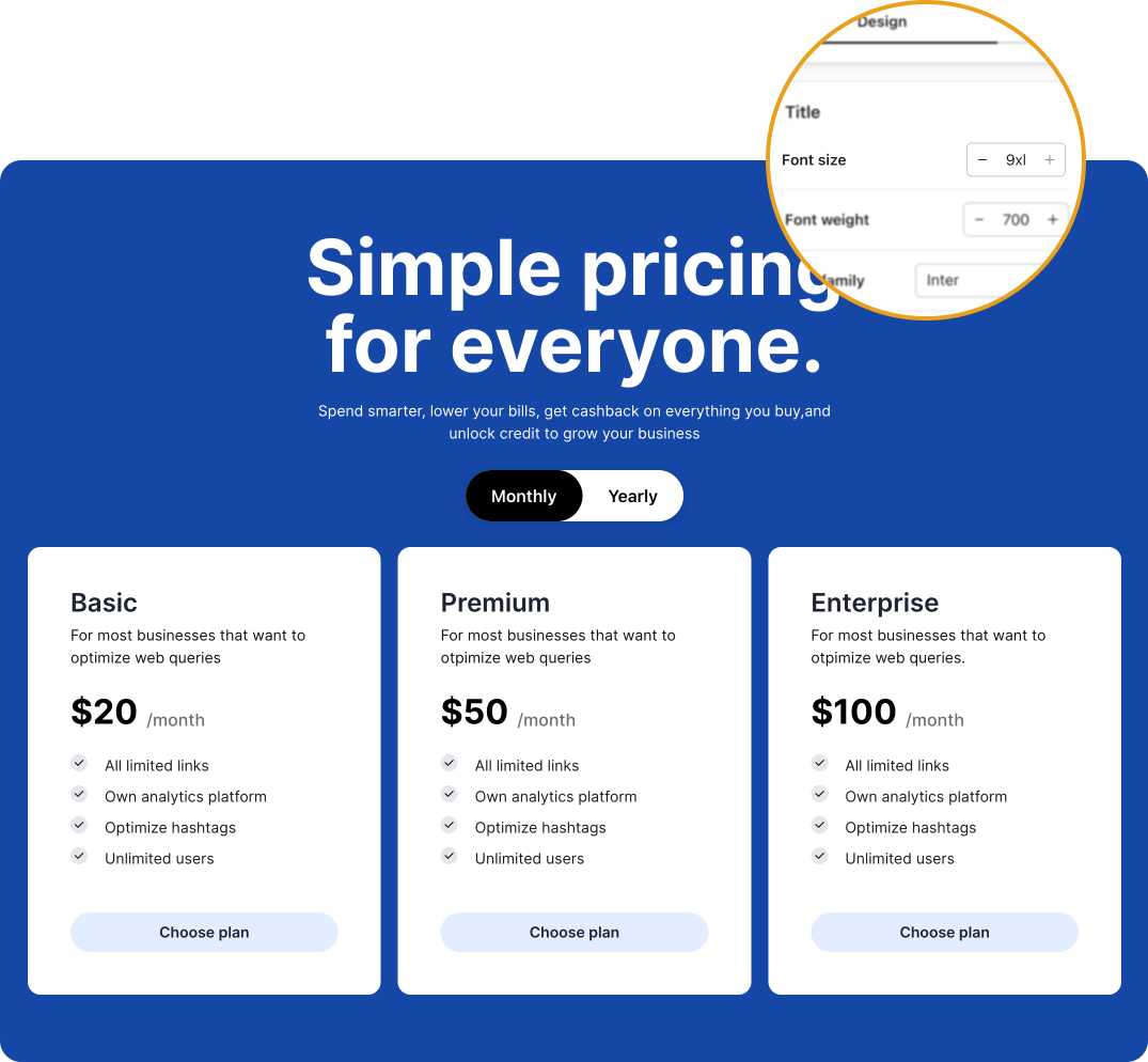
<p>At NeetoSite, users can personalize font sizes from the design page. If a user
selects the largest font size (<code>9xl</code>) for the <strong>title</strong>, everything looks
flawless on the desktop view. However, when switching to mobile, things start to
look a little off. The title appears out of place, and that's because we had
been using the same font size for both desktop view and mobile view.</p>
<p><strong>Desktop view</strong></p>
<img alt="desktop view" src="https://www.bigbinary.com/blog/images/images_used_in_blog/2023/perfecting-mobile-responsiveness-on-neetosite-using-rfs/desktop.png">
<br>
<p><strong>Mobile view</strong></p>
<div>
  <img alt="mobile view" src="https://www.bigbinary.com/blog/images/images_used_in_blog/2023/perfecting-mobile-responsiveness-on-neetosite-using-rfs/mobile.png">
</div>
<h3>Limitations of the Tailwind approach</h3>
<p>We use Tailwind CSS to create the building blocks of NeetoSite. One way to
implement responsive typography is to use
<a href="https://tailwindcss.com/docs/font-size#breakpoints-and-media-queries">Tailwind's responsive font size classes</a>.</p>
<p>For example, to make the text <code>60px</code> on large desktop screens, we can use the
<code>lg:text-6xl</code> class.</p>
<pre><code class="language-html">&lt;p class=&quot;lg:text-6xl&quot;&gt;Text&lt;/p&gt;
</code></pre>
<p>Now we need to choose the font size for mobile and tablet devices. Let's say we
choose <code>30px</code> for mobile and <code>48px</code> for tablets. We need to add additional
Tailwind classes:</p>
<pre><code class="language-html">&lt;p class=&quot;text-3xl md:text-5xl lg:text-6xl&quot;&gt;Responsive text&lt;/p&gt;
</code></pre>
<ul>
<li>The <code>text-3xl</code> class makes text <code>30px</code> on mobile.</li>
<li>The <code>md:text-5xl</code> class will set the font size to <code>48px</code> on tablet devices.</li>
</ul>
<p>Now, let's dive into a practical example within NeetoSite. This platform
provides users with the flexibility to customize font sizes for their content
from the design page.</p>
<p><img src="https://www.bigbinary.com/blog/images/images_used_in_blog/2023/perfecting-mobile-responsiveness-on-neetosite-using-rfs/example.png" alt="example building block"></p>
<p>NeetoSite offers a total of 13 font size variants, each associated with its
default desktop value, as shown in the table below.</p>
<table class="font-size-variants-table">
  <thead>
    <tr>
      <th>Font size variant</th>
      <th>Font size (Desktop)</th>
    </tr>
  </thead>
  <tbody>
    <tr>
      <td>9xl</td>
      <td>4.5rem (72px)</td>
    </tr>
    <tr>
      <td>8xl</td>
      <td>3.75rem (60px)</td>
    </tr>
    <tr>
      <td>7xl</td>
      <td>3rem (48px)</td>
    </tr>
    <tr>
      <td>6xl</td>
      <td>2.5rem (40px)</td>
    </tr>
    <tr>
      <td>5xl</td>
      <td>2.25rem (36px)</td>
    </tr>
    <tr>
      <td>4xl</td>
      <td>2rem (32px)</td>
    </tr>
    <tr>
      <td>3xl</td>
      <td>1.75rem (28px)</td>
    </tr>
    <tr>
      <td>2xl</td>
      <td>1.5rem (24px)</td>
    </tr>
    <tr>
      <td>xl</td>
      <td>1.25rem (20px)</td>
    </tr>
    <tr>
      <td>lg</td>
      <td>1.125rem (18px)</td>
    </tr>
    <tr>
      <td>base</td>
      <td>1rem (16px)</td>
    </tr>
    <tr>
      <td>sm</td>
      <td>0.875rem (14px)</td>
    </tr>
    <tr>
      <td>xs</td>
      <td>0.75rem (12px)</td>
    </tr>
  </tbody>
</table>
<p>For each font size variant, <strong>the challenge is to determine the optimal font
sizes for tablets and mobile devices</strong>. Once we have chosen the font sizes for
mobile and tablet, we need to apply the corresponding Tailwind classes, as
mentioned above. It can indeed involve a substantial amount of work and effort,
doesn't it?</p>
<h3>The solution - RFS package</h3>
<h4>What is RFS?</h4>
<p>Bootstrap’s side project <a href="https://github.com/twbs/rfs">RFS</a> is a unit resizing
engine that was initially developed to resize font sizes (hence its abbreviation
for Responsive Font Sizes). It's a great tool for creating responsive typography
and layouts, as it automatically calculates the appropriate values based on the
dimensions of the browser viewport. Nowadays, RFS is capable of rescaling most
CSS properties with unit values like margin, padding, border-radius, or even
box-shadow.</p>
<h4>Using RFS</h4>
<p>The <code>rfs()</code> mixin provides shorthands for common CSS properties with unit
values, such as <code>font-size</code>, <code>margin</code>, and <code>padding</code>. This makes it easy to use
RFS to create responsive CSS.</p>
<p>Importantly, we don't need to worry about creating complex media queries to
achieve responsive font sizes. RFS handles this for us.</p>
<p>For example, to set the font size of a <code>.title</code> class to be responsive, you
would use the following Sass code.</p>
<pre><code class="language-css">.title {
  @include font-size(4rem);
}
</code></pre>
<p>The above Sass code will generate the following CSS output.</p>
<pre><code class="language-css">.title {
  font-size: calc(1.525rem + 3.3vw);
}

@media (min-width: 1200px) {
  .title {
    font-size: 4rem;
  }
}
</code></pre>
<p>In the generated CSS, the font size is set to <code>calc(1.525rem + 3.3vw)</code>. This
formula takes a base size of <code>1.525rem</code> and adds <code>3.3%</code> of the viewport width
(<code>vw</code>). As the viewport width changes, the font size dynamically adjusts to
ensure optimal readability and aesthetics. If the viewport width is greater than
<code>1200px</code>, the built-in media query in the generated CSS sets the font size back
to the user-defined value of <code>4rem</code>.</p>
<h4>Visualisation</h4>
<p>The following visualization shows how RFS rescales font sizes based on the
viewport width.</p>
<p>Note that every font size is generated in a combination of <code>rem</code> and <code>vw</code> units,
but they are mapped to <code>px</code> in the graph to make it easier to understand.</p>
<p><img src="https://www.bigbinary.com/blog/images/images_used_in_blog/2023/perfecting-mobile-responsiveness-on-neetosite-using-rfs/visualisation.png" alt="visualisation"></p>
<p>The X-axis represents the viewport width in pixels. The Y-axis represents the
font size in pixels. The colored lines represent the different font sizes that
can be generated using RFS.</p>
<p>As you can see, the font sizes are scaled down as the viewport width decreases.
This ensures that the text is readable on all devices, regardless of the screen
size.</p>
<h3>How we applied RFS on NeetoSite</h3>
<p>We created custom CSS classes for each font size variants and applied RFS to
them. RFS automatically calculates the appropriate values based on the browser
viewport, so the font size scales down pleasingly.</p>
<pre><code class="language-css">.ns-font-9xl {
  @include font-size(4.5rem !important);
}

.ns-font-8xl {
  @include font-size(3.75rem !important);
}

.ns-font-7xl {
  @include font-size(3rem !important);
}

.ns-font-6xl {
  @include font-size(2.5rem !important);
}

.ns-font-5xl {
  @include font-size(2.25rem !important);
}

.ns-font-4xl {
  @include font-size(2rem !important);
}

.ns-font-3xl {
  @include font-size(1.75rem !important);
}

.ns-font-2xl {
  @include font-size(1.5rem !important);
}

.ns-font-xl {
  @include font-size(1.25rem !important);
}

.ns-font-lg {
  @include font-size(1.125rem !important);
}

.ns-font-base {
  @include font-size(1rem !important);
}

.ns-font-sm {
  @include font-size(0.875rem !important);
}

.ns-font-xs {
  @include font-size(0.75rem !important);
}
</code></pre>
<p>Similarly we created custom CSS classes for each padding and margin variants and
applied RFS to them.</p>
<h4>RFS fluid rescaling in action</h4>
<p><img src="https://www.bigbinary.com/blog/images/images_used_in_blog/2023/perfecting-mobile-responsiveness-on-neetosite-using-rfs/block.gif" alt="RFS fluid rescaling in action"></p>
<h3>How RFS transformed NeetoSite</h3>
<ul>
<li>
<p><strong>Improved mobile responsiveness</strong>: With RFS, we were able to effortlessly set
responsive font sizes, paddings, and margins for different screen sizes,
ensuring a seamless and visually pleasing experience across devices.</p>
</li>
<li>
<p><strong>Simplified user customization</strong>: Users could continue customizing font
sizes, but now with the added benefit of automatic responsiveness, eliminating
the burden of setting tablet and mobile values manually.</p>
</li>
<li>
<p><strong>Enhanced readability</strong>: RFS helps ensure that the text remains readable at
all screen sizes.</p>
</li>
<li>
<p><strong>Improved consistency</strong>: The use of RFS ensures that the typography, padding,
and margin of all NeetoSite blocks are consistent across all devices. This is
because it scales all of the padding and margin values based on the same
formula.</p>
</li>
</ul>
<div>
  <img alt="difference" src="https://www.bigbinary.com/blog/images/images_used_in_blog/2023/perfecting-mobile-responsiveness-on-neetosite-using-rfs/difference.gif">
</div>
<h3>See RFS in action</h3>
<p>Take a look at <a href="https://bigbinaryacademy.com/">BigBinary Academy</a>, a place to
learn coding powered by NeetoSite. Recent changes have brought about a
significant improvement in mobile responsiveness. Another example of successful
RFS implementation can be found at https://neetocode.com, a coding platform
built by BigBinary.</p>
]]></content>
    </entry>
  <entry>
      <title type="text"><![CDATA[Understanding the automatic minimum size of flex items]]></title>
      <link rel="alternate" type="text/html" href="https://www.bigbinary.com/blog/understanding-the-automatic-minimum-size-of-flex-items"/>
      <link rel="enclosure" type="image/jpeg" href="https://www.bigbinary.com/blog/images/social_preview_images/understanding_automatic_minimum_size_of_flex_item.jpg"/>
      <id>https://www.bigbinary.com/blog/understanding-the-automatic-minimum-size-of-flex-items</id>
      <published>2023-08-17T00:00:00.000Z</published>
      <updated>2023-08-17T00:00:00.000Z</updated>
      <author>
        <name>Praveen Murali</name>
        <uri>https://www.bigbinary.com/blog/authors/praveen-murali-ind</uri>
      </author>
      <category term="UI"/>
      <media:thumbnail url="https://www.bigbinary.com/blog/images/social_preview_images/understanding_automatic_minimum_size_of_flex_item.jpg" width="1200" height="627"/>
      <summary type="text"><![CDATA[Introduction Flexbox is a powerful CSS layout module that allows us to create flexible and responsive user interfaces. However, when dealing with flex items that contain text, we may encounter issues...]]></summary>
      <content type="html" xml:base="https://www.bigbinary.com/blog/understanding-the-automatic-minimum-size-of-flex-items"><![CDATA[<h3>Introduction</h3>
<p>Flexbox is a powerful CSS layout module that allows us to create flexible and
responsive user interfaces. However, when dealing with flex items that contain
text, we may encounter issues where the text overflows its container, disrupting
the user interface. In this article, we'll explore the problem of text overflow
in flex items and learn about the automatic minimum size behavior of flex items.</p>
<h3>The problem</h3>
<p>Consider a scenario where we have a card component with a title that can be
lengthy. To prevent the card from becoming too large and breaking the layout, we
want to truncate the title and show an ellipsis when it overflows its container.</p>
<p>However, even after applying the necessary CSS properties such as
<code>white-space: nowrap</code>, <code>overflow: hidden</code>, and <code>text-overflow: ellipsis</code> to
<code>card__title</code>, the text doesn't truncate as expected. The card content doesn't
shrink to accommodate the overflowing text, resulting in an undesired UI.</p>
<p><img src="https://www.bigbinary.com/blog/images/images_used_in_blog/2023/understanding-the-automatic-minimum-size-of-flex-items/the-issue.png" alt="Card title text overflowing its container instead of truncating with an ellipsis"></p>
<p><strong>HTML</strong></p>
<pre><code class="language-css">&lt;div class=&quot;card&quot;&gt;
  &lt;div class=&quot;card__avatar&quot;&gt;&lt;/div&gt;
  &lt;div class=&quot;card__content&quot;&gt;
    &lt;p class=&quot;card__title&quot;&gt;This is anexampleofalengthytitle&lt;/p&gt;
    &lt;p class=&quot;card__description&quot;&gt;some text here&lt;/p&gt;
  &lt;/div&gt;
&lt;/div&gt;
</code></pre>
<p><strong>CSS</strong></p>
<pre><code class="language-css">.card {
  display: flex;
  align-items: center;
  width: 260px;
  gap: 10px;
  padding: 10px;
  margin: 20px;
  background-color: #ffffff;
  border-radius: 10px;
}

.card__avatar {
  flex-shrink: 0;
  width: 50px;
  height: 50px;
  background-color: #aac4ff;
  border-radius: 50%;
}

.card__content {
}

.card__title {
  white-space: nowrap;
  overflow: hidden;
  text-overflow: ellipsis;

  font-size: 20px;
  margin: 0;
}

.card__description {
  font-size: 14px;
  margin: 0;
}
</code></pre>
<h3>Why is it not shrinking?</h3>
<p>The default value of
<a href="https://developer.mozilla.org/en-US/docs/Web/CSS/flex-shrink">flex-shrink</a> of a
flex item is <code>1</code>, which means the <code>card__content</code> should be able to shrink as
much as it wants to. Surprisingly, the result is not what we expected!</p>
<p>The flexbox algorithm refuses to shrink a child below its minimum size.</p>
<p>When there is text inside an element, the minimum size is determined by the
length of the longest string of characters that cannot be broken.</p>
<p>Flexbox specification:</p>
<blockquote>
<p>To provide a more reasonable
default <a href="https://www.w3.org/TR/css-sizing-3/#min-width">minimum size</a> for <a href="https://www.w3.org/TR/css-flexbox-1/#flex-item">flex items</a>,
the used value of
a <a href="https://www.w3.org/TR/css-flexbox-1/#main-axis">main axis</a> <a href="https://www.w3.org/TR/css-sizing-3/#automatic-minimum-size">automatic minimum size</a> on
a <a href="https://www.w3.org/TR/css-flexbox-1/#flex-item">flex item</a> that is not
a <a href="https://www.w3.org/TR/css-overflow-3/#scroll-container">scroll container</a> is
a content-based minimum size;
for <a href="https://www.w3.org/TR/css-overflow-3/#scroll-container">scroll containers</a> the <a href="https://www.w3.org/TR/css-sizing-3/#automatic-minimum-size">automatic minimum size</a> is
zero, as usual.</p>
</blockquote>
<h3>The solutions</h3>
<p>To overcome the issue of the flex item not shrinking as expected, we can apply
one of the following solutions:</p>
<p><strong>Solution 1 :</strong> Set <code>min-width: 0;</code></p>
<pre><code class="language-css">.card__content {
  min-width: 0;
}
</code></pre>
<p>By explicitly setting <code>min-width: 0;</code> on the flex item, we can override the
default behavior and allow the element to shrink beyond its automatic minimum
size. This change enables the flex item to adjust its size to accommodate the
ellipsis and prevent UI disruption.</p>
<p><img src="https://www.bigbinary.com/blog/images/images_used_in_blog/2023/understanding-the-automatic-minimum-size-of-flex-items/min-width-fix.gif" alt="The card title truncating with an ellipsis once min-width: 0 is applied"></p>
<p><strong>Solution 2:</strong> Set <code>overflow: hidden;</code></p>
<pre><code class="language-css">.card__content {
  overflow: hidden;
}
</code></pre>
<p>Setting <code>overflow: hidden;</code> alone can also help. This property ensures that any
overflowing content is hidden, which indirectly allows the flex item to shrink
properly.</p>
<p><img src="https://www.bigbinary.com/blog/images/images_used_in_blog/2023/understanding-the-automatic-minimum-size-of-flex-items/overflow-hidden-fix.gif" alt="The card title truncating with an ellipsis once overflow: hidden is applied"></p>
<p><a href="https://codesandbox.io/s/the-automatic-minimum-size-of-flex-items-0fyimb?file=/src/styles.css"><strong>codesandbox demo</strong></a></p>
<h3>Conclusion</h3>
<p>Understanding the automatic minimum size behavior of flex items is crucial for
creating effective and visually pleasing web layouts. By implementing the
suggested solutions, you can overcome the challenges associated with text
overflow and achieve the desired UI outcomes.</p>
<p>Happy coding ❤️</p>
]]></content>
    </entry>
</feed>